Urban

City quantification devices

Quantification device 
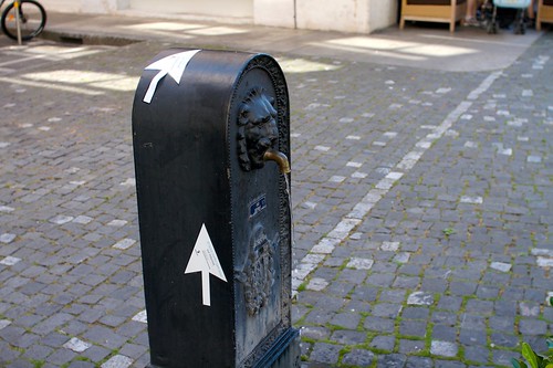
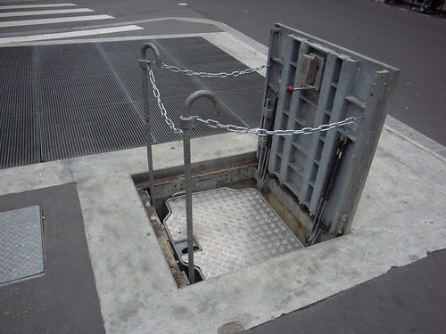
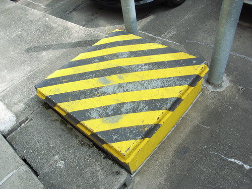
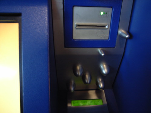
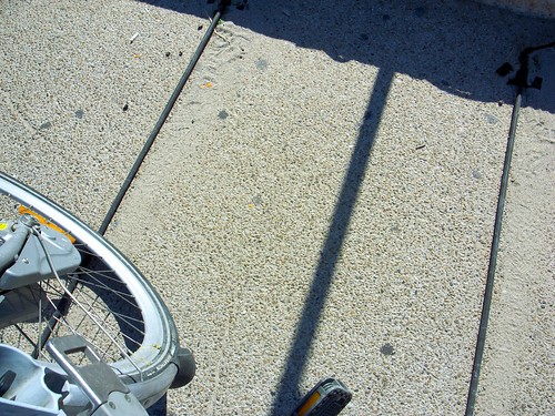
A quantification device encountered on a bike path in Marseille last sunday when riding "le vélo" (that's how they call the bike rental system down there). Two intriguing pieces of strings connected to a metal box. As an aside, the warning sign on top of it could even be re-used by angry punk-rock guitar players if they wish to start a new band.

This artifact led me thinking about how measurement devices could take different shape.

On one side you can have small and portable objects like pedometers or fancy nike+ shoes. You just take the damned thing and put it in your pocket or simply sport it while walking/running. It's individual, each human who like to have a reflective account of his/her own movement use it. And that's all good: as a user you can access the data and reflect on them. Of course, there are different levels of access ranging from reading them on the screen to exporting them in a fancy spreadsheet to run statistical computations.

Quantification device

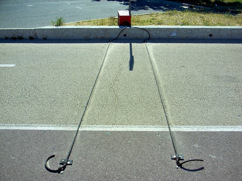
On the other side, it's also possible to have measurements infrastructures like the one represented above. It's collective and generally put in place by a city stakeholder (be it a transportation company/institution or the city council). In this latter case, the information is less accessible to the users: it sits rights there in the weird box and some human comes uploading them before parsing the whole thing on the 7th floor of a building owned by his company. Obviously, the granularity of the information collected by this device is way different than our first category. In addition, the aim is also distinct. The point here is to get some insights about the number of cyclists riding on this bike lane. For the record, this is the "sensable city" from the 20th century: situated data-capture at its best, then-turned into a tool for decision-makers about how this place is "used" by people who ride bikes.

Why do I blog this? categorizing different measurement devices is intriguing and contrasting the approaches.

Collecting street stuff

Collecting stuff on the streets Sunday morning in Marseilles, France. This folk is collecting material and old devices in the city. I don't really know what he's going to make out of it but he seems to be fully equipped. Perhaps some tinkering and device repurposing, the fan may surely prove handy with Marseilles' hot temperatures.

A practice that I see more and more in occidental cities.

Soft infrastructure interruption

Soft Infrastructure interruption Somehow, this soft infrastructure, a zebra crossing in Marseilles, is quite intriguing: (1) it's yellow (which reveals that it's a temporary signage), (2) it's interrupted by a layer of concrete that has been added there.

Why do I blog this? observing the decay of soft infrastructure and how different layers pile up in the urban environment.

Workshop in Torino

Last tuesday I was in Torino, Italy for the "I Realize" conference organized by TOPIX (Torino Piemontre Internet eXchange). Participating as a workshop facilitator, I was told to focus on how people will move and interact in the city of tomorrow. We worked on identifying unsolved problems, suggesting possible (technological?) solutions. The day after the workshop, I presented a quick overview of the results that others such as Bruce Sterling commented during the panel. Annotated slides can be found here. The workshop was based on a quick field exploration in the morning, during which participants were told to collect some material about people practices and needs. The afternoon as devoted to material analysis and discussion of design issues and solutions.

Thanks Leonardo for the invitation!

About digital and paper maps

Taxi map Mapping is a favorite topic of mine, not only because I worked on locative media, but also because I find they are fascinating objects. Maps are really interesting these days as they exemplify one of the design trend I spotted recently: the transformation of non-digital objects by design techniques coming from the digital world. To some extent, lots of artifacts from the material world can be re-designed by applying insights learned when creating weird interfaces and new sorts of interactions.

This is what happens currently with paper-maps which design is reshuffled by people who grew up with video-games and on-line mapping tools, or by designers who consciously want to apply techniques coming from the digital. What is highly captivating in this context is that it also reshapes the user experience of the object at hands. Maps are a good example of such phenomena.

One of the most advanced project along these lines is certainly Jack Shulze's Here and There. Although I don't have the poster version, the Wired UK version will do to exemplify what it is:

Here and There

Here is the idea:

"Imagine a person standing at a street corner. The projection begins with a three-dimensional representation of the immediate environment. Close buildings are represented normally, and the viewer himself is shown in the third person, exactly where she stands. As the model bends from sideways to top-down in a smooth join, more distant parts of the city are revealed in plan view. The projection connects the viewer's local environment to remote destinations normally out of sight."

There is more on S&W's on-line web log where Schulze describes how he wanted to "exploits and expands upon the higher levels of visual literacy born of television, games, comics and print". More specifically, he wanted to tap into the satellite representation as a symbol of omniscience and the reason why a platform such as Google Earth is so compelling. The point was to have "a speculative projections of dense cities (...) intended to be seen at those same places, putting the viewer simultaneously above the city and in it where she stands, both looking down and looking forward".

Reading this in the train yesterday made sense when few minutes after, arrived at my final destination in the city of Lyon (France), I encountered this curious map:

Horizontal Map

The map depicts the city of Lyon from the train station at the bottom (in this white area) and the city itself in the upper part of the picture. There is a lot to discuss here and I won't comment about what is not represented (can the white part be absent because it may have been perceived as not interesting for tourists?). What I find relevant there is:

  • The sort of bird eye's view, as if we were in a video game, where the landscape is represented in plan over distance
  • The color overlay that shows the subway, tram and bus lines is also curious. It basically maps the public transport infrastructure on the perspective
  • The map is fixed and located in the train station, it's only drawn for this specific viewpoint (the station) and definitely match the context of use.

Why do I blog this? trying to make some connection between online musing and urban scouting... and the map topic is highly intriguing for that matter. I am convinced there is a lot to work on to modify non-digital objects with this sort of design techniques.

See-through toilet

See-through toilet (3) Another item I found curious while spending time in Lausanne the the other day: a see-through toilet. Based on a steel-and-glass architecture, the toilet is based on a transparent system: when pressing the "voir" button (which means "see"), the glass gets transparent and it turns opaque when someone is inside and presses the button again. A motion sensor also turn the glass transparent if there's no motion during a certain amount of time (to prevent people from staying there for too long or in case of a problem) OR if there is TOO MUCH ACTIVITY (no party is allowed in there).

See-through toilet (1)

See-through toilet (2)

It's questioning as well to see that the button has been called "VOIR" ("see"), as most of the people who enter the toilet do not want to "see" but instead to "not be seen". My guess is that it's on purpose, to disrupt people's behavior (who would want to press a button anyway to see how to make the glass opaque).

From what I've read, the point is to find an answer the recurring problems of toilet trashing. By looking at the inside, people can have a direct overview of the toilet state. Designed by Oloom in 2008, the whole point of this is explained on their website:

"Eleven glass sides for this toilet whose walls are partly made of liquid cristal glass. Under electric tension, the glass is transparent and the toilet shows its clean and functional inside/interior: the user feels safe and sound. Out of tension, they become opaque: the place is now occupied and the users intimacy guaranteed. An innovative concept to deal with insecurity problems whilst playing with transparency."

An important feature in this design is the presence of a pine tree next to the transparent toilet. This tree has been especially chosen to be planted there because it's aimed at bringing more pleasant smell. A sort of high-tech/low tech combination.

Why do I blog this? An intriguing piece of furniture with curious combinations (the pine tree, the syringe trash can). Is this the Everyware-like city toilet of the future? I don't know but it's certainly interesting to understand more the way the glass gets transparent or opaque. The rules embedded in the system, that I described at the beginning of this post, tells us captivating insights about what is considered as normal or not in society.

Visual marker on the sidewalk

QR code on the sidewalk Interesting encounter in a one-day trip to Paris this morning: a visual marker, complemented with a unified resource locator on the pavement of Paris, close to Place de la Bastille. Aimed at mobile phone owners who will surely be led to the url.

What's intriguing here?

  • a curious merging of the digital and the physical that depends on the viewer: at first, having a mobile phone or not, you see the digital representation only through the form of an index (the url or the marker). It's only if you use the phone that you can access to the genuine digital layer
  • the presence of the marker in the environment, surely an interesting design issue to be contrasted to representation on posters or marker on magazines (smaller surface that you hand out to other performs, while the sidewalk marker is static.
  • the horizontality of the surface: you have to look at the sidewalk and point it with your phone.
  • the repetition of the url showing different levels and moment of engagement with the content referred to by these inscriptions
  • and the practice of spraying visual market on the pavement per se

Paper in contemporary cities

Different forms of paper-handling solutions in Geneva, Zürich and Seoul: Paper day in Zürich (pieces of paper maintainted by a piece of string in Zürich)

PAPIER PAPER (paper bin in Geneva)

Paper about to be recycled (Huge and compressed stacks of paper, once collected, in Geneva)

Shredded documents everywhere (Failed attempt to recycle shredded paper, in Geneva)

Trash (Shredded paper in plastic bags, in Seoul)

Why do I blog this? documenting the different forms of recycle papers in our cities is always curious. It basically shows how a certain material moves through different instantiations as well as the recycling norms or practices: the use of strings in Switzerland is very common with or without a big paper bin, the importance of collecting shredded papers (and the inherent accident, as shown in the photo in Geneva) or plastic bags with certain colors. All of this nicely represents both cultural norms, organizational processes and artifacts that people have put in place to maintain this recycling flow. It's important to keep in mind that this is where toilet papers, newspapers and books come from.

Some surfaces are more attractive than others

STOP Stickers and graffitis are now common on lots of urban surfaces. On this example found in Venice, Los Angeles, some surfaces are, interestingly, more attractive than others. Although the height of each sign is almost similar, the "stop" sign clearly receives more inscription than the street name plate. Is it because the red sign corresponds to an authoritative order (that should be regarded with mockery)? Or simply that the size of the sign is a better affordance?

*you are here*

You are here The different way to express the famous "you are here" sign on maps (San Francisco, Zürich, Geneva, Saint Etienne and Zürich again). Regardless of the map type (w/o transportation system, with different granularities of environmental description and scale differences), the way your position is indicated can be described in a wide array of signs. Circles w/o arrows, w/o the "you are here" symbol, etc.

You are here (5)

you are here (3)

you are here

You are here (6)

Perhaps the best one is the following: a sign which indicates that you are where you are ("here"):

You are here

okay to play here / not okay to play here

Play here, it's okay! Each places have their own rules. It's okay to play on this giant and empty parking lot above (Santa Monica) but this bench below in Venice depicts clear signs of defensible space (to prevent skateboarders to grind the curb). In one case the sign is explicit, in the other, it's rather a deterrent than a proper sign.

Defensible space

Dead end on the interwebs

404 on Netscape Navigator There was a time when this sort of message was more common. For the record, an error 404 (or Not Found error message) refers to:

"a HTTP standard response code indicating that the client was able to communicate with the server but either the server could not find what was requested, or it was configured not to fulfill the request and did not reveal the reason why. 404 errors should not be confused with "server not found" or similar errors, in which a connection to the destination server could not be made at all."

A time when information superhighways were full of dead-ends and wrong-ways... People were given means to circulate (through URLs addresses, Web directories and then search engines) but these tools could also be misleading... and lead to Error 404. It's less usual now, and web folks have learn to create user-friendly 404-pages.

404

Is there a physical equivalent to 404? What would be a "404 error" when wandering on the streets (or in the countryside)? A mistake where "you don't find what you looked for/requested".

Why do I blog this? thinking about translations of practices and rituals from the digital to the physical.

Physical layers

Thickness of postersSeen in Lyon, France last year.

Accumulation of information or simply a physical representation of the history of concert posters. The different layers are added on top of each others creating this intriguing shape. This accumulation leads to a curious texture/surface in our environment: there is an inherent 3D effect to this stack of posters. Can there be a role of this "thickness"? What do people infer from it? the fact that no one is cleaning up this mess or the richness of cultural events in the area?

Adaptive street-signage?

Deformed An intriguing and purely accidental assemblage observed in Geneva this morning: as if the pedestrian's footsteps were reshaping the yellow band (of course it's not, these curves are caused by cars). An evocative image of the adaptive city.

Paleo-future textures

Front de Seine The city of the future was supposed to have a certain kind of texture and rugosity. Seen last week in Paris, in the Front-de-Seine neighborhood, where I encountered an intriguing set of paleo-futurist buildings.

Front de Seine

Why do I blog this? ... this material goes straight to my set of futurist architecture.

Manhole covers from the 21st century?

Street trap Street trap!

Street "traps" or elevators are definitely an interesting feature of cities that I am noticing lately (Paris and Lyon above, Geneva below).

Beware of the trap?

These devices definitely remind me of the pipes in Mario Bros, sort of tubes that allow people to be transferred to some underground secret world:

Mario Bros screenshot

Beyond this aesthetic concern, they do exemplify the 3D nature of cities. More importantly, this hidden stairs/elevators are important as they reveal the underlying infrastructure of the city as well as the need to access this infrastructure (sewage, electrical station, etc.) to fix things. It's the sort of modern version of manhole covers in a more technological fashion.

Speaking objects in Amsterdam

shop Two curious encounters on my way from the Waag to the train station: the interesting use of speech bubbles in both cases, as if the designers of these elements wanted to convey the message that objects are close to have self-expression.

door

This way to express objects' agency in our physical environment is certainly close to the blogject meme where "artifacts" and places would be more talkative in the near future. One can qualify the Internet of Things as "more than mere speech bubbles".

Vending machine interface design

Prevention against stickers? The evolution of vending machine interfaces is highly curious. Seen in Amsterdam yesterday, at the train station in Schiphol. This train ticket machine sports weird spikes. What do they mean? What are they intended to do? preventing people to put stickers? Or it can be a way to prevent credit card skimming (the practice of retrieving and using the information that is encoded on the magnetic strip of a legitimate credit card).

Prevention against stickers?

The way they are place on the interface is very odd. Any clue?