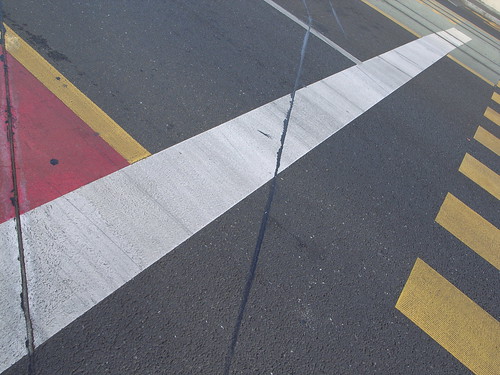
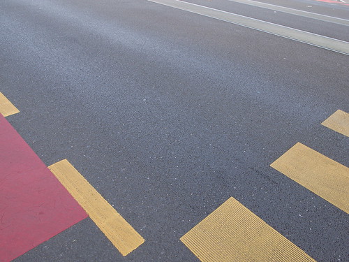
 The complexity of indications on street pavement in Geneva: - Green is to represent tram paths but the information is for pedestrians, cars and bikes since the tram pilot knows obviously that he/she only go straight. - Red is to represent bike paths: useful for cars and pedestrians to know where NOT to go since it's actually the portion of bike lanes near cross-roads - White is to represent road/street boundaries for cars, bikes and trams (stop/do not cross the line) - Yellow on the street is for pedestrians (to cross the road + to show the limits of the bike lanes) - not present on the picture is also the podotactiles on the sidewalk, for pedestrians.
Why do I blog this? I find intriguing how the use of such signs for cueing behavior is more and more complex. See also the subway platform example.