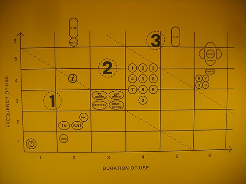
 An interesting diagram encountered in London at the 'ergonomics' exhibit (thanks Alexandre Burdin for the two pictures). The horizontal axis corresponds to the duration of use of a certain button, while the vertical axis is meant to represent the frequency of use. Doing this enable to discriminate 3 clusters of remote control features.
As described below, this graphic emerged from an empirical study of remote control prototypes.
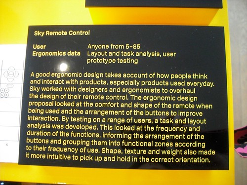
Why do I blog this? Definitely an interesting way to analyze a physical artifact. More specifically, this is a relevant way to visualize results from a study of how people use a remote control. It's also interesting (with regards to a design process) to understand how they employed this as a way to work out the buttons arrangement using this kind of data reduction method.
A similar graphic can be designed for joypads, considering the use of various buttons.