Granularity degrees of "nearby"

Easyjet recommandation Travelling very often in different european cities, I am always curious about Easyjet place recommendation to observe what sort of advices they bring to the table and how they renew their propositions over time.

Easyjet recommandation

One of the feature that interest me is the "Escape" part, the quick description of how to go out of the city you just landed and what sort of magical things you can discover in the surroundings. I generally look at various cities (Paris, Lyon, Geneva, Lisbon, Milan, etc.) and am sometimes struck by the granularity of the "escape" range. Sometimes, most of the time I should say, the recommendation is to visit something nearby. The term "nearby" or "vicinity" is not stated, yet it's the basic assumption of the "escape paragraph". Like you're in Paris and one recommend you a quick hop to Eurodisney, not my thing but it's fair enough, it's quite close in termes of mileage (kilometers for the metric readers).

However, there are sometimes exceptions. In the example shown form a recent Easyjet trip, the description of the city of Lyon is filled with "escape" notes about the possibility to visit Camargue. Surely a nice place that I explore from time to time, but definitely not perceived as "nearby" from the continental europe standpoint... given that you must at least drive 3 hours from Lyon to get there.

Why do I blog this? This is definitely no big deal but it strikes me as revealing to what extent representations of "nearby escape" can be perceived. There is clearly here a gap between the writer's mental model and reader's representations. Of course, there is not just one type of reader and it may matter to escape from Lyon and go to Camargue. What is at stake here, and it's a must-have question for location-based services designers, is the notion of spatial granularity which needs to be taken care of. Let me reformulate it here: if you want to provide people ("consumers") with location-based information about what is relevant in the vicinity, how can you make sure what is hidden behind the term "in the vicinity" or "nearby"?

Failure(s)

failure is cool According to the thesaurus I use:

"Failure:

Definition: lack of success

Synonyms: abortion, bankruptcy, bomb, botch, breakdown, bungle, bust, checkmate, collapse, decay, decline, defeat, deficiency, deficit, deterioration, downfall, failing, false step, faux pas, fiasco, flash in the pan, flop, frustration, implosion, inadequacy, lead balloon, lemon, loser, loss, mess, misadventure, miscarriage, misstep, nonperformance, nonsuccess, overthrow, rout, rupture, sinking ship, stalemate, stoppage, total loss, turkey, washout, wreck

Antonyms: accomplishment, achievement, attainment, earnings, gain, merit, success, win"

Why do I blog this? writing a paper about design research and failures, looking for inspiring material and vocabulary.

Swiss post box: from the material to the physical

La Poste Another one about post-related issues: the swiss Post just launched a new service called Swiss Post Box: the "electronic equivalent to your regular physical mail box".

It allows subscribers to receive scans of their unopened envelopes by e-mail message and then decide which ones they want opened and scanned in their entirety, to be read or achieved online (or "shredded"). You pay a monthly fee and you get a a set number of scans, at least one address for free and long-term archiving. There's even a connection with a Miles program for flights.

An interface detail that struck me as curious too is the fact that the interface is only in english, which gives an interesting hint about the target groups of these services.

Why do I blog this an interesting service at the crossroads of the digital and the physical. I am pretty sure there could be lots of possibilities in terms of applications based on this kind of platform, both in terms of personal information management and less utilitarian purposes.

Besides, It's intriguing to think about the implications in terms of need to have letters/mail in material format and the importance of physical space. Concerning the importance of paper, I'm curious to see how people would be react and what sort of routine can be put in place to choose between what should be sent online and what should be kept (and when because there are obviously lots of exceptions). Now about space, as the NYT piece puts it "There’s a huge amount of infrastructure", the letters will no longer sit in a shoebox under your desk but they will be stockpiled in huge data-warehouse here and there, a sort of add-on to the post buildings. Eventually, it may also change the Post's general process which are based on flow and less on accumulating data. I don't mean here that Postal services never had to deal with keeping things but the scale may change with this sort of innovation.

User participation

Out of order A basic occurrence of user participation, taking the form of a rough message that indicates this stamps machine is broken. User-generated content if I may use this term.

This sort of activity has been taken as potentially transferable to digital interfaces. Think, for instance, about GPS devices that allow people to send over some updates concerning traffic jams and constructions (and sometimes send fake information about non-existing constructions only to prevent other persons to use certain routes). A topic I address yesterday on the french radio "France Culture" (podcast here, french only, sorry about that).

Causes and symptoms of failures

Perusal My interest in failures (as attested by my Lift09 speech) led my peruse "Anatomy of a Failure: How We Knew When Our Design Went Wrong, and What We Learned From It" (by William Gaver, John Bowers, Tobie Kerridge, Andy Boucher, Nadine Jarvis) with attention.

The article is a case study that examines the appropriation (or the wrong appropriation I should say) of an home health monitor device. The authors identify what they call ‘symptoms of failure’ that touches 4 themes: engagement, reference, accommodation, and surprise and insight. They discuss theses reasons of failures by looking at three different angles: (1) problems particular to the specific design hypothesis they had, (2) problems relevant for mapping input to output more generally, and (3) problems in the design process they employed in developing the system.

An interesting aspect in the paper is the must-have definition of what constitutes a failure:

"Approaches to evaluating interpretive systems such as the sort we describe here tend to focus on how to go about gathering suitable material for assessment, but avoid discussing how success or failure might be determined. For instance, Höök et al. based their evaluation of a system on analysing the conversations that groups of people had on encountering it. Others seek alternatives to verbalised judgements to capture more intuitive and sensual aesthetic and emotional responses. Finally, others advocate gathering multiple forms of evaluation from a variety of perspectives, including those of ‘cultural commentators’ such as journalists or filmmakers. Opening out evaluation to multiple voices and new forms of expression in these ways reflects the multiple interpretations afforded by the class of systems in which we are interested. On the other hand, these approaches can invite a kind of relativism from which it is difficult to draw firm conclusions. (...) we propose features of user engagement as being reliably symptomatic of success or failure, (...) we describe the symptoms of success and failure that emerge from a comparison of the unsatisfactory experiences observed in this field study with more rewarding deployments of other systems in the past."

The authors then go on with a description of their system (the "Home Health Monitor") with an account of early field trials that serve as a sort of baseline against which they compare the results from a field study. What is important to my research here is the description of how the system failed in conjunction with certain behavioral indicators they did not find:

  • Engagement: Beyond any explicit declaration of liking, we take as evidence such things as an enthusiasm about discussing the design and their experience with it; persistence in use and interpretation over time; suggestions for new enhancements that reflect our original design intentions, showing the prototype to friends.
  • Reference: the tendency for volunteers to discuss successful prototypes through reference to other technologies or experiences that they like.
  • Accommodation: the degree to which people accommodate successful designs to their existing domestic activities and rhythms
  • Surprise and Insight: successful systems are those which continue to occasion new surprises and new insights over the course of encounters with them. For instance, new content might appear, or unfamiliar, potentially rare, behaviours might be observed, and this might give rise to new perceptions of the system or the things it indicates. Equally, people may find new meanings for relatively rich but unchanging experiences. Of course, surprise and insight are neither properties of the system per se nor of the people who use it, but instead characterise the relationship between the two.

These were the symptoms of failures, which should no be confused with potential reasons of failure. The authors also contrast early trials results to the field study to get a grip on the causes that are quite specific to their design.

Why do I blog this? pursuing my work about failures here, gathering material about design issues with regards to failures for publication ideas. This piece is highly interesting as it shows how field research may help to uncover symptoms and causes of failures. Surely some good content to add to my lists.

Telescope to see leaves

Installation in Lausanne This huge tube that looks like a medieval bull horn is one of the installation from the Lausanne Jardins project (Lausanne garden), which is a series of devices located here and there in the city that aims at renewing the relationship to nature.

The piece above is called "Dentelles" ('lace' in english) and it has been designed by Aline Juon, Florine Wescher. It's made of 3 telescopes that target a nearby forest (yes, in Lausanne) which used to be much closer to the city in the past. These devices have been created as a invitation for passers-by to observe the detailed elements of trees, and eventually notice this fragile urbanization boundary as a "lace".

Why do I blog this? the gigantic size of the devices struck me as fascinating when I came past. Observing the trees through the lense is intriguing as it leads to a very detailed representation of leaves, as if you were close to nature (like it used to be in the past in this neighborhood). Unlike lots of devices which are meant to make visible phenomena that are invisible, this piece aims at bringing things closer, which is also an interesting goal.

It looks like a sort of macroscope (big size of the device) but it's closer to a microscope.

Nametagged

Alex This name-tagged hooded that I ran across yesterday morning reminded me of Aram Bartholl's WoW project. The fact that this kid walked around with his first name written on his clothe seems to be a curious phenomenon; although, it's perhaps not his name (is there a brand called "Alex"? or is it some sort of movie star I am not aware?).

Assuming that's this is the teenager's name, displaying one's name publicly like this denotes a shift in identity and privacy perception that is very well addressed in Bartholl's WoW project:

"[in World of Warcraft] Each player is represented by an individual avatar, which is given an unalterable name that by no means corresponds to the real name of the player but serves as a clear means of identification in the online world. This so-called nickname floats above the avatar’s head and is constantly visible by all other players. There is no anonymity for the avatars themselves

The WoW project takes this mode of publicizing players’ names that’s typical of online 3D worlds and transfers it into the physical domain of everyday life. Participants of the WoW-workshop will be able to construct their own name out of cardboard and then parade around in public with it hovering above their head. What happens when a person’s customary anonymity in the public sphere is obliterated by the principles operative in virtual worlds online?"

Why do I blog this? A street encounter like this led me to get back to Bartholl's project and wonder about the display and projection of identity in physical space. I did not want to mean that there is a direction relationship between the kid's hooded and online habits. However, I found intriguing to see how this sort of MMO interface can echo with existing physical artifacts' design: there are already some instances of people wearing and displaying their identity in the material space. Of course, the "conference badge" and name tags is a common one but the hooded example here is even more curious as it's a more opened (and less formal) context.

Another instance of such observed in Montreux this afternoon: Name tag

Count on something else happening

Three card monte The observation of this sidewalk game (three card monte) the other day in Geneva 5 minutes after starting a book by Howard Becker lead me to acknowledge the full veracity of the following quote:

"We can always count on something else happening, another glancing experience, another half-witnessed event. What we can't count on is that we will have something useful to say about it when it does. We are in no danger of running out of reality; we are in constant danger of running out of signs, or at least of having the old ones die on us."

Geertz, C. (1995), After the Fact: Two Countries, Four Decades, One Anthropologist, Harvard University Press.

Why do I blog this? this should be at the roots of scouting for insights and elements for design research. An interesting quote to be re-used in one my course.

White Glove Tracking

The never-ending discussions about MJ in various contexts sometimes leads you to talk about pop culture in conjunction with concepts such as "crowd sourcing" and "social web". This is what happened yesterday when I brought back the White Glove Tracking project in a social web meeting. It was a crowd sourcing experiment form 2007 created by Evan Roth and Ben Engebreth that asked an online community to help track Michael Jackson’s white glove from a televised performance, in 10'600 frames. It took then 72 hours to go from the txt files to user-generated visualizations of the data collected using Processing. Some of the results can be found in the white glove gallery.

Why do I blog this? beyond the MJ thing, I find this crowdsourcing instance quite curious (among others like the Nasa Clickworkers project) and some hilarious examples (like the big white glove that fits quite well with the Billie Jean bass line). A sort of testbed for distributed visual data analysis where human eyeballs are quite efficient.

What I also find intriguing here is the social dynamic around it, see for instance both the different categories in the gallery ("the winners") and the sort of "rankings" of participants (see below). I am always amazed by pervasive rankings even, perhaps they play a role in crowdsourcing experiments:

(ranking)

Yet another weird toilet interface

Toilet door interface(Out)

Toilet door interface (In)

This toilet door encountered in a french train yesterday struck me as fascinating. On both side of the door (in and out the toilet), you have a remnant of the past (a door handle that has its highly efficient affordance) and a set of button (open/close). As you can imagine, most the passers-by start by turning the door handle, which fails to open the door, they then froze and realize they can press a button. The next step is that they come in and realize that a similar masquerade happens inside. What is intriguing is that when outside of the toilet, the button set is close to the door handle, which is not the case inside (hence the presence of weird yellow arrow-shaped stickers).

What happened here? The combination of two interaction styles (buttons + door handle) is stunning and detrimental to this basic interaction (opening and closing a door uh!). What's the design rational here? maybe that it's less physically demanding to press a button and wait that the door automatically closes/opens. However, and you may expect, people IN the toilet are generally anxious about how to close this god damn door. Some even try to grasp and push the handle, which does not allow to lock the door.

Let's have a look closer:

Toilet door interface

Besides, the button set is perhaps not the best way to interact but the presence of both is even more confusing. Weird arrows, red circles for emergency opening, what a mess!

Why do I blog this? observing how everyday basic interactions can be transformed into complex encounters with objects. And yes, I always bring my camera when I go to ANY toilets, it's an interesting place to analyze weird technological innovations.

3 pieces about ethnography and design

notes about blogjects Some pieces I ran across recently about the role of ethnographically-inspired approaches in design:

Fewer Engineers, More Anthropologists (by Navi Radjou) highlights a so-called new R&D model based on interdisciplinarity. The authors describes to what extent "anthropologists" (or people who have skills related to anthropology) can help companies to "tailor their business models and offerings to match users' socio-economic and cultural context". What is weird here, as described by near future laboratory fellow Julian Bleecker is that this is definitely not really new ("2.0"). For example, Julian points to earlier work by Lucy Suchman at PARC (described in here book). What I find surprising here is that the notion that users should be taken care of in the design/R&D process is not new as well. Of course it was not called "design-based ethnography" in the past and "co-design" wasn't employed either. Perhaps the HBR has lowered his standards or forgot to ask an historian of science and technologies.

How to Turn Research into Innovation Gold (by Jessie Scanlon, Business Week) is a bit more mature as it do not highlight the originality of such approach. With such title, the assumption is clear: data from the field can be turned into gold. It basically points out with a problem field researchers have with the huge quantity of material they collect: what to do out of it? how to turn it into something that is fruitful for other stakeholders (such as designers, strategy people or engineers). What the article describes as "how to tease useful insights out of all of this disparate data". The author takes the example of a Steelcase case (I always like to make weird phrase like this, using two times the same word):

"With all of the research materials gathered in a room, the group convened for what they call a "big share"—a two-day event that included marketers, engineers, industrial designers, and other stakeholders. The field team began by telling stories and sharing observations. (Researchers record the latter in formal documents that include the observation, its origin, its significance, and other details.)

With their thinking primed by the stories, the group went through all of the research photos, organizing them into related themes—a patient's need for privacy, for instance—and taping those clusters on the wall. As they began to see common problems or workarounds, they added observations written on Post-It notes to the wall. "The goal is to take the knowledge gained from the research and make it explicit," says Bromberg."

They then apply a 100 to 50 to 12 insights "that could guide the design and development phases to come" in a sort of reduction process. The article also gives some ideas about the process itself (take time to look back at the data, look for patterns) which seems like the outline of a thick manual of ethnography.

In the last issue of Ambidextrous, there is an interview of a designer and an anthropologist who addresses the general issues raised by the role of field research in design. They discuss the existence of such approach for sometimes (it goes beyond the HBR piece for that matter) and focuses on the added value: the uncovering of "unmet needs or 'opportunity spaces'", "get business people a little closer to real people, to customers". Doing so is achieved through high-level goals: "understand people in their own terms", "through simplified models, a set of key stories or quotes", "eliciting the cultural constructs people have while keeping your mind on two places at once, both the native model [of the user] and your own analytical model [as an ethnographer]".

Some general comments about these pieces:

  1. The first aspect that strikes me is the vocabulary. The general use of terms such as "ethnography" and "anthropology" sounds like they reference to established and well-respected academic disciplines and practices. It's a sort of indicator of their validity, relevance or maybe seriousness. However, what is generally meant is "field research" with a strong focus on "data" and data collection techniques. The absence of theories and theoretical constructs is quite astonishing. Of course, there are different schools of thoughts in anthropology, and some of them employ less theories than others, but still they argue about the reasons for that. That being said, I tend to prefer using the term "field research" (or scouting) since it's more humble and less anchored in a specific discipline (don't want rain on anyone's parade).
  2. The focus on a utilitarian model is also important in these pieces. The point of using ethnography is to find "unmnet needs" with their obvious counterparts: business opportunities (or in engineering circle: opportunities to turn a technology into something that can be employed by peeps). Surprisingly, there's never a discussion about what is a "need" (isn't it a theoretical construct?) and the fact that this term is used with a very broad meaning do not account for the complexity of what it encompasses. Recently I was in a round-table with engineers and they were eager to find a "need" that could justify their developments. I find it intriguing but my interest vanished when I realized they stayed at an highly general level: a need for a mobile service could be "sharing content" or "communicating with one's tribe". It was really hard for me to make them understand that these needs are only broad categories and that it's important to go to finer-grained levels. Like... what is important for [a certain category of] people when they do X and Y, at certain moments in time/their life, etc.
  3. The quantitative rhetoric grounded in temporal perspectives is also fascinating in these articles. See for example: "To effectively carry out their global R&D 2.0 strategy, CEOs of multinationals must give themselves a target of staffing at least 40% of their R&D labs in emerging markets with sociologists and micro-economists by 2015" in the HBR piece. Or: "the group had generated close to 100 insights (...) they "collapsed" these to 50 and then further." in the BW document". Maybe, it's a side-effect of the corporate world that desperately need indicators and quant stuff but the emphasis on such parameters is curious from an external viewpoint.

Why do I blog this? preparing material for my "Field research for designers" course for next semester, I try to find an alternative model to what already exist. I am particularly interested in the use of ethnographical techniques in a context where one do not try to jump on the "uncover needs" bandwagon. My assumption is that there are still some possibilities to employ methodologies and theories coming from ethnography in a meaningful and subtle ways to inform/constraint/inspire/question/help design and the different stakeholders of design-based projects.

Urban animal 
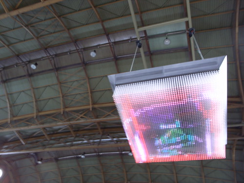
(an interesting encounter from last week-end, a giraffe-shaped game in a public parc in Geneva, which nurtured some interesting reflections about public space and "how do people do what they do" discussions).

This topis is well present in the discussion I have with Julian, about how to go beyond the instrumental and explore fringes (the places where the unevenly distributed glimpses form the future may be located) for crafting weird near future explorations.

Library or antilibrary

Library or antilibrary? Going through Nassim Nicholas Taleb's The Black Swan another time, I stumbled across this inspiring quote at the beginning of the book:

The writer Umberto Eco belongs to that small class of scholars who are encyclopedic, insightful, and non dull. He is the owner of a large personal library (containing thirty thousand books), and separates visitors into two categories: those who react with 'Wow! Signore professore dottore Eco, what a library you have! How many of these books have you read?' and the others - a very small minority - who get the point that a private library is not an ego-boosting appendage but a research tool. Read books are far less valuable than unread ones. The library should contain as much of what you do not know as your financial means, mortgage rates, and the currently tight read-estate market allows you to put there. You will accumulate more knowledge and more books as you grow older, and the growing number of unread books on the shelves will look at you menacingly. Indeed, the more you know, the larger the rows of unread books. Let us call this collection of unread books an antilibrary."

Why do I blog this? mostly two reasons for this on a sunday evening:

  1. Because it highlights to what extent books and resources like the one shown on the picture above (some of my books, including weird comics) can be seen as TOOLS. Mostly for researching insights, ideas, methods over the course of projects. Even comic books and awkward booklets have a role in research projects I conduct.
  2. As a reminder to avoid the fear of having stack of un-read books here and there. It's sometimes menacing but reassuring at the same time (still some material to peruse). The importance of the "un-read" is in direct correlation with possible discoveries and new vectors. I often randomly take one of the books and look at it (be it read or unread) and adopt two strategies: quick scan OR focus on one page and deeply explore what is said.

Robust computing

Touch interface A street interface seen in Marseilles, France the other day. Located in a very crowded and touristic area, and aimed at informing visitors, the specification that lead to this device certainly put a super strong emphasis on the firm and protected quality of the material. What is even more intriguing is the verticality of the keyboard with extra-large touch-keys.

In an era where public things are punched and molested, new design constraints call for new solutions. And it's often robustness that is perceived as the main possibility. See also the following example with the metal keyboard found at UBS in Switzerland:

coredumped

Why do I blog this? observing current design constraints and solutions people have put in place, wondering about how, down the road, people use the vertical keyboard up there. The UBS bank machine is maybe slightly more usable though. Isn't there a trade-off between the robustness of the device and its potential usability?

A Sony walkman described by a 21st century kid

This account by a brit teenager of how he used a Sony Walkman from back in the days is highly intriguing. The kid tells his story and compare it to the ipod. Some excerpts I enjoyed:

"My dad had told me it was the iPod of its day. (...) Throughout my week using the Walkman, I came to realise that I have very little knowledge of technology from the past. I made a number of naive mistakes, but I also learned a lot about the grandfather of the MP3 Player. (...) It took me three days to figure out that there was another side to the tape. That was not the only naive mistake that I made; I mistook the metal/normal switch on the Walkman for a genre-specific equaliser, but later I discovered that it was in fact used to switch between two different types of cassette (...) Another notable feature that the iPod has and the Walkman doesn't is "shuffle", where the player selects random tracks to play. Its a function that, on the face of it, the Walkman lacks. But I managed to create an impromptu shuffle feature simply by holding down "rewind" and releasing it randomly - effective, if a little laboured. (...) This is the function that matters most. To make the music play, you push the large play button. It engages with a satisfying clunk, unlike the finger tip tap for the iPod."

Why do I blog this? this is both fun and inspiring as it is always curious to see how the naive usage of previous devices is described (especially in conjunction with the use of new artifacts). Of course, beyond the fun read, it's interesting because it allows to grasp todays' users perception of certain features and affordances. The need to have a reference ("the iPod of its day") and the understanding of switches and button is shows how mental model are shaped by previous usage of technologies.

ATM interface complexity

Interstitial practice These four pictures depict different ATM interfaces from Lyon, Santa Monica, Lisbon and Paris. As usual, there is a lot to draw here: keyboard minimalism versus "a button for each bill needs", presence or absence of jack-entry for headphone, paper annotation, ATM receipts dumped in the cracks, etc.

out of doe

ATM interface

Touch interaction

Why do I blog this? An always-interesting approach to object and design analysis consist in taking pictures of similar items in various places, and to adopt an analytical perspective (drawing comparisons, observing exceptions or recurring phenomena, trends and patterns, etc.). I wish I had more time to spend on this sort of analysis.

Urban screens as skeuomorph

Big interactive stuff in Zurich Hauptbahnhof(an interactive display at Zürich train station)

In his chapter called "Extreme Informatics: Toward the De-saturated City" (taken from "Handbook of Research on Urban Informatics: The Practice and Promise of the Real-Time City" by Marcus Foth), Mark Shepard offers an insightful critique of urban screens. He basically posit that they operate as "skeuomorph" in the evolution of urban informatics.

The notion of "skeuomorph" is taken from Hayles who borrowed it from anthropology to describe transitional objects and meme in the context of cybernetic theory:

"In archaeology, skeumorphs are material artifacts that simulate an aspect of a previous time using a technology that has superseded it. They are derivative objects that retain structurally necessary elements of the original as ornamentation, stripped of their original function. Skeuomorphs are often deliberately employed to make the “new” look familiar, comfortable and accessible. Examples include the simulated stitching of the vacuum formed vinyl replacing the fabric upholstery of car interiors, the mechanical shutter sound produced by digital cameras, or more abstractly, the metaphor of the “desktop” work-space of the personal computer introduced by Apple with the Macintosh computer in 1984, where the organizational syntax of files and folders serves to orient us within an otherwise unfamiliar space"

For Shepard, these transitional artifacts enable to soften the transition between technological phases. As he points out, "Artifacts (and by extension ways of thinking) of one moment are carried forward into the future by simulating aspects of the past". Quite an inspiring quote I think.

Using this notion, he then explains how urban displays are based on a longstanding model of information access and distribution in public space that is old (and flawed): the fact that we need to access MORE information (and that it should be broadcasted to a "public"):

"I would argue that the paradigm of large-scale “urban screens” operates as a skeumorph in the evolution of urban informatics. It is based on conceptual categories whose relevance vis-à-vis contemporary societies is questionable. While this paradigm may serve to smooth the transition of integrating digital information systems into urban environments, it does so by reproducing modes of information access and distribution that no longer hold sway. In doing so, it perpetuates design logics regarding “the public” and “public space” that are perhaps less reflective of the way we access, share and distribute information today."

The paper also offers an interesting exploration of other strategies for urban computing/informatics to offer alternatives.

Why do I blog this? I have to admit that I am often on the look out for such theoretical constructs that enable to reflect on technological design. The notion of "skeuomorph" seems relevant and largely applicable to other fields. It's surely important to use in a course I am preparing for next week about innovation and foresight.

City quantification devices

Quantification device A quantification device encountered on a bike path in Marseille last sunday when riding "le vélo" (that's how they call the bike rental system down there). Two intriguing pieces of strings connected to a metal box. As an aside, the warning sign on top of it could even be re-used by angry punk-rock guitar players if they wish to start a new band.

This artifact led me thinking about how measurement devices could take different shape.

On one side you can have small and portable objects like pedometers or fancy nike+ shoes. You just take the damned thing and put it in your pocket or simply sport it while walking/running. It's individual, each human who like to have a reflective account of his/her own movement use it. And that's all good: as a user you can access the data and reflect on them. Of course, there are different levels of access ranging from reading them on the screen to exporting them in a fancy spreadsheet to run statistical computations.

Quantification device

On the other side, it's also possible to have measurements infrastructures like the one represented above. It's collective and generally put in place by a city stakeholder (be it a transportation company/institution or the city council). In this latter case, the information is less accessible to the users: it sits rights there in the weird box and some human comes uploading them before parsing the whole thing on the 7th floor of a building owned by his company. Obviously, the granularity of the information collected by this device is way different than our first category. In addition, the aim is also distinct. The point here is to get some insights about the number of cyclists riding on this bike lane. For the record, this is the "sensable city" from the 20th century: situated data-capture at its best, then-turned into a tool for decision-makers about how this place is "used" by people who ride bikes.

Why do I blog this? categorizing different measurement devices is intriguing and contrasting the approaches.

Location-based audio file in Marseille

Tag for location-based information A subtle cue on the pavement that indicate that you should press "2" on the audio-guide. An interesting location-based service which do not necessitate a GPS or any other positioning technology. In this case, it relies on people's curiosity and will to spot this sort of red dot on the pavement.

Why do I blog this? apart from the general aesthetic of the cue, it's interesting to contrast this sort of approach and a positioning technique. What are the pluses and minuses? What are the conditions under which it would be better to let people spot such cues (and hence be more active)?