Observation

Vending machines and their cultural implications

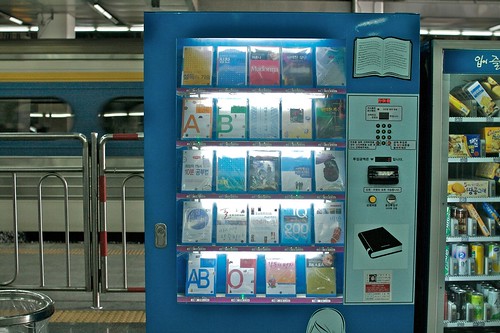
Yesterday, in a very small village in the French Alps, I ran across this fascinating bread vending machine. It made me think about other encounters with not-so-common machines such as a book delivery system in Seoul:

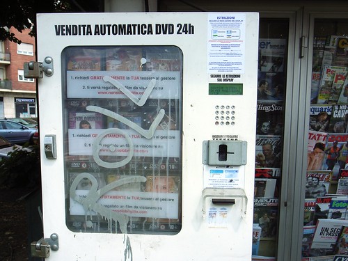
Or this pr0n vending machine in Torino:

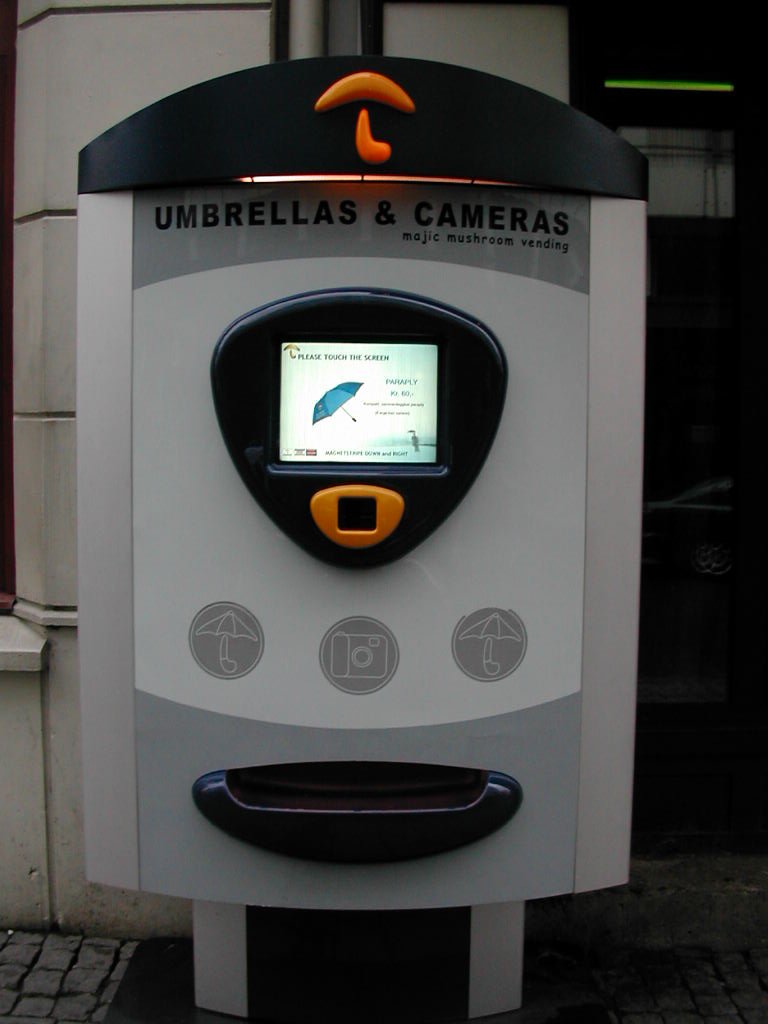
And the camera/umberall combo in Bergen, Norway:

Why do I blog this? Looking at what is sold in vending machine is an interesting cultural indicator that it's always refreshening to observe. It says something about convenience and what is "acceptable" to be served by a non-humans.

In the French "bread" case, an naive observer would say that it's the end of the world and no French people wants its bread to be delivered in such a mechanized way. To these, I would say that: (1) The French are definitely used to this sort of weird machinery: pizza making devices on parking lots started to appear here and there, (2) It's not because it's a machine that the bread is bad. You can't see it in the picture above but the bread pieces are wrapped in typical french paper, and the presence of flour in the machine makes it certainly more baker-like.

In addition, the understanding of such devices is tightly related to contextual issues. You don't find these machines anywhere. The camera/umbrella one in Norway is present in a touristic area (where rain is sadly common), the porn machine is located in a gloomy suburb in Torino (where other forms of newspaper shops are absent or much too difficult to visit with this kind of literature), the bread machine is located in a place where shops are totally absent and it can be used by people form the neighborhood (as a dropping point).

Now, why is this important in a blog about interaction design? Simply because these machines are designed by people... who certainly need to understand human needs, contextual issues, technological constraints and business model problems. They seem blank and not interesting but I actually find them intriguing.

Multitasking TVs at the airport

Stuck at the airport in Austin the other day, I couldn't help being fascinated by the three TVs in a café. Each of them was on a different program (news + sport 1 + sport 2) and the sounds of each channel was mixed with the background noise of the place (+ music). The different device sit there all day and broadcast their message continuously.

This situation did not prevent the avid users to follow what was going on at the time, especially because of the weird subtitles appearing right in the middle of the screen (with a certain delay):

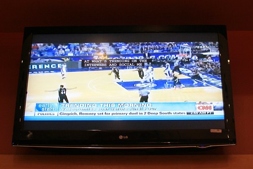
"... at what's trending on the interwebs and social me..." says the CNN person.

Why do I blog this? Fascination towards the deluge of information appearing at 5am in a café, and by the "interface" tricks to let people grasp small bits from this.

Some interfaces encountered in Los Angeles this week

Few examples of technology/software-enabled spatiality encountered in Los Angeles last week: First, this marvelous dashboard from a Toyota Prius, an energy monitor that dynamically gives indications to the driver. As soon as I got into the taxi, I became fascinated by this visualization, it looks like a weird video-game (especially if you consider the joystick-shaped gear selector that has no real mechanical link to the car).

Then this Google map itinerary printed on paper, definitely a classic nowadays:

This miniature keyboard seen at the flea market in Pasadena is also curious... sitting here in a previously human-inhabited kiosk:

Being a great fan of pet toys, this mouse-controlled mouse is a definitely stunning invention. Not just because of the mouse recurrence, but also because designing artifacts for non-humans may be intriguing:

And finally, this gorgeous "singing rock" that we ran across in Calabasas is one of those little things that express the seemingly human need to control nature:

Why do I blog this? Of course there are plenty of other objects, but these different "interfaces" struck me as fascinating this time in California. Mostly because they have various spatial implications and that they're all somewhat recent.

Hidden webcam: the reluctance to be observed

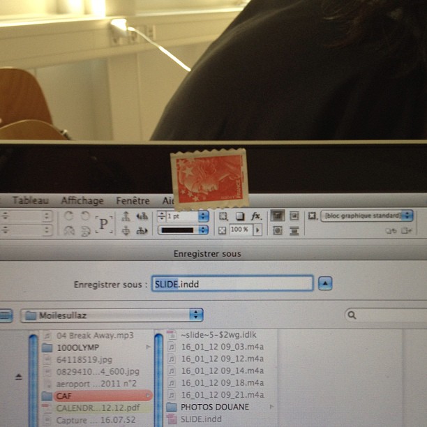
Observed on one of my student's laptop. He told me that he "did not want to be observed" (nor he wanted his laptop to be controlled from elsewhere). Which is why he he put a (French) stamp ("easy to remove", he told me) on the camera.

Why do I blog this? This is an interesting example of these little signs of how users try to reclaim a form of control on digital technology. Even if the laptop has a LED that indicates whether the webcam is working on not, this user prefers to have a better control on this device.

ENDCOMMERCIAL® / Reading the City

ENDCOMMERCIAL® / Reading the City is a book that Chris Woebken recommended few weeks ago via a quick exchange of 140-character messages. It's a fascinating object that is perhaps 102% in line with my interests (urban artifacts, classification, aesthetics).

This book is basically a compilation of pictures photographed by Florian Böhm, Luca Pizzaroni, Wolfgang Scheppe and published by Hatje Cantz Publishers. It is based on a exhibit located in Berlin back in 2002 and features an extensive exploration of New York City. The authors took this environment as a sort of generic city from which they could highlight certain aspects. Which was definitely the purpose of the authors, as they say, "it is about the represented not the representation" and their inspiration lies both in "scientific and ethnological photography and Claude Levi-Strauss" and "the device itself: the product line of electronic consumer goods. Digital cameras by japanese makers. Nikon, Canon, Sony".

Why do I blog this? What I found interesting in this work is that it's definitely more than a simple visual encyclopedia:

" I hope it can change your sensibility for your surrounding, a change in perception of the ordinary, a shifted view on something that has become invisible by its omnipresence. The images are arranges in a way that they have an effect on you, wake you up, make you see things for example reveal social and economic patterns that shape the modern urban enviroment, understand things in their context."

The way they sorted the picture is also interesting. Based on an inductive approach, they sorted the different themes and they created various "periodic tables" to define similarities and categories:

"WS: The quality of the diagrams is that of a taxonomy. A taxonomical order systemizes phenomenons due to analogies and similarities judging elements of their appearance. while analyzing and researching our archive we found similarities, types of figures, strange coincidences. after identifying these they were transformed in themes and subjects for new shootings and field researches. new material was collected to verify or falsify categories of the taxonomy.

FB: The Diagram was extracted from the material after screening and structuring the image archives into themes, not the other way around. In this way it is rather an empiric investigation with a result that could have not been anticipated fully in the beginning. The material reveals many aspects, sociological, political, economic, urbanistic etc... But we didn't plan for it to be anything."

As a final word, one of the best quote from the author about this work is certainly: "it is impossible to walk down the street without seeing social qualities in objects". This is clearly what this book depicts.

From Back to the Future 2 to a WIPO patent

It took 20 years to (finally) see a patent for self-lacing shoes. The Nike prop from Back to the Future 2 has indeed been shown in 1989 (with a non-automatic lacing version released as a collector in 2008).

People interested in rather low-tech solution can also have a look at this arduino-based version with utterly swell strapped micro-controllers and motors to a pair of Jordans.

Why do I blog this? Of course this is old news for the interwebs, but I find it interesting to collect examples of product featured in speculative movies that find their way to real artifact or intermediary artifacts such as patent. It's a good way to trace the evolution of product ideas from a Los Angeles studio to a huge server farm at the World Intellectual Property Organization near my apartment in Geneva. The fact that it took 20 years to see this move is intriguing too.

iPhone headset proxemics

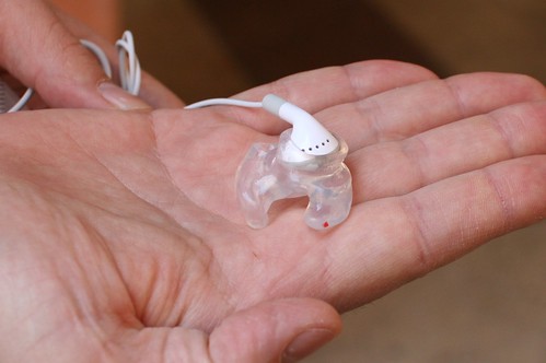
Although it's hard to see on this picture taken in Marseille last week, it represents the maximum distance between two persons using the same iPhone headset.

Collaborative usage of music if you want and headset proxemics.

Why do I blog this? Collecting behavior like this leads me to wonder about a new book project about categorizing such habits/practices... Besides, I am fascinated by the use of audio/sound interactions (as "non-optical augmented reality", collaborative practices, etc.).

Various clock-like devices to express time in public space

Why do I blog this? fascinating towards the diversity of clock-related devices to indicate time in public space. The first one is definitely my favorite as it's sort of absurd.

It's been a while that i collect such examples, I don't know what to do with them. Perhaps something will emerge out of this, a typology or sth else and I'd have to think about a design research workshop with students.

The design of cell-phone trees

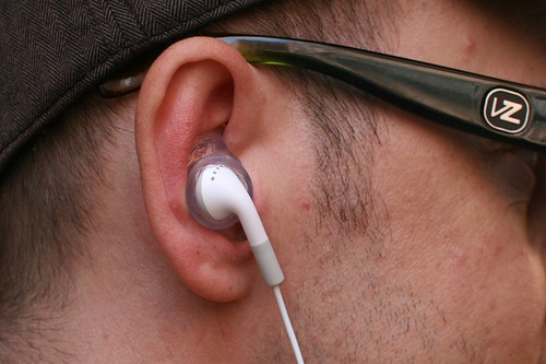
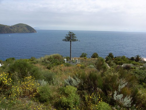
The ubiquitous presence of cell phone towers in urban and rural landscapes have led to protestation against their visual presence (the ugly mast/transmitter aesthetics) and their electromagnetic waves (which are invisible). A side-effect of people's "need" for uninterrupted connectivity, the design and building of phone towers is now influenced by various strategies. One of them consist in the use of camouflage techniques... and obviously the "natural" metaphor plays an important role here, as attested by these examples encountered in Lipari, Sicily last week.

Fake trees such as these palm transmitter species are great candidate but there are also other concealment possibilities such as fake chimneys, cross ("already a transmission tower of sorts", clock tower, water towers, etc.

As pointed out by Rick Miller and Ted Kane in their chapter on mobile phones in The Infrastructural City: Networked Ecologies in Los Angeles edited by Kazys Varnelis:

"the result is the camouflaged cell phone tower, the by-product of the only position available to communities who oppose cell phone towers, that is to demand their invisibility. Hiding its presence from public view, the ubiquitous cell phone tower camouflaged as a palm tree becomes an appropriate icon for the private infrastructural network of our day"

It would be intriguing to discover the whole design and construction process, especially how the the details have been taken care of. See for example the tower base and the antennas below... the design of the trunk, the branches and the leaves is of great quality, leading to some surreal piece of nature. Even more important here is the fact that the tree itself is (or must be) protected because it's an infrastructural installation that have inherent dangers for the genpop (electricity, etc.). The tree itself is just part of this ecosystem of components (electricity adapater, barriers, light system for night inspections, etc).

Why do I blog this? I see this sort of design as a curious sign of how certain norms lead to fascinating (absurd and perhaps depressing) solutions like transmitters concealed in fake trees:

  • Social and aesthetic norms about what should be visible or not and the type of tree/leaves that can be employed in an italian island.
  • Technological norms about how certain technologies should be protected, concealed or be accessible 24/7 (hence the presence of light).

Both French and Swiss systems

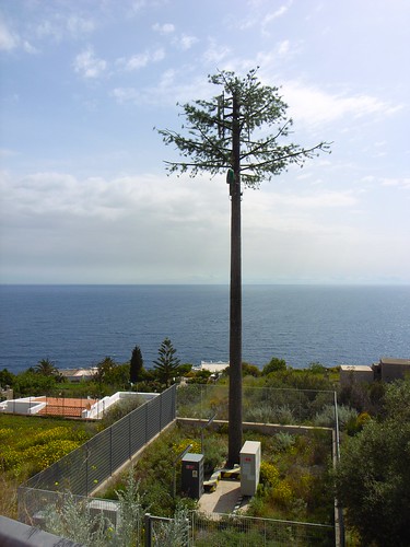
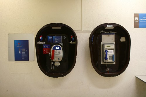
There's this part of the airport in Geneva that has this fascinating setting. Several remarks:

  • You have traces of both French and Swiss systems: two separate phone booths (Swisscom and France Telecom), two separate mailboxes (French and Swiss Posts), two different fire extinguishers
  • You have both phones and mailboxes because it's a joint airport between the two countries. But this is from the French part of the airport.
  • As usual with French enclaves in foreign countries, the institutions do not seem to care much about their devices... as attested by the fact that you have an old mailbox model... and the previous logo of France Telecom.

About gestures and mobile phone conversations

"Not crazy, just talking on the phone: Gestures and mobile phone conversations" by Carolyn Y. Wei is an intriguing paper I ran across recently. It basically focuses on a phenomena you may have certain notice: why and how mobile phone users engage in vivid nonverbal communication behaviors that do not benefit their communication partner (gesturing, smiling, and nodding their head). The most interesting part of the paper is about the design implications, such as creating mobile phones that can be sensitive to nonverbal communication behaviors (with paralinguistic social cues such as tone of voice, pitch, and volume). The "Jerk-o-Meter at MIT Medialab is based on this approach:

"The Jerk-O-Meter (or JerkoMeter) is a real-time speech feature analysis application that runs on your VOIP phone or cellphone that remedies precisely that experience. It uses speech features for activity and stress (and soon empathy) to measure if you are 'being a jerk' on the phone. The phone displays messages in case you are, and can also be setup to inform the person on the other end of the line that you're extremely busy."

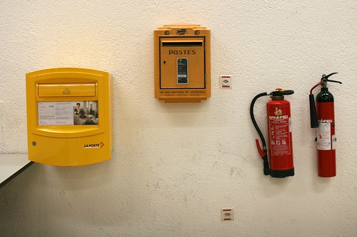
(A courier in Seoul who make gestures when using his mobile phone)

But the most intriguing one is described in the original article:

"Mobile phone design can also respect existing research that suggests gestures are more meaningful to the speaker than the listener, and thus focus on innovations that aid the speaker. An example of this kind of design would be a mobile phone that senses gestures or other nonverbal behaviors and compares them with the words being spoken. If the words being spoken match the amount and nature of gesturing, then the phone might alert the user that she is performing well. Light could be used in such an interface: if the user is gesturing and speaking very animatedly, then a light on the phone might hold steady to indicate appropriate activity. If there seems to be a disconnect, for example, where the user is not saying anything but still gesturing, then the phone could alert the user with a pulsing light that she might appear odd to others. Similar feedback could be offered with paralinguistic features such as volume to notify speakers that they may be speaking overly loudly."

Why do I blog this? Observing how people gesture when talking on the phone is a situation that I have always conducted with curiosity and fascination. Especially because you can see it as an indicator how these gestures are nearly more important for the speaker than the listener. It's therefore intriguing to see how mobile phone design can benefit from this.

Urban ratings: from flowers to @

Yesterday, I went to a small village in Savoy, France. This was a good opportunity to take a picture of these two forms of signage that are pervasive in this country. On the one hand, you have the common "Ville fleurie" ('flowered cities') which corresponds to a sort of rating French cities get to evaluate the presence of flowers. The more flower you get on the signage, the better it is. This classification is pervasive and it's very rare not to find it. On the other hand, you have the sort of equivalent for the 21st Century: the "Ville Internet" ('Internet City') rating. Instead of flowers, it uses "@" symbols to evaluate the quality of Information Technology infrastructure of the city.

What's funny is that it's very difficult to encounter this label. Especially because they're only placed at city entrance, which means that you only see them while driving.

Why do I blog this? A fascinating encounter, especially in this little town, it's interesting to see the evolution of the indicators used to show different aspects of urban flavor. The internet is now as prevalent as flowers in French cities.