Design

Internet time clock/watch

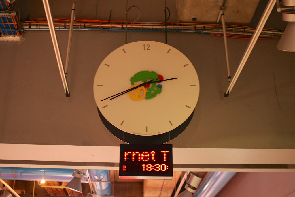
If you enter Centre Georges Pompidou, a cultural complex in the 4th arrondissement of Paris, and you wander around the basement, you may run across the clock represented on the right. The device looks rather standard, except for the colorful cogs, perhaps shown here as an echo of the high-tech architecture of the whole building. Another oddity you might notice is the LED display which gives a digital indication of the time, and a mysterious 3 digit number next to an "at" symbol.

This combination ("@ 452") corresponds to a new way to display time, envisioned by Swatch, a Swiss watch company. The idea was to divide up the mean solar day up into 1000 parts called ".beats" (which means that a ".beat" last 26.4 seconds). Each day begins at @000 .beats, which actually corresponds to midnight in Switzerland (CET: Central European Time) and the Internet noon is thus @500 (3am in San Francisco, 6am in New York). This simply means there are no time zones, and only time scale called "Biel Mean Time" (BMT), based on the city where the company's headquarters are located.

Besides this big clock, one may find such .beats on Swatch watches as well certain cell phone models, a video game and Linux GUIs. Apart from the company website, this "new" time display is now quite uncommon, but it should not prevent us to wonder about its origin as well as its cultural implications.

According to the Wall Street Journal, the Swiss company first presented the idea for "Internet Time" back in 1998 at the MIT Medialab's Junior Summit:

"The gathering of more than ninety children aged 10 to 16 from 54 countries was organized to discuss technology's impact on the younger generation. Swatch is a major sponsor of the Lab and has been for about five years. The idea was that far-flung people would use Internet Time to coordinate their schedules and socializing"

Also, this new time standard was supposed to be used for the Nation.1 project, a conceptual country based on the Internet and owned, populated and governed by the children of the world (!).

Aside from this intriguing origin, this "internet time" based on .beats is interesting from a cultural perspective for various reasons.

First, it is important to frame this project as one of the many initiatives to measure and manage time. Over the course of history, scientific and technical discoveries have led to the design of curious apparatuses to display the "passage of time". Think about how sand, oil, candles, ropes, sticks, mechanical pieces or nuclear technologies have enabled this. It's thus not surprising to see "the Internet" as part of an assemblage devoted to measuring time. However, unlike the usage of sand or oil to measure time, the idea here is not to use the technology (network infrastructure). The point is, instead, to benefit from the sort of temporal synchronicity created by the usage of internet platforms (email, Web, etc.) and claim the importance to live in a similar timeframe. Swatch internet time was meant to get rid of time differences and have a common reference. Said differently, it's as if the Swiss company had declared local time and place irrelevant. This is all good and nice except for a fact: the "origin" .beat (@ 000) corresponds to where their headquarters are located, which is not exactly very egalitarian.

Nevertheless, even if this "internet time" sounds curious and may have looked cool, this new time format suffered from path-dependence: " how the set of decisions one faces for any given circumstance is limited by the decisions one has made in the past, even though past circumstances may no longer be relevant". This phenomenon seems always an issue when it comes to changing people's habits.

Why do I blog this? documenting the subtleties of our everyday life.

Common misconceptions about design research

Last week I gave a two-days workshop about design research. It was part of a week-long seminar aimed at masters students from the two local design schools (HEAD–Genève and ECAL). We went through a quite intense set of activities ranging from lectures to drawing sessions, visit to the library, long arguments and exquisite corpse-like activities. My first objective was to describe what design research is, and the second to help students come up with "the research question", which looks like a Holy Grail for lots of them. We had various conversations about what research is, and how it's related to design. In doing so, lots of issues bubbled up to the surface and it was strikingly intriguing to list them. I took some notes about these and I turned it into a short presentation about the misconceptions about design research.

  1. Design research is what's produced when you don't have a client. It's personal project Well, this was a common perspective offered by students at the beginning. As we discussed, it seems that the way "research" is used in some of the participants' background lead them to think that we do research only when there's no problem to solve, no brief from a client. Research, in the academic sense, is about generating knowledge. What does it mean in a design context? Well, this quote by Bruce Archer express differently: “Design Research is a systematic search for and acquisition of knowledge related to design and design activity.” It's also a misconception because research projects are not done in a vacuum: there's a need to refer to the existing knowledge produced by other researchers, and funding bodies definitely influence what they want to fund. Also research can be "personal" but in general there's more than one person involved (colleagues, research partners...).
  2. Design research is what you do before designing a prototype, like user research for instance. The problem here is that design research is not limited to field research/ethnography. A relevant model to consider here is the one described by Christopher Frayling with the famous trichotomy of research about (e.g. history of design), for (e.g. ethnography to surface insights for design), and through design (discovering new insights/building theories based on artifact design). Design research corresponds to these three elements, but the third one is the most important... because of the relationship between theory and practice... which leads us to the third misconception:
  3. Design leads to artifacts (products) it doesn't produce theories. Yes, design produces artifacts but it doesn't mean that you cannot derive/generate theoretical insights based on this. The way objects are used, produced, repurposed can offer various perspectives that can be turned into different levels of theories, as showed by this quote from Alain Findeli: "due to his/her involvement in the object, the researcher will raise new questions, discover new approaches, and if he/she has talent, produce new theoretical models. I propose to call this method project-driven research". To discuss what it means practically, we used "Strong Concepts: Intermediate-Level Knowledge in Interaction Design Research" by Höök and Löwgren to discuss this. The paper describes a spectrum of knowledge one can abstract from particular design instances.
  4. Design research produces bad design. What designers express with this is their disappointment when they see the outcome of design research projects: artifacts which are not in line with the Zeitgeist or with tacit design criteria; and of course it's also related with certain fonts used on researchers slides, the lack of attention to certain graphic details (someone in class wondered about the 2-columns ACM template) and, above all, the fact that artifacts they see do not correspond to their level of expectations as designers (regardless of the theoretical insights produced). That's a good one as it's not so much of a misconception. There's indeed a lot of bad design outputs in design research and the community needs to do better. However, there are lots of exceptions to this and, the fact that artifacts produced by design researchers are bad does not mean that one cannot do better! As examples, we looked at various cases: Auger-Loizeau's Carnivorous Robots, Fabian Hemmert's work, as well as our own Curious Rituals.

Why do I blog this? Nothing better than a skeptical audience to learn how to frame your research topic/contribution. This seminar was highly stimulating. Plus, these misconceptions are interesting not only because there's a need to correct then. Most of them reveal how research is normative and it's sometimes good to push the boundaries a little bit!

"[Design can be …] The stable platform on which to entertain unusual bedfellows. The glue for things..."

““[Design can be …] The stable platform on which to entertain unusual bedfellows. The glue for things that may not be naturally sticky. The lubricant that allows movement between ideas that don’t quite run together. The medium through which we can make otherwise awkward connections and comparisons. The language for tricky conversations and translations.”

- Dr Ken Arnold, Head of Public Programs, The Wellcome Trust, London.

Read More

The representation of futuristic technology

An insightful excerpt from NASA/Trek: Popular Science and Sex in America by Constance Penley:

"the original star trek had a curious ambivalent relation to the representation of futuristic technology. Although the producers of the show consulted scientists, engineers, and technicians in their efforts to make the science and technology plausible, they decided finally to give only the barest and sketchiest of outlines to keep, for example the design of the ship and the various scientific, medical, and military instruments extremely basic and simple. Not only was this decision an economical one (for example, some of Dr. McCoy's medical instruments were made from salt-shakers), simplicity helped to ensure that the technology would not quickly look dated. "Phasers," "tricorders," "communicators,", "scanners", "photo torpedoes," and "warp drive" were therefore designed to reveal their functions without divulging anything about how they were actually supposed to work"

Why do I blog this? Currently working on a design fiction project in video format, we had to wonder about similar issues. In our project, the idea is to explore the type of curious gestures that may appear in five years time with the usage of new digital technologies. In the film, the characters will have things such as augmented reality glasses, brain-computer interfaces or "virtual closets"... which of course led us to wonder about the appearance of such devices. What kind of style should it reflect? How to avoid making them too glossy or passé? How can we taken into account vintage trends from 2017?

Interesting projects at Art Center

Two interesting project I saw yesterday at the Pecha Kucha organized at Art Center College of Design in Pasadena:

A Machine Frame of Mind by Brooklyn Brown:

"As the computational environments that surround us rapidly become more sophisticated will we continue to trust them more? If the computer can’t see something, does it not exist? When the world can be read by humans and machines, the way we perceive and interpret it will be radically different. (...) This research trajectory reveals the machine perspective as a source of pleasure, the result of radically different analytical capabilities, and the complicated creation of the abstract, computerized self.

The project suggests that the machine-readable world is something we are both constructing and should continue to design for in order to demystify and expose advanced technological processes."

Be My Satellite by Bora Shin About geospatial literacies:

"BeMySatellite is an initiative that aims to allowevery individual on Planet Earth to be uniquely documented by satellites.

The ultimate goal of this project is for everybody to appear at least once in a publicly accessible satellite image (such as on Google, Yahoo and Bing).

Using social network systems like Twitter andFacebook, we will assign instructions for participants to make a mark in certain locations when satellites will be passing overhead."

Why do I blog this? Two intriguing projects that I find relevant. If the former is close to "machine culture" issues that I'm interested recently, the second one is close to my long-time exploration of geospatial practices.

Rigor and relevance in interaction design research

Establishing Criteria of Rigor and Relevance in Interaction Design Research by Daniel Fallman and Erik Stolterman is a paper about the epistemological underpinnings of interaction design. It addresses the problem of ‘disciplinary anxiety’ that is often felt by people in this field and the inherent discussion about what constitutes ‘good research’ in terms of rigor and relevance. The author uses the following model, called the Interaction Design Research Triangle, to map out a two-dimensional space for plotting the position of a design research activity drawn up in between three extremes: design practice, design studies, and design exploration:

Some comments from the authors:

"The three forms of research do not randomly advocate certain research methods, techniques, or tools, instead they are a consequence of years of trial and error, practice, and experience, through and by which appropriate methods have emerged. The methods that have survived have been and are continuously tested against the purpose of the approach and they have thus proven over time to deliver the kind of results looked for in a way that makes sense. We therefore make the argument that the only way to discuss and examine rigor and relevance for interaction design research is to do it in relation to the three forms of research and to their particular purposes. (...) this is not done consistently in our field today. This sometimes leads to misunderstandings, confusion, and mistakes when design research papers and articles are reviewed, assessed, and evaluated. We argue that reviewers often come to apply the wrong notions of rigor and relevance to a particular research effort by not taking into consideration what form of research it is."

Why do I blog this? Currently writing a research project about the role of user research in interaction design, this kind of article is relevant to set the theoretical framework in the document I'm working on.

SXSW2012 talk about mind and consciousness as an interface

Yesterday at SXSW Interactive 2012, Julian and myself participated in a panel about "mind and consciousness as an interface". We basically covered the whole spectrum from the cultural backdrop (science-fiction movies, reiki approaches) to current technologies involved in this. We also concluded about the interaction design issues and limits at stakes. See the slides below: [slideshare id=11971769&doc=2012-sxsw-brain-final-2-120312073507-phpapp01&type=d]

Touch technologies in shared public toilets

Towards Touch-Free Spaces: Sensors, Software and the Automatic Production of Shared Public Toilets by Martin Dodge and Rob Kitchin is an essential read for anyone interested in how software-enabled technologies have implications at various spatial levels. In this case, it's about touching things with hands (pressing of buttons, pulling of handles, flicking switches, twisting selector dials), a relevant situation to understand the "nature of the recent automatic production of touch-free spatiality".

(Toilet interface in Geneva)

Some excerpts that fascinated me:

"in spite of the hype and some potential benefits from touch-free technologies for enhanced convenience and hygiene, their real world implementation is always imperfect. The incomplete deployment of sensors and software across the sequence of activities (including opening doors) means that toileting as a whole can never be rendered fully touch-free and the bathroom fails to become a completely automated code/space. (...) Touch-free technology is almost always implemented partially, and also partial in different ways, which can make for user frustration as one is uncertain about how bits of an unfamiliar bathroom are meant to work: ‘so where do I wave my hands to get some soap?’. (...) The danger is then that toileting is set to become an over-determined activity. Attempting to make avowedly simple activities touch-free with digital sensors and software algorithms is simply unnecessary it could be argued, and an excess of automation in the bathroom could be critiqued as an example of disciplining the body through ‘technological paternalism’ "

Why do I blog this? Being interested in the usage of digital technologies in various places as well as the implications of automation, this is a good example of how to explore a specific locus of interaction.

Structured curiosities: personal approach to design projects

In California this week for a workshop at Nokia Design about location-based services. Today at lunch, I also gave a brownbag seminar about my approach to design/innovation projects. Here are the slides of the presentation:

[slideshare id=11572970&doc=2011-nokiadesign-brownbag-120214154307-phpapp02]

Why do I blog this? It was a good opportunity to finally step back and describe informally how I work, what I'm interested in and what kind of assumptions I have when carrying out projects (self-funded or with clients).

Devices showing their inner selves

I found this gem on the website of the Evil Mad Scientist Laboratories:

"Meggy Jr RGB is a new kit that we designed as a platform to develop handheld pixel games. It's based around a fully addressable 8x8 RGB LED matrix display, and features six big fat buttons for comfy game play. (...) A unique feature of Meggy Jr RGB is that it is designed to be mounted inside a "handle set" -- a wooden or plastic case that's safer and more pleasant to hold than a bare circuit board. You can make, mod and customize your own handle sets to suit your taste-- These are like faceplates in that you can switch whenever you want to suit your mood or the game that you're playing, however different handle sets can radically change what the Meggy Jr looks and feels like. Above, you can see what our basic handles (left) look like, as compared to a set of custom smoke-colored batwing handles (right)."

And you can even make your own handle (or to have them fabbed) on platforms such as Ponoko or Pololu. I'd be curious to test it and see whether the interface itself is easy to play with, without a shell.

Why do I blog this? What fascinates me, beyond the fab/open platform, is the device aesthetic. That might be the equivalent of Centre George Pompidou (Beaubourg) for digital devices! Showing the internal guts of a technical apparatus is an intriguing approach that can be traced back to other architecture/industrial design traditions. It can be about making things visible and transparent to the users/people.

It also reminds me of this Mehmet Erkök’s Extreme Personalization phones. The phone shell, personalized in a very expressive way, can be seen as an interesting approach to customization:

"it’s not the strangeness of the work as much as their thinking process that counts"

An interesting excerpt from the interaction12 day1 report by Johnny Holland about Antony Dunne's speech "Crafting Design Speculations":

"One audience member did ask the obvious question: where is the role for such out there work in everyday interaction design? His answer was that these students come from work and many return to the commercial field being employed by big corporations: it’s not the strangeness of the work as much as their thinking process that counts."

Why do I blog this? that's simply a good quote/answer to the question since it reflects the value of design.

PHOTO/NYKTO: a game played by switching on and off the lights

PHOTO/NYKTO is a project designed by my colleague Annelore Schneider & Douglas Edric Stanley at HEAD in Geneva:

"« Photo/Nykto » is an experimental game conceived by Annelore Schneider and Douglas Edric Stanley as part of the « Unterplay » project at the Master Media Design —HEAD, Genève. It is a game for nyktophobes and photophobes. It is played by switching on and off the lights in order to avoid reaching the edge of the screen. The score increases exponentially near the edges, and speeds up with each change from light to dark and back."

Why do I blog this? Fascinating gameplay!

About location-based advertising

Few articles raising doubts about location-based advertising: Unni, R., Harmon, R. (2007) Perceived Effectiveness of Push vs. Pull Mobile Location-Based Advertising. In: Journal of Interactive Advertising, Vol. 7, Nr. 2:

"Pull LBA fared better than push LBA. However, value perceptions of LBA and intentions to try this service appear to be quite low. Also, privacy concerns relating to location data were high, and perceived benefits were low. (...) Interestingly, initial surveys by market research agencies such as Driscoll and In-Stat showed a high level of interest and willingness to pay for location-based services such as navigation (driving directions), maps and guides, and traffic updates. Unlike LBA, these services are perceived to be more utilitarian and hence benefits and perceived value are easier to communicate. Results of our study show that the perceived benefits from LBA are low."

Banerjee, S. & Dholakia R.R. (2008) Mobile advertising: does location-based advertising work?, MMA International Journal of Mobile Marketing,

""location inertia" seems to characterize consumer responses from a private location. We use the term location inertia because this relative unwillingness to shop when advertised in private places has nothing to do with geographical distance from the store. In the LBS scenarios, private or public locations, the distances of the advertised store were specified as exactly the same (less than 0.1 mile away) but it appears that the actual distance does not matter; despite knowing that the store is the same distance away, a consumer is less likely to avail the offer when the ad is received at a private location than a public location. (...) The example of mobile advertising discussed in this paper can be simply viewed as an Internet pop-up ad that has traced the consumer's location and accordingly appeared on his mobile phone."

Why do I blog this? I'm not necessarily into this kind of application but I'm often asked by clients and journalists about the co-called "effectiveness" of using location-based ads in a "push" mode. My general understanding of these technology is that users find it intrusive and not very useful but it's good to have more data up my sleeve to discuss the complexity of people's perspective on this.

The main problem I see in the research papers about this is that they generally focus on projective methods (as opposed to following people using location-based advertising platforms).

From idiosyncratic detail to design

Preparing my course about interaction design next week, I got back to the work by Bill Gaver about cultural probes:

"Tactics for using returns to inspire designs

1 Find an idiosyncratic detail: Look for seemingly insignificant statements or images.

2 Exaggerate it: Turn interest into obsession, preference to love, and dislike to terror.

3. Design for it: Imagine devices and systems to serve as props for the stories you tell. 4. Find an artefact or location. - Deny its original meaning. What else might it be? - Add an aerial, what is it? - Juxtapose it with another, what if they communicate?"

Why do I blog this? Although the quote above is about probes, this is exactly the sort of direction I try to show as an alternative to "standard" (or utilitarian) user-centered design. As a design exercise, it would be good to use this in a cadavre-exquis way (observation/design/observation/design...).

Weeknotes

Always good to do some weeknotes once in a while, as a way to reflect what has been done in the past few days. Monday was devoted to Lift12, working on the program of the upcoming conference in Geneva... getting the ducks lined up, discussing with the last speakers, calling people interested in workshops.

Tuesday was a conference day, at the Serious Game Expo in Lyon, France, where I participated in a session about location-based games with Mathieu Castelli, as mentioned in my earlier post. It was also a good occasion to catch up with him and test his new project called Meatspace invasion. The rest of the day (4 hours of train and the whole afternoon) has been spent on data analysis: videos and picture from a field research projects that involves mobiles phones and 3D.

Wednesday was a mix of discussion with masters students at HEAD-Geneva about their masters thesis, the monthly meeting with colleagues and... a session of data analysis (for the aforementioned projects)... and a 3-hours workshop at EPFL in which we engaged engineers in a series of creative activities to design an accessory for book reading (based on assignments such as post-its brainstorming and drawing exercises with storyboards).

Thursday was a combination of client meetings, data analysis, fondue with the friend at Bookap in Lausanne and a workshop with a client (an electricity utility) that finished with a cooking workshop in Vevey.

Today was a conference day, the annual Swiss Design Network conference in which I participated in a panel about design research, games and cognitive sciences. It was a good opportunity to meet up with like-minded people such as Gesche Joost, Martin Wiedmer, Alain Findeli, Massimo Botta and the guys from emphase.ch.

Get inspiration from artifacts

Found in "Design as art" by Bruno Munari, Penguin, 2009

"Go into the kitchen and open the first drawer you come to and the odds are you’ll find the wooden spoon that is used to stir soups and sauces. If this spoon is of a certain age you will see it no longer has its original shape. It has changed, as if a piece had been cut obliquely off the end. Part of it is missing.

We have (though not all at once, of course) eaten the missing part mixed up in our soup. It is continual use that has given the spoon its new shape. This is the shape the saucepan has made by constantly rubbing away at the spoon until it eventually shows us what shape a spoon for stirring soup should be.

This is a case (and there are many) in which a designer can learn what shape to make the object he is designing, especially if it is a thing destined to come into frequent contact with other things, and which therefore takes it particular shape according to the use to which it is put."

Why do I blog this? I find that this excerpt is a good example about how objects (reflecting traces of human activity) can lead to inspiration in design. Will try to use this in the workshop at ENSCI tomorrow.

"degamification" as a design tactic

(Via Tom Ewing and metagaming) An intriguing question addressed on blackbeardblog:

"So presumably the removal of game mechanics from things which possess them might also have an effect on those things. And then I had to ask: would the effect of that removal – that degamification - always be undesirable? I think it wouldn’t.

Part of the reason I think this, I admit, is my own experiences playing Dungeons and Dragons and other tabletop games in the 80s and 90s, when the more I immersed myself in the hobby the more I was drawn to rule-light or even rule-free systems. D&D has – as you’ll know if you ever played it – a vast and hydra-headed system of rules. At first we would modify them, as almost all players did – dropping the ones that weren’t fun. But eventually we abandoned the rules entirely, shifting to what used to be known as “freeform” gaming – something more like interactive storytelling.

The reason we did this is that we’d reframed the aim of the activity to be creative rather than simply competitive or even co-operative. Once we’d done that, the game mechanics became a hindrance to play, rather than a spur."

Why do I blog this? The idea of "degamification" as a design tactic is interesting and the author presents it in a compelling way. What I find important here is that the removal of certain external rewards can be relevant for participants over time, "handing over more responsibility and autonomy" as said in this blogpost.

For those wondering about how this "subtraction"-oriented design approach can be applied, the author also gives an example:

"Tumblarity – the short-lived popularity measure on Tumblr introduced back in 2009, which had the effect of radically jacking up engagement and activity but in directions Tumblr management allegedly didn’t expect or like. So they degamified the site, removing Tumblarity, and found that the popularity of their service continued to grow but that the artificial metric no longer distorted the content on it quite so much. The behaviour Tumblarity artificially encouraged - chasing popularity, content inflation, and so on - didn’t go away, but its levels stayed manageable. Degamification rewarded its creative users at the expense of its game-playing ones."