SpacePlace

"Grand Theft Auto V" level design

Fantastic article about "Grand Theft Auto V" level design. It's a very interesting account of their process with "location scouts, architectural historians, off-duty police, DJ Pooh and our own research team." The description about how they dealt with light as well as the diversity of geographical signifier Some excerpts:

"Our process has been to block the world in quickly and then collate our reference and build out each part till we hit a good visual bar and a reasonable level of solidity. This is probably where in the past we would have stopped and finished off. Instead, we have done pass after pass of refinement for all sorts of reasons. Simply, does it look good enough? Does it play well enough? Does it feel distinctive? Does it sit well with its surroundings? Does it get across the character of the area we’re trying to create? How does it sit in terms of vistas and general sculptural composition? Do we need more color, contrast, branding, or lighting? Does it feel weathered? Does it have a sense of place and history? Can we layer story over it, whether through ambient, “generalized story” (who lives here, what have they done to the place, who lived here before them, where do they shop, what do they do for fun, do they keep their garden nice, do they have a fetish for gnomes and pink flamingos?) or whether it’s layering our actual story over it: mission detailing, filling out areas that belong to characters, random events or beats, and random characters you might meet. We take all the elements the story and mission guys add and layer more detail over the world based on it. [...] I know there are bigger games out there geographically, but I don’t think there are in terms of content. I want to stress that not only is this world huge but it’s absolutely handcrafted. Every little bit of this world has had a large number of extremely talented artists pore over it. There’s always something to discover, something weird or interesting to see or interact with. It’s absolutely not a massive, empty world. We’ve considered the placement of every tree. We’ve simply not copied buildings around the map or procedurally generated the terrain to pad it out. It’s all handcrafted, all unique, and we’ve gone over it all again and again and again to make sure there’s enough layering of detail that I don’t think many people will ever see everything we’ve put into the world. That in itself, though, means that most people will have different experiences."

I also love the way they understand the complexity of spatial experiences ("Even elements like the radio and their ads have an influence on the map.") and use these kinds of tricks in the game. Why do I blog this? Fascination towards the recreation of Californian space and the way it's addressed to engage players.

Representing the city as it's lived: livelihoods

It's been few days that I'm following the the livehoods.org/ and it's quite interesting.

The project is defined as follows:

"Livehoods offer a new way to conceptualize the dynamics, structure, and character of a city by analyzing the social media its residents generate. By looking at people's checkin patterns at places across the city, we create a mapping of the different dynamic areas that comprise it. Each Livehood tells a different story of the people and places that shape it. (...) The hypothesis underlying our work is that the character of an urban area is defined not just by the the types of places found there, but also by the people who make the area part of their daily routine. To explore this hypothesis, given data from over 18 million foursquarecheck-ins, we introduce a model that groups nearby venues into areas based on patterns in the set of people who check-in to them. By examining patterns in these check-ins, we can learn about the different areas that comprise the city, allowing us to study the social dynamics, structure, and character of cities on a large scale."

Why do I blog this? Working on a similar topic, I quite enjoy this kind of research work. The idea that social media data can be employed to understand areas as lived by people is fascinating and highly intriguing to test. It's somehow what one can call a "social map" and we now have more and more data to see how it would look like.

Mysteries and Curiosities map of NASA Jet Propulsion Laboratory

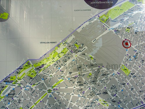
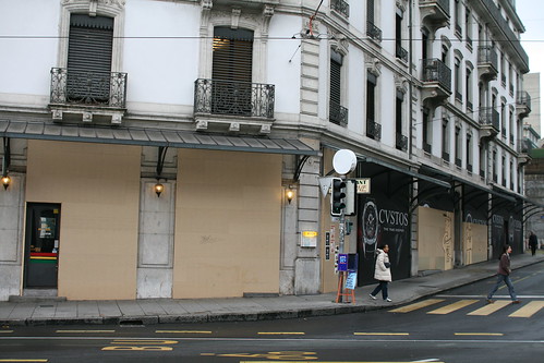
Two weeks ago, when in California, Luke Johnson gave me this fantastic (and sort-of psychogeographic) map of
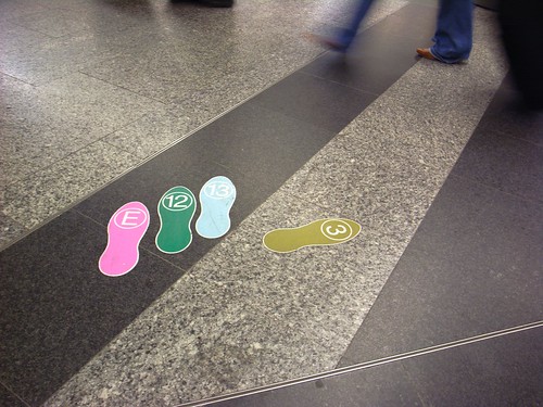
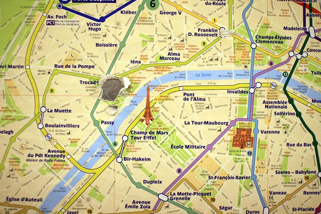
 NASA Jet Propulsion Laboratory. The project is called "Mysteries and Curiosities Map of JPL: How can design influence an established culture?" and it has been conducted by Luke and a bunch of other people.

As described by the website, "The map functions as a tool to orient new employees, encourage Lab explorating for current employees, and to put a human face on JPL for the outside public".

As described by Luke:

"For a place that depends on logic and reason, the Lab's layout is anything but. In fact, a running joke at JPL is that its employees need to use GPS to find their way around the Lab. For one, buildings have numbers instead of names. Secondly, buildings are ordered in the number in which they were funded, instead of by location. For example, Building 67 is perplexingly located between Buildings 238 and 138. 
Intrigued by this dichotomy and wanting to know more about JPL aside from the four walls of my cubicle, I came up with a plan. Armed with a GPS tracking device, camera, and a trusty pair of shoes, I walked to every building on Lab in numerical order. What I thought would take a Saturday afternoon took 22 hours over the span of four days at a walking distance of 52.2 miles. 
The resulting map is a reflection of this wacky experiment, research at the Lab's Beacon Library, and conversations with other JPL employees. The map itself is divided into two sections. The front is an Insider's Guide to JPL, containing information I wish someone had explained to me when I began working at the Lab."

Why do I blog this? Having been to CERN yesterday morning with the Lift12 speakers made me realize how such maps of big research facilities can be relevant as a way to not only describe spatial material but also stories and cultural content related to these intriguing places. Quite a nice project!

Pixels Per Person: making WiFi networks tangible

Pixels Per Person by Carina Ow is an inspiring design project that looked at how to give a tangible existence to the public WiFi network in the city of Geneva:

"In images, WiFi connections are usually represented as a series of fluctuating waves derived from signal strength indicators that fall and rise according to the strength of the WiFi connection. This inspired the creation of a system that would not stay static, but would instead be in a state of constant motion. To represent this idea, each installation takes the form of a dynamic OLED surface modelled differently each time depending on the characteristics found on site. Organic LEDs (OLEDs) were specified for surface of the installations because they work both in the light and dark, and can therefore contribute to the spatial quality of the installation site at night. (...) The graphical system is designed as different configurations of these pixels forming pixel images derived from classic Wi-Fi signal motifs. Depending on the total number of users connected to the network, the image will change to reflect the network traffic, i.e. the more users, the more pixels used in the composition of the image. The pixel images morph between themselves in a pre-defined transitional animation."

Why do I blog this? Because of my long-time interest in representation the digital envelope of urban environments. This project is intriguing as it represents WiFi usage and aims to induce a sense of participation and ownership in the users.

The smart city backdrop

"It should come as no surprise that the design and development of urban informatic systems is currently dominated by people coming from a background in web design. Despite the fact that these are very smart, extremely talented people, they struggle - as we all do - with the received assumptions, latent biases, and hidden agendas that one's background inevitably brings to the new and relatively uncharted territory. So you find urban system designers that can't help but view the city as a website"

Mark Shepard, "Toward the Sentient City", Sentient City: Ubiquitous Computing, Architecture, and the Future of Urban Space, 2011

Why do I blog this? The perusal of this excerpt from Shepard's book about urban informatics, on my way to Marseille for Lift France 2011, immediately echoed with my own feelings. What he expresses here, was actually a footnote but I found it quite important to highlight an interesting phenomenon. This footnote was related to a part of the book intro in which Mark Shepard describes that the underlying logic of "smart cities" can sometimes be limited to functionalist views such as "a searchable city with an easily accessible shopping cart". More specifically, this quote echoes with my feeling when using various mobile services/apps (public transport, restaurant review, location-based signage, augmented reality...).

Urban dérive on the (urban) information superhighways

This video of two Japanese guys using Google Streetview to visit the USA from their living room is quite fascinating.

It's not necessarily the numbers that caught my attention (90 hours, 104,619 clicks, lots of energy drinks). Of course, they're quite extreme but what's curious here is the practice itself. Unlike some commenters who fund it useless and pathetic, I find it rather curious and intriguing as a human practice.

This made me think about a recent project by French writer François Bon called "Une traversée de Buffalo" in which he gives an account of how he lost himself in this area of North America using Google Earth (via).

On the same topic, it's clear that the recent release of Liberty City Streetview map by GTA4net is also relevant (via). It basically allows you to "plunge into the boroughs of Liberty City from the safety of your own chair". But again, this is only a partial view. The point is not just use this as a complement of the game... exploring this Street View map is a game in itself (a playful activity let's say).

Why do I blog this? This kind of (extreme) practice can be considered as an intriguing signal for narratives or services that would tell stories in new ways. A sort of dérive is happening here.

Habitar: bending the urbran frame

For researchers and designers interested in urban informatics and architecture, the HABITAR exhibition at LABoral Centro de Arte y Creación Industria seems to be a great pick. The curator (José-Luis de Vicente) and his conceptual advisor (none other than Fabien) describe it as:

"The new urban landscape is no longer predicated solely on architecture and urbanism. These disciplines now embrace emerging methodologies that bend the physical with new measures, representations and maps of urban dynamics such as traffic or mobile phone flows. Representations of usage patterns and mapping the life of the city amplify our collective awareness of the urban environment as a living organism. These soft and invisible architectures fashion sentient and reactive environments.

The Habitar project offers a journey through these emerging urban scenarios. It is a three-dimensional catalogue of projects and images by artists and design and architecture studios, as well as hybrid research centres and media labs. It is an overview of the practices, tools, solutions and languages that are being developed to negotiate every day life in this new urban predicament."

The artists, designers and researchers who contributed to this are: Timo Arnall, Julian Bleecker, Ángel Borrego - Office for Strategic Spaces, Nerea Calvillo, Citilab-Cornellà, Pedro Miguel Cruz, Dan Hill, IaaC - Instituto de Arquitectura Avanzada de Cataluña, kawamura-ganjavian + Maki Portilla Kawamura + Tanadori Yamaguchi, Aaron Koblin, Philippe Rahm architectes, Marina Rocarols, Enrique Soriano, Pep Tornabell, Theodore Mohillo, Semiconductor, SENSEable City Lab, Mark Shepard.

The catalogue of the exhibit (PDF) also features 8 essays from Benjamin Weil, Molly Wright Steenson, Bryan Boyer, Usman Haque, Anne Galloway, José Pérez de Lama and myself.

Why do I blog this? I see this exhibit (that i still have to explore) as an important landmark in the evolution of urban informatics. The projects and abstract considerations describes in the catalogue can be seen as interesting pointers to what I see as the most intriguing issues and topics in the field.

Crowd dynamics determined by more than physical constraints

A long time ago, while still doing a bachelor degree in biology, animal cognition was a pet project of mine. Ants and bees or ethology methods were highly intriguing and paved my way towards more technology-oriented studies of behavior. I still keep an eye on this field and the following paper from one of the lab I followed recently caught my attention (via): Moussaïd M, Perozo N, Garnier S, Helbing D, Theraulaz G (2010) The Walking Behaviour of Pedestrian Social Groups and Its Impact on Crowd Dynamics. PLoS ONE 5(4).

(Pedestrian flows in Toulouse, France as observed in this study)

Some excerpts I've found interesting (my emphasis):

"Human crowd motion is mainly driven by self-organized processes based on local interactions among pedestrians. While most studies of crowd behaviour consider only interactions among isolated individuals, it turns out that up to 70% of people in a crowd are actually moving in groups, such as friends, couples, or families walking together. These groups constitute medium-scale aggregated structures and their impact on crowd dynamics is still largely unknown. In this work, we analyze the motion of approximately 1500 pedestrian groups under natural condition, and show that social interactions among group members generate typical group walking patterns that influence crowd dynamics. At low density, group members tend to walk side by side, forming a line perpendicular to the walking direction. (...) when crowd density increases, the group organization results from a trade-off between walking faster and facilitating social exchange."

Why do I blog this? what is interesting in this work is that the crowd dynamic model should take into account the presence of people who put more emphasis on social activities than on movement efficiency. It basically shows that pedestrian flows are complex and not determined by physical constraints induced by other pedestrians and the environment, but also significantly by on less utilitarian reasons (communicative, social interactions among individuals). This result is perhaps taken for granted in the social sciences but it's curious to observe it with this kind of modelling work.

All the movements made in the space of one year by a student

The famous drawing extracted from "Theory of the Dérive" (Théorie de la Dérive) by Guy Debord. As explained by the author:

"In his study Paris et l’agglomération parisienne (Bibliothèque de Sociologie Contemporaine, P.U.F., 1952) Chombart de Lauwe notes that “an urban neighborhood is determined not only by geographical and economic factors, but also by the image that its inhabitants and those of other neighborhoods have of it.” In the same work, in order to illustrate “the narrowness of the real Paris in which each individual lives . . . within a geographical area whose radius is extremely small,” he diagrams all the movements made in the space of one year by a student living in the 16th Arrondissement. Her itinerary forms a small triangle with no significant deviations, the three apexes of which are the School of Political Sciences, her residence and that of her piano teacher."

Why do I blog this? Tracing some documents and insights about chronotopic representations.

"The World As Seen From New York’s 9th Avenue"

While discussing the Here and There project by BERG with Etienne, he pointed me on this great New-Yorker cover from 1976 by Saul Steinberg. Entitled "The World As Seen From New York’s 9th Avenue", is directed towards the West (Europe is absent as if the authors wanted to turn is back to it) with the big-rectangled USA right across the Hudson river and then the Pacific with foreign countries such as Japan, China or russia.

Why do I blog this? There's a lot to be drawn here concerning the implications of such representation of course (see here). However, I was rather intrigued by this sort of mapping that represents a subjective view of the world, and how this sort of viewpoint could be curious for paper map design.

Mountain cues

La Pointe Perçée The presence of patina on mountain rocks is an interesting "footsteps in the snow" sign: the activity of people modify the environment, which in turn reveal relevant cues for other persons. Especially when hiking in a rocky environment. It allows to find your way and avoid unnoticeable crevasse and cracks.

Mountain cues

Pacman maps

Been stuck into Pacman maps and cartographic representations lately, as the one above (that represents the "strawberry and first Orange" levels. I found the one above at this Unified Resource Locator when practicing random combinations of keywords on the Google (an activity I often carry out with a keen interest).

I do not really know why but they seems highly peculiar and remarkable, perhaps as a seminal depiction of video game levels; in other words, one of the most important (and early) representation of a digital environment based on a metaphorical grid (Not to mention the 256th "split screen" special).

Beyond this map metaphor, what is also intriguing is the solution possibilities, which are based on the fact that Pacman works on a deterministic but not random. What I mean here is that the opponents you have to escape from have very specific kinds of behavior. Each ghost has a specific role (chaser, ambusher, fickle and stupid). As explained on the Wikipedia:

"enabling experienced players to devise precise sequences of movements for each level (termed "patterns") that allow them to complete the levels without ever being caught. A later revision of the game code altered the ghosts' behavior, but new patterns were soon developed for that behavior as well. Players have also learned how to exploit other flaws in the ghosts' behavior, including finding places where they can hide indefinitely without moving, and a code bug occasionally allows Pac-Man to pass through a non-blue ghost unharmed. Several patterns have been developed to exploit this bug. The bug arises from the fact that the game logic performs collision detection based on ghost / Pac-Man occupancy of grid squares, where the grid squares are large relative to the size of the characters. A character occupies (for collision detection purposes) only one grid square ("tile") at at time, despite its graphic depiction overflowing to another tile. If a ghost and Pac-Man switch tiles with each other simultaneously (which is not a rare phenomenon, because the tiles granularity is large), a collision isn't detected"

The solution is about finding patterns about the grid and artifacts' behavior, which is something some players understand and some others never get. At least, some who did, took some time to get it or were told to spot a pattern.

Why do I blog this? Pure curiosity towards this historical piece of culture. There must be something to nail down here about Pacman's grid (and players' behavior) as a metaphor/vehicle for discussions nowadays about the advent of augmented maps. We all know the cartographic representations updated in real-time (or in a more asynchronous way) and based on the aggregation of digital traces. Mapping the use of cell-phones for instance to highlight urban activities with a platform such as Citysense.

To what extent the "instant maps" based on the collecting of digital traces will require users to perform the same pattern analysis than Pacman maps? Should it be like them? different? How can we formulate the difference and help users to spot patterns?

But wait. What is pattern anyway and why do we need to reveal them to people in the first place?

Space, from above

"By looking at the satellite image we extract ourselves from our particular point of view, yet without, bouncing up to the bird's eye view; we have no access to the divine view, the view from nowhere. We go from our bounded view to a sliding view that will carry us from a labyrinth of transformations to the general frame in which our daily action is set – and that will never be more than a few square centimetres big. The frame has the same dimension, in a sense, as the object it frames. The big is no bigger than the small"

"Paris ville invisible" by Bruno Latour and Emilie Hermant (1998).

Why do I blog this? writing a piece with Julian about urban computing leads me to revisit this nice book by Latour.

Map incompleteness

Incomplete map Map incompleteness is something that I am very intrigued about. As shown in the example above taken in Paris, the city itself is well represented but as soon as you leave the "périphérique" (the highway-like infrastructure that surrounds the french capital), it's a blank grey void as if no one leaves beyond this limit. It's a phenomenon you also encounter with weather maps as you can see below: weather forecast generally stops at the border (clouds don't go through the customs, do they?). You can see the swiss map as if it was a stand-alone territory (lots of countries do it anyway).

R0020461 (1)

Why do I blog this? Map incompleteness is understandable in terms of information design: the use of "white space" can be relevant to "balance composition and induction properly". Designing maps and signage is a matter of simplification so that people could easily grasp the situation at hand. However, in both situations above I am often bothered by the simplification; not that I need to go across the border and would be happy to know the temperature, rather because it discretized phenomena that should be represented as continuous.

300km per hour

tgv "Ladies and Gentlemen, our TGV is running at its maximum speed at 300 kilometer per hour" as announced by the train controller. Revealing the company's (and country's) pride? Informing passengers of service quality (assuming that speed is quality)? Telling consumers that they're taken care of by recurring feedthrough information?

When surface has more value than volume

Geneva's new ad frenziness A picture I took yesterday morning in Geneva. It shows an interesting (and sad) trend lately in the city: the disappearing of mom and pop's shop which are now so expensive to rent that it's more valuable for certain luxury companies to use the shop as a billboard structure. In the case depicted above, the former DIY shop on the right has been turned into a billboard for a watch company (but of course some cool graffiti-makers attacked it). The portuguese restaurant showed on the foreground (left) has also recently been turned into this kind of surface: the wooden structure will soon be covered by crappy watch ads.

In the end, we have an empty volume with this super-expensive surface.

Why do I blog this? this quick thought ("surface more valued than volume") while walking around there yesterday led me to think about how spatiality is a complex issue. It's kind of weird to think about this sort of practice.

Vodafone's receiver on space/geoweb

In the last issue of Vodafone's receiver, which is about "space", there is an interesting overview of the geospatial web (aka GeoWeb) by Sean Gorman. The article examine how these technologies allow to understand spatial and social phenomena. Starting by a quick overview of the field and how it shifted from cartographers and geo-scientists to hackers and programmers, Gorman describes the different possibilities enabled by such technologies: from mash-up to mobile application (unfortunately using again the sad restaurant-rating example).Why do I blog this? useful material to write a chapter about the history of location-based services. The article by Jonathan Raper is also pertinent as it uncovers principles about what "digital geography" can offer.

Bystander in ubiquitous computing

In the CatchBob! project, the location-based game I used for my PhD research, players often reported the encounter with other persons puzzled by the presence of running people with TabletPCs. The general reaction of passers-by seemed to range between ignoring the game to asking players about how to participate in trials. However, the physical environment is an overlap of lots of activities carried out by different groups and individuals, which can be conflicting. In one trial, two players tried to visit one of the campus library and the janitor forbid them to enter the building carrying out the game TabletPCs. This kind of phenomenon unfortunately undermines the engagement of players in the game, turning the experience into something less fun to achieve. This problem has been investigated by researchers, as shown by this warning quote from one of the deliverable from the European iPerg project entitled "Designing Pervasive Games":

"Pervasive games introduce an important problem: when a game is expanded, the bystanders do not always have the means to distinguish game events from the non-game events. However, regardless of whether they know or don’t know about the game, they perhaps should have a choice pertaining the mode of attendance, i.e., they should be given chance to play, or ignore the game and appreciate it as an art artefact, or view it as a morastatement. Otherwise, the game is can lead to ethical and practical problems. (...) Whether unaware or aware of an ongoing game, bystanders have no intention or opportunity to participate in it or at least no opportunity to do so. Here, we probably find the most challenging effects of social expansion. Socially unexpanded games are typically completely insulated from bystanders: they are not affected by the game (even if aware of it) and they have no influence over the game."

Why do i blog this? The presence of bystanders in some pervasive games or ARG is interesting as it shows how the notion of "user" in ubiquitous computing is flawed. Unlike face-to-face (so to say) interactions with a desktop computer, ubicomp/pervasive computing/internet of things can lead to situations where people experience non-intentional participation in services/events they did not want to be engaged in.

If pervasive games can take this into account and not affect people' life, other ubicomp applications can be less careful about it. What am I thinking about? perhaps applications which tracks individuals and propose them services without any consent form the user (to be tracked or to receive services s/he does not want to receive).