Urban

Data science and “methodolatry”, the aestheticization and idolization of method.

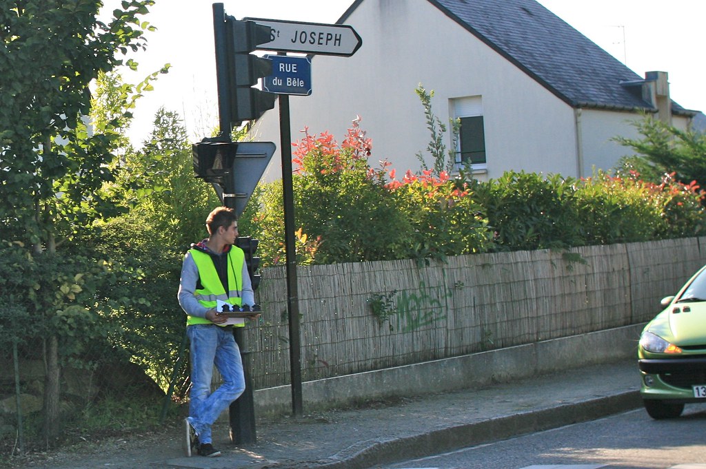
(Someone counting the number of car near a roundabout in Nantes, France)

"Methodolatry and the Art of Measure by Shannon Mattern is an interesting piece that Jan sent me this morning. It addresses the implications of "urban data science", i.e. citizen scientists, public labs, urban explorers, infrastructural tourists generating and collecting their own data on one end of the spectrum, civic hackers on the other.

Both share the same "way of conceptualizing and operationalizing the city" and an "instrumental rationality/solutionism”... what the author calls “methodolatry,” the aestheticization and idolization of method. The author describes how the relationships between the urban environment and data with different historical pointers showing how cities are "'machine' for efficient circulation". She also refers to different claims by Lewis Munford, Friedrick Kittler and Ola Söderström which are quite relevant.

Some excerpts I found interesting:

"Is there an ethos, a value system, driving these data-generated processes, or is it all just algorithms? Of course, we wouldn’t say that there’s no ideology inherent in the algorithms themselves, but the computers powering these Big Data projects run billions of operations that cumulatively produce substantive transformations in the urban landscape, with little regard for underlying values (...) sometimes the most readily apparent or accessible way — for students in particular — to gain entry to those complex practices is to take on the aesthetics of measurement: to devise a clever data collection system, to accumulate a reassuringly big pile of data, and to massage that data into a persuasive visualization. That’s a worrisome trend. This isn’t to say that engagement with the affective or stylistic dimensions of measurement precludes engagement with its larger methodological functions; Feyerabend has shown us otherwise. Rather, I hope these concerns are brought into alignment: that the methodological packaging suits the purpose, the form serves the function, the knolling serves the knowledge. (...) perhaps these methodolatrous projects, in their aestheticization of measurement, are calling our attention to presumptions about scientific rigor, parodying our algorithmic impulses, tacitly asking questions about the ideology of a pervasive culture of measurement and assessment. Perhaps, despite their implicit alliance with CUSP and Cisco and the like, our citizen data gatherers want to highlight the “givenness,” the rhetorical nature of that data, to show its inherent irrationality, to demonstrate that the “science of cities” is also, necessarily, an art."

Why do I blog this? An interesting addition to the debates about data science and smart cities. Certainly a good complement to Adam Greenfield's "Against the Smart City".

An interesting book by Marc Vallée about...


Why do I blog this? An interesting book by Marc Vallée about defensive space, covering anti-skateboard devices. Interestingly, this is the topic that led to the largest number of comments on my blog. I find it relevant to see the type of “solutions” presented here. It would be funny to document how skaters ingeniously manage to get rid of them.

Read More

Talk in Madrid about Smart Cities

Last week in Madrid, Fabien and I participated in a workshop at BBVA innovation about Smart Cities. Organized by Urbanscale (and more specifically by Jeff Kirsh, Adam Greenfield and Leah Meisterlin), it focused on opportunities to use networked data for the client. It basically followed up on the previous work we have done with this bank last year. This workshop was followed by an open session entitled “Beyond Smart Cities” at BBVA’s Innovation Center, with Adam Greenfield, Kevin Slavin and yours truly.

My talk was a critique of the "prediction trope" in the discourse about Smart Cities. Slides are on Slideshare and I've included some notes in the document:

[slideshare id=11199761&doc=2011-bbva-120122035754-phpapp01]

There’s a write-up of the event at the following URL

Theoretical bases for Smart Cities

"A theory of smart cities" by Colin Harrison and Ian Abbott Donnelly offers an overview of the different theoretical bases for the "Smart Cities" trope. As the author mentions, "the current ad hoc approaches of Smart Cities to the improvement of cities are reminiscent of pre-scientific medicine. They may do good, but we have little detailed understanding of why".

After a quick introduction in which they describe what is hidden behind this term (use of digital sensors, penetration of networks that allow such sensors and systems to be connected, computing power and new algorithms that allow these flows of information to be analyzed in near “real-time”), they highlight two theoretical approaches:

"One of these is work in scaling laws going back to Zipf, but enormously enriched in recent years by theoreticians such as West and Batty to name but two. (...) This body of work provides evidence that although many behaviours of complex systems are emergent or adaptive, nonetheless there are patterns or consistent behaviour at the level of macro observation. (...) The second body of work considers cities as complex systems. (...) This approach introduces concepts such as interconnection, feedback, adaptation, and self-organization in order to provide understanding of the almost organic growth, operation, decline, and evolution of cities."

Why do I blog this? I'm preparing a speech that I'll deliver at the "Beyond Smart Cities" event in Madrid next week at the BBVA innovation center. My aim is to give a critique of the prediction trope in Smart Cities projects. The aforementioned article offer a relevant starting point for this top happen, even though their perspective is quite partial in terms of academic references. The paper is also interesting to understand the kind of assumptions IBM make when addressing these issues (as attested by the partial list of references).

An interview with Saskia Sassen about "Smart cities"

Preparing the Lift France 11 conference, and given our interest in a session about the future of cities, urban computing and its implications, we ran across this interesting column by Saskia Sassen about "Smart Cities" on a McKinsey digital. We liked it a lot and we invited her to the conference. Few days ago, she kindly proposed to answer few questions I had about her perspective on this topic.

Nicolas: You recently wrote an essay about so-called "Smart Cities" at Mckinseydigital.com, I really liked your point about the need to "urbanize" the technologies deployed in Smart Cities projects. What do you mean by that and what do you think is missing in projects such as New Songdo or Masdar?

Saskia Sassen: This notion of urbanizing technology is one of several along those lines that I have been working out for a while. The starting point was not necessarily cities. It was the notion that in interactive domains the technology delivers its capabilities through ecologies that include non-technological variables --the social and the subjective, the logics/aims of users, for example finance uses the technology with different aims from Amnesty international, etc etc. Again, I make this argument for interactive domains, not, say, data pipelines.

There is another condition present in the interactive domain, separate from the technology itself. At the beginning I studied how the logic of finance (a sector that is deeply embedded in digital networks and digitized spaces) is not the logic of the engineer and computer scientist and software developer who made the digital domain. The effect is that the user (finance) does not necessarily use all the properties that the engineer etc. put into it. I also looked at civil society organizations along the same lines. This helps explain why the outcomes never correspond to what we may have predicted based on the capacities of the technology.

Now I am looking at cities through the same lens. Users bring their own logics to these technologies. In the case of a city with its vast diversities of people and what makes them tick, the outcome can be quite different from what the designers expected. And this matters. This keeps the city alive, and open. When you embed interactive technologies in urban settings, it is important to allow for this mutating as diverse types of users bring their own logics to those technologies. If the technology controls all outcomes in a routinized fashion ((as if it were a data pipeline) there is a high risk that it will become obsolete, or less and less used, or so routinized that it barely is interactive. More like buying a ticket from an automaton: yes you have choices, but you can hardly call this interactive.

The key, difficult, and ever changing question is how do we keep technologies open, responsive to environmental signals and to users choices, including what may seem quirky from the perspective of the engineer. The city is full of signals and quirky uses: given a chance , it would urbanize a whole range of technologies. But this possibility needs to be made – it is not simply a function of interactive technologies as we know them now, and it needs to go beyond the embedded feedback capability. Open Source is more like it.

Nicolas: Do you feel that networked technologies can lead to new forms of urbanity? Said differently, to what extent are the cities of the future shaped by our past urban experiences and infrastructures?

Saskia Sassen: Urbanity is a mutant. And this means it is made and remade along many different concepts/ideas/imaginations across the world. It can happen in sites where we, we of our westernized culture, might not see it. At night in working class neighborhoods of Shanghai bus stops become public spaces –that is urbanity. In some megacities the only spaces that the poor, often homeless have, are what during daytime hours we see as infrastructure: spaces where multiple bus lines intersect or end in. There are many many such examples of practices that destabilize the formal meaning of a space: this, again, takes making, and in that making lies an urbanity. I do think that urbanity is made; it is not only beautifully designed urban settings.

So yes! I think that networked technologies will also, and in fact, already are, leading to new forms of urbanity. The most familiar of these are of course using the tech to communicate about swarming an actual space –a square, a furniture shop—and diverse locational devices. Again, what intrigues me is to think beyond these somewhat “pre-scribed” possibilities: in two ways. One is through the unsettling, making unstable, the prescribed options embedded in the technology’s design. For instance, inserting a given technological capability into a different ecology of elements (in the sense I used this earlier –technical and non-technical elements). This is what hackers do, in a way. In the case of the city, it would mean bringing an urban logic into that ecology –the city as the hacker. .. a benign, positive hacker of a range of technological domains in cities. The other is what I like to refer to as “barefoot engineering” -- this resonates with the so-called “barefoot doctors” in China’s villages during Communism –knowledgeable locals who knew the properties of plants and understood the village. We need urban “barefoot engineers”!

Nicolas: In the aforementioned paper, you use the term "open-source urbanism". It's interesting to see that metaphor coming from digital culture are currently transposed beyond their original realms. How do you think the "open source" concept can be applied to urbanism? What would be the limits and opportunities?

Saskia Sassen: As a technological practice of innovation, Open Source has not been about cities, but about the technology itself. Yet it resonates with what cities have and are at ground-level, where its users are. The park is made not only with the hardware of trees and ponds, but also with the software of people's practices. There are manay examples, and each city has its own. In my city, NY, an example of such people’s software is New York's Riverside Park in the 1980s which went from being a no-go zone, charged with dangers, to being a park for all those who wanted to use it. How did this switch happen? In part because dog-owners started to walk their dogs in large numbers. Having a dog was itself a function of feeling insecure in a city of high murder rates and much mugging. But the city as lived mutating environment allowed people to talk back: get a dog, walk your dog, go in groups, and you recover the territory of the park. Another example is the recent proliferation of urban agriculture; it was not a top-down decision. It resulted from a mix of conditions, primarily the desire of city residents to make, to green, to transform, and the romance with fresh produce. And now the push is for every roof, every empty plot of land to become a site for urban agriculture. Here we see that a thousand individual decisions created an urban possibility and transformation. There are many diverse initiatives that produce these kinds of "third space."

These are ways in which the city can talk back. We can think of the multiple ways in which the city talks back as a type of open-source urbanism: the city as partly made through a myriad of interventions and little changes from the ground up. Each of these multiple small interventions may not look like much, but together they give added meaning to the notion of the incompleteness of cities and that this incompleteness gives cities their long lives, their flexibility, their capacity to mutate. 

And this potential for distributed outcomes is a natural for open source technology. But beyond the technology proper, bringing open source concepts into multiple urban settings/domains strengthens these core features of cities, make them cities of people, strengthen the rights to the city.

In sharp contrast, I think that the model of "intelligent cities" as propounded by technologists, with the telepresence efforts of Cisco Systems a key ingredient, misses this opportunity to urbanize the technologies they mobilize. Secondly, the intelligent city concept if too rigid, becomes a futile effort to eliminate the incompleteness of the city, to get full closure/control. This is a recipe for built-in obsoleteness. Imagine if Rome could not have mutated across the millennia: it would be a dead city now. Third, the planners of intelligent cities, notably Songdo in South Korea actually make these technologies invisible, and hence put them in command rather than in dialogue with users. 
Beyond the imagery of open-source urbanisms, can we strengthen this positive scenario of the city's incompleteness by actually deploying open-source technologies in a variety of urban contexts

Kevin Lynch's "Image of the City" with a graphic design treatment

"The Image of the City" by Kevin Lynch is an important contribution in urban design thinking. The perspective expressed by the author, as well as the methodology (description of mental maps drawn by residents in several cities such as Boston, Los Angeles and Jersey City), is insightful. Interesting, Gabriel Pelletier, a graphic designer added a new perspective on this book using the following treatment:

"Excerpts from Kevin Lynch's "Image of the City" were graphically treated according to their respective themes. The blue color was used throughout all the document is used to recall blueprints.

Each section's beginning was created using the graphic symbols located throughout it's pages. The cover was done in the same fashion, taking all graphic elements of the book and adding them to note the notion of unity when talking about the city's elements."

Why do I blog this? First because I like this book and enjoy this kind of graphic design. Second because it's interesting to see how the material presented in the book can be enhanced through the kind of representations proposed by Pelletier. The idea of using blue shapes is intriguing as it is sort of reminiscent of building blueprints.

"Cassette drive for storage: a safari in post-modernity"...

... is a new side-project of mine. It basically consists in the articulation between two sources of insights about the urban environment:

  1. Some pictures I've taken over the years in various territories. The photograph are converted into Black and White using a threshold filter to highlight certain characteristics of the environment: shapes, forms, grids, silhouette, outlines or directions. Given my interest to show stereotypical shapes, the focus of the pictures is certainly connected to my interests, obsessions and gut feeling when undertaking urban safaris. As much as I can, I'll indicated where the pictures have been taken (which is not that difficult if you have an eye for peculiar scenes and buildings).
  2. Quotes from books written in the second part of the 20th Century about cybernetics, architecture, urbanism and design theories. I've bought these books recently at the flea market and in an architecture/design book shop and they seem to come all from the collection of a recently deceased professor from the University of Geneva. The quote I've chosen echoes with my interests and perception about what "matters" in these disciplines. It's definitely a subjective choice and I enjoy the accumulation of such excerpts (as attested by the presence of commented quotes on this blog).

My aim was to select quotes and pictures so that a peculiar kind of relationship emerges out of the juxtaposition. To some extent, this articulation between the two elements could be seen as some vague correlation: sometime there is indeed a cause-and-effect relationship (the quote exemplifies a certain trend that has influenced the architecture of the building represented on the picture), sometimes there isn't. The idea is to show that some notions, paradigms and system thinking either shaped urbanism or provided a certain framework/cultural Zeitgeist which led to the shapes and representations depicted on the B&W pics.

This is a work-in-progress thing. I guess some assemblage are better than others of course. Let's see how things unfold, I'll try to keep this going and select the best juxtapositions in a booklet once I have a certain quantity of material. My perception of this is simply that some patterns and categories will emerge at some point and perhaps a narrative could be constructed at some point.

As usual here, comments are welcome.

Recent "you are here" encounters

London, UK: the delicate use of a pointing finger.

Istanbul, Turkey: the finger is now turned into an arrow, that indicate the location.

Faial, Portugal: a common "you are here" symbol with a bullseye signage that replaces the finger/arrow metaphor.

Lyon, France: an interesting example of a semi-bullseye signage linked to an indication of a walking path. There's a direct continuity between the two. Interestingly, this kind of representation shows a direction, where one could head to.

Paris, France. Perhaps the most intriguing as it says "vous êtes ici" printed on the sidewalk, a "you are here" indication that it not really useful as you already know that. Certainly a playful graffiti to indicate that there's something relevant in the area (one of my favorite book shop in Paris: Bimbo Tower). What is curious here is the direct inscription of the symbol in the context of the person.

Why do I blog this? sorting out the main categories of "you are here" symbols with a limited sampling (recent encounters) allows to understand the evolution over time and the design space (possibilities). Nothing digital here but I'll get to it later on.

What can we learn from the analysis of disorientation?

An excerpt from this presentation by Ruedi Baur:

"We simply allow ourselves to be guided by the system, led by the hand, almost to the point of losing any notion of orientation in the process. So we can fairly easily imagine this future world in which everyone would be systematically guided by his device, connected to the synchronized global network, and gradually lose any sense of natural orientation. It is a matter of everyday observation that being guided considerable reduces our capacity to know where we are and have any spontaneous sense of the route towards our chosen destination. Neither is this phenomenon only connected with satellite navigation technology; more generally, any guidance by a reliable artificial system tends to reduce our capacity to orientate ourselves naturally, that is to interpret what is in front of us in the environment and independently take decisions that would truly enable us to find our way. (...) What can we learn from disorientation? How can a design project leave room for individual choice? How can we orientate without guiding?"

Why do I blog this? Although the tone here is slightly over-deterministic, I like the design issue that is at stake when creating urban signage (supported by digital and non-digital means). There's plenty of study about how people orientation but it would be good to grasp the user experience of disorientation... and use it as a starting point to create meaningful systems.

Paris metro interactive map

Subway map in Paris On the most interesting "static" map I've ever seen is the "indicateur d'itinéraires" located on some of the metro station in Paris (this one is close to the entrance of Ligne 1 in Paris Gare de Lyon). You press the number of the metro station that you want to reach with the keyboard below and the suggested route appears displayed on the lights on the board.

Subway map in Paris

Subway map in Paris

Although some folks think there's a small person in there, the inner mechanism is closer to "Operation" with lights. Very low-bandwidth and based on electricity.

This device is actually called PILI, which stands for "plans indicateurs lumineux d’itinéraires" (Light-Based Indicator Plan for Itinerary") and has been implemented in 1937. A simple and straight-forward way to get both a general overview as well as information about where you want to go. It's intriguing to see how people from these times designed a map-based system without any complex display technology, and it's very efficient.

Why do I blog this? Going to the French capital quite often, I love to spend some time observing how people interact with these machines. There are lots of things to notice, see for example:

  • User's proximity to the device, which depends on their purpose (getting and overview, looking for a specific route).
  • The flexibility of usage: the device is very big and it allows people to use it in various ways altogether. If a person looks for a route, it doesn't prevent others to observe the map and look for their information (without necessarily using the buttons).

Interestingly, I found it much more efficient than the 21st century version that you can see below. Even though it has different features, this new version is rather small (intended to be used by only one person) and I generally rarely see people using it.

Urban signage

Superimpose various urban realities

You Are the City (Petra Kempf) Received today my copy of You Are the City: Observation, Organization and Transformation of Urban Settings by Petra Kempf, definitely a gem in my collection of books and artifacts about urbanism. Made of 22 transparent slides in a folder, and a 16 page brochure, as described by the author:

"this publication offers architects, urban planners and general readers interested in city design and growth a novel approach, a mapping tool that creates a framework for understanding the continually changing configuration of the city. With the aid of themed transparencies, the tool allows one to superimpose various realities in layers in order to create new urban connections, thus inviting readers to immerse themselves in the complexity of our cities."

You Are the City (Petra Kempf) You Are the City (Petra Kempf)

Readers interested in Petra Kempf's work may be interested in this interview, from which I took the following excerpts:

"there are many ways to represent cities and each of the mapping technologies available certainly have their value and importance. However the technologies that are currently available, are mostly based on numbers and facts, not personal experiences. But to really experience a city one must be part of it. This is an analog process, by which we engage with a city’s intricate fabric. To re-create that analog process, in this project, I needed to use a tool that helped me simulate that experience. The limitations and computational restrictions of a computer program did not allow me that opportunity. (...) Mapping human flows in cities is a daunting task. I have mixed feelings about mapping these flows, since it could easily shift into ‘the big brother is watching or tracing’ the flows of people. Examples are already at hand with tracing people through their mobile phones, personal GPS security devices, ISP addresses, debit cards or passports. I think one needs to be very diligent with this subject. When I think of mapping human flows I think of Michel de Certeau or Henri Lefebvre, to name just two. They thought of the urban inhabitant as someone who could never be traced, since he/she always slips away from the ‘official’, traceable path. In this way each individual creates their own path, which can not be traced—even though they shape the city and the city shapes them."

You Are the City (Petra Kempf) You Are the City (Petra Kempf)

Also about how cities have always been informed by the traces we leave here and there: You Are the City (Petra Kempf)

Why do I blog this? What I find intriguing with this "instrument" is that the transparent sheets enable readers to perceive the city by isolating and superimposing different urban components. Doing so, one build his or her own representation of what a City can be.

Beyond the author's purpose, these sheets remind me of Dan Hill and Andrew vande Moere's workshop exercices. As you may notice, it's perhaps the use of transparent and overlays that made me think about it. I like this project both for its aesthetics (and how it reshape the notion of maps) and as a methodology to observe and discuss about the urban fabric. The manipulation of transparent sheets (superimposing various versions) enable to trigger interesting conversations and I am pretty sure that the design of similar maps for a specific neighborhood can also be a curious tool in workshops.

Supermodern spaces. Places to go through

Supermodernism An interesting definition of "supermodernism" found in Desolation Jones, a comic book series written by Warren Ellis:

"Supermodernism. The fact that we don't build places to just be in anymore. We build places to go through. To wait in. To be transient. You ever watch 'Cribs' on MTC? All those pop stars' houses? They're all beige and white. They're the colour of airports. All those houses are decorated like hotel rooms and waiting lounges. You never wonder why?

Supermodern spaces. Places to go through. An now look at this bloody city [Los Angeles] Two hundred thounsand fucking miles of road. Not event a city. A dozen towns stitches together by motorways. Housing that goes up today and get knocked down tomorrow. LA's a supermodern space. A place you dont' stop in"

Also check Ellis's commentary on his website:

"Supermodernism: a term I first encountered in architecture, coined by Hans Ibelings, used to describe buildings constructed without context or integral information. Airports are supermodern spaces. Just pipes and sockets, there to pass through or plug into. Places to facilitate swarms and flow. An outsider’s view of LA. Which, I’d remind people, is exactly what Jones’ view is. He’s not looking at LA like a native, a committed long-term resident, or even someone who likes the place much"

Why do I blog this? gathering insights about society from various types of media is always a pleasure. In this case it's about the evolution of spaces and places. Also look at the illustrator's trick to put these quote in context with a "red line" that connects up the whole page with a map and the discussion with the two protagonists.

See also Jack Schulze's remarks about this very same comic page.

Open data exchanged on good old paper format

Data.gov.uk NewspaperData.gov.uk Newspaper Some excerpts of the Data.gov.uk Newspaper that Russell Davies gave me last week. As described by the people who designed it, the purposes were the following:

"We’ve been thinking about the beta Data.gov.uk repository, and wanted to explore putting some of the information contained within into people’s hands in a form that is accessible, timely, and relevant.

It’s a prototype of a service for people moving into a new area. In our exercise we imagined you might receive it after paying your council tax for the first time.

It gathers information about your area, such as local services, environmental information and crime statistics. (...) We printed 50, and gave them out to a room full of civil servants, who seemed very excited its possibilities. Hopefully it’ll find its way around Whitehall over the next couple of weeks, acting as a demonstration of the kind of stuff people want to make with all this data that government has. And maybe that’ll encourage some more data to get opened up to the public."

Data.gov.uk Newspaper Data.gov.uk Newspaper

Why do I blog this? an interesting initiative to render local public data in an original way. What I find curious here is the use of paper: clearly an easy and convenient way to share content.

Transportation system information

Transport information A quick visit to EPFL last week in Lausanne gave me the opportunity to observe and test the new QR-code system that enable to get some information about the tram schedule.

The service works pretty well but it's rather the little poster showed on the picture above that raised my attention. What is strikingly curious is that the size of this sheet of paper (that explain how to use this weird B&W square) is the same as the tram schedule (on the bottom left-hand corner). For most of the cell-phone users, this kind of system is fairly new and the transportation company (+ the IT company which provided them with this "solution") felt the need to give some sort of step-by-step description.

Why do I blog this? Observing the environment and trying to surface some remarks about the implications. The poster describes what the user needs (obviously, a phone and a service that allows to scan QR code), the different steps to make it work (I like the "Confirm the Internet connection" phase) and a warning that you should check with your mobile phone carrier what would be the price of such transaction. As usual with technological innovations, the stake-holders try to help potential users and give a large amount of details that make the poster as long as the schedule poster. Of course there are two supposed expectations from this long description: (1) Teaching people how to use a technical objects (the QR code scanning process that can help to get real-time information), (2) Once the lesson learned it will be OK to remove this description and only keep the two QR codes.

On the UX side, I am also a bit concerned by the legibility of the two QR codes that refers to both directions of the tram. My guess is that some sort of graphic design trick could help here, either below the code (with a bigger font) or on the code itself using a different sort of visual marker. A D-touch marker with some easy-to-read "Flon" and "Renens" (the name of the two directions) tags would be helpful. Although they look curious-and-cool, I've always thought that a solution which can be "both machine-readable and visually communicative to humans" would be better. Especially in an urban context.