Design by Use and object repurposing

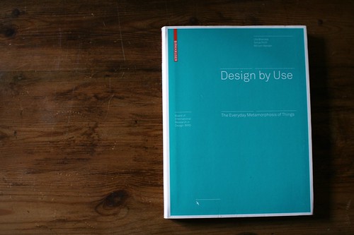
Design by Use: The Everyday Metamorphosis of Things by Uta Brandes, Sonja Stich and Miriam Wender is a wonderful book I've read recently about object appropriation or reinvention and the role of design into this.

The book basically gives a design perspective to how people redefine objects, which is very complementary to what Michel de Certeau described in The Practice of Everyday Life (see some excerpts in this earlier post). The authors defines various notion such as:

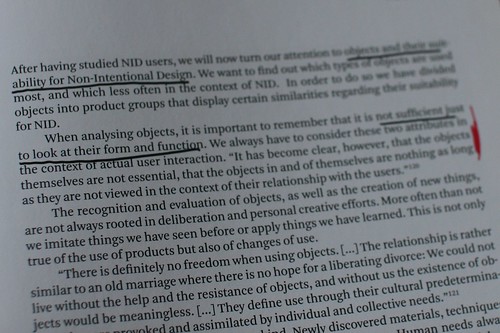
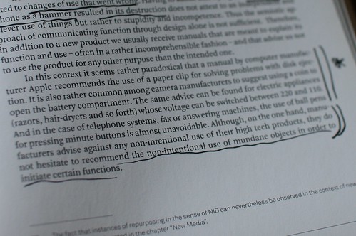
  • "intentional redesign", when "objects are used differently from their intended purpose"
  • "non-intentional design" (NID), by exploring "similar forms are used for the same purpose even if they were not created to fulfill the same function (...) If, in the spirit of NID, things are used for purposes other than they were intended for, this is not due to a misinterpretation of their original function, but is instead rooted in our ability to see beyond this and discover abstract or open forms."

As described in this review in Metropolis:

"Just as Roland Barthes posited that readers (rather than authors) create meaning in a text, here it’s the user’s intentions that matter. Brandes throws down a gauntlet, writing, “Each object must be investigated from two opposing perspectives: from the perspective of design and from the perspective of use.” In other words, people aren’t thinking about the concepts that lead to products; they’re simply looking for things that fulfill specific needs. Once designers begin to take that indepen dent agenda into account, she argues, “then we can expect a qualitative and open design approach as a result.”

Brandes also pleads for simple things, since they are the easiest to transform into ad hoc solutions. The more complex a design, the more needs it’s supposed to fit, but the harder it is to rejigger to meet your own. Knives may be made for eating, but Brandes reminds us that they serve as quite good letter openers. And in that vein, how many times have you used a chair as a bookcase, a lamp stand, or a bedside table? (The chair in my bedroom is not at all as Ebert Wels intended it when he designed it in 1928; instead, it’s bedecked in sweaters and ski pants.)"

Some inspiring quotes:

Why is this interesting? well, this quote from the Metropolis article speaks for itself:

This “design misuse,” “post-use,” “post-design,” “nonintentional design,” or whatever you decide to call it, can create evocative, meaningful objects—more meaningful, in fact, because of the user’s par tici pation in the process. The British sculptor Richard Wentworth once said, “I find cigarette packets folded up under table legs more monumental than a Henry Moore. Five reasons. Firstly, the scale. Secondly, the fingertip manipulation. Thirdly, modesty of both gesture and material. Fourth, its absurdity and fifth, the fact that it works.”

Robot memory in Blade Runner

Roy Batty, in Blade Runner, who tells Deckard about the things he saw in his life and how all those memories would vanish. He is about to die and give this memorable final speech:

"I've seen things you people wouldn't believe. Attack ships on fire off the shoulder of Orion. I've watched c-beams glitter in the dark near the Tannhäuser Gate. All those ... moments will be lost in time, like tears...in rain. Time to die."

...when a replicant/robot loved his life and tells what it meant.

Why do I blog this? a curious quote to be used at some point.

Networked objects 2010

An update for myself. Various networked objects that I've ran across recently and that seems to be curious for my projects: Analogue Tape Glove (Signal to Noise)

"This interactive sound installation deals with "exploring the physical connection between people and technology". A tangible user interface is provided in the form of a glove, worn by the participant as they are invited to interact with an analogue tape surface. As the glove comes in contact with the tape, sound is generated and can be manipulated via touch and movement. The pre-recorded sound on the tape is a random collage of compiled material including a range of musical styles & found recordings. According to its creators, the work “explores the somewhat obsolete medium of tape through a playful and sonically interesting experience."

Daily Stack (sebastian rønde thielke and anders højmose)

"The simple design allows users to help track their work flow by creating physical representations of their tasks. The design consists of a small base and a series of wood blocks that each have a different colour and shape. Each colour represents a different task and the time interval is determined by the size of the block. The user stacks their tasks on the base, committing to them. the base contains electronics that communicate with a computer, tracking time and tasks in progress digitally. The user can even go back through their archive and look at previous stacks. the design helps the user better visualize their time, helping them make the most of it."

Slurp:

"Slurp is tangible interface for manipulating abstract digital information as if it were water. Taking the form of an eyedropper, Slurp can extract (slurp up) and inject (squirt out) pointers to digital objects. We have created Slurp to explore the use of physical metaphor, feedback, and affordances in tangible interface design when working with abstract digital media types. Our goal is to privilege spatial relationships between devices and people while providing new physical manipulation techniques for ubiquitous computing environments."

Kokonatchi / ココナッチ (University of Tokyo and Waseda):

" Looking something like a hybrid stress ball and giant butter bean, Kokonatchi connects to your computer via a USB lead, sits on your desk, wiggles and lights up when a new tweet enters your account feed. It contains RGB LEDs which change color according to the context or ‘emotion’ of the tweet, and vibrates or ‘shivers’ when it is scared"

Olars (Lars Marcus Vedeler)

"Olars is an electronic interactive toy inspired by Karl Sims' evolved virtual creatures. Having thousands of varieties in movement and behaviour by attaching different geometrical limbs, modifying the angle of these, twisting the body itself, and by adjusting the deflection of the motorised joints, results in both familiar and strange motion patterns."

OnObject:

"OnObject is a small device user wears on hand to program physical objects to respond to gestural triggers. Attach an RFID tag to any objects, grab them by the tag, and program their responses to your grab, release, shake, swing, and thrust gestures using built in microphone or on-screen interface. Using OnObject, children, parents, teachers and end users can instantly create gestural object interfaces and enjoy them. Copy-paste the programming from one object to another to propagate the interactivity in your environment."

Species (Theo Tveterås and Synne Frydenberg)

"Interactive toy that tunes in on bacteria frequency and amplifies it."

Why do I blog this? a kind of messy list but it's sometimes good to collect curious projects and see how they compare to what has been done in the past. Some interesting new trends ahead in terms of interactions: augmentation by other channels than visual representation, new forms of object connectivity (slurp), the importance of original material (wood, textiles). It's not necessary brand new in 2010 but what's curious is that the implementation and the usage scenario are intriguing and beyond classical utilitarian ideas.

Joypad memory game

The game controller project moves slowly but we're definitely onto something. We'll release soon an iPad/iPhone application that would correspond to a visual corpus to all the joypads. Each pair of pages will describe one of the 42 official joypads along with various data: date, brand, corresponding console, total surface, action button surface, d-pad surface, connector pin type, wire length, weight, etc. But there's more.

Given that Laurent Bolli had a curious machine that enabled us to print badges for participants at the Lift10 conference in Geneva, we repurposed it and create a Memory/concentration game with all the gamepad visuals we had. Each card features a graphical representation of the game controller as well as information about the joypad surface (total surface, action buttons, menu buttons, d-pad surface, etc.). A first prototype of the card game here:

Maes-Garreau Point/horizon

Read at Kevin Kelly's blog:

"The latest possible date a prediction can come true and still remain in the lifetime of the person making it is defined as The Maes-Garreau Point. The period equals to n-1 of the person's life expectancy.

This suggests a law: Maes-Garreau Law: Most favorable predictions about future technology will fall within the Maes-Garreau Point. (...) Because the official “Future” -- that far away utopia -- must reside in the territory of the unimaginable, the official “future” of a society should always be at least one Maes-Garreau Point away. That means the official future should begin after the average lifespan of an individual in that society.

Why do I blog this? referencing material for my book about technological failures/failed prophecies about innovation.

Letter box agency and new metaphors in service design

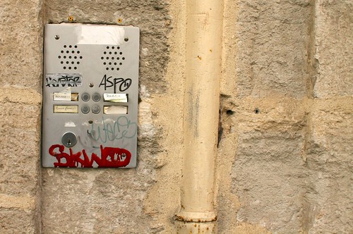
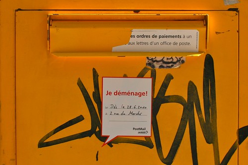
An interesting new form of signage recently appeared in our cities.

See this example in Geneva: few weeks ago, letter boxes in Geneva featured stickers telling people that they will be moved. Interestingly, as shown on the example above, the message was not just a message from the Swiss Post telling me that "The letter box will be moved to XXXX". Instead, there was a speech bubble expressing that "I am moving" to show that letter boxes were in the process of being transferred to a new location. Then, this week, a brand new yellow box was located in the announced place; and it featured another message: "Let's know each other" with two signatures: "Your new letter box" and "Postmail".

Why is this interesting? Well, some aspects I find intriguing:

  • The fact that the message is given from the letter box perspective (see the use of the first person and the term "relocation"), as if the object was given a form of agency by the Post institution. I don't mean here that objects never had agency but let's say there is a stronger acknowledgement of what is delegated to the object. The use of the speech bubble meme also reinforces this trend.
  • The temporal aspect of this is strikingly curious: from the relocation announcement to the new place, there are different ways to interact with the box. First people need to know that their old pal will move and that a new one will be located in a different place (see the new box design).

Why do I blog this? these observations led me to wonder about how service design is evolving. New metaphors are being employed and it's curious to run across them in a city. Beyond this, I am also intrigued by the way objects are more and more anthropomorphized and how people perceive this sort of communication.

Overall, my intuition is that this sort of communication is far more effective than what robot designers are putting in place. It's IMO another example of using basic means to convey certain messages (see recent examples).

Finally, this kind of observation shows that there seem to be a common thread in my interests lately: human-object interactions (human-robot interaction?), artifact agency, user's understanding of objects, etc. Surely some good material for projects about robots, networked objects and blogjects. What is funny and relevant here is to think about how to give objects agency using basic elements such as smiley faces (Gerty) or speech bubbles. Will this be a new idiom for objects? Should robots look like human/animal or should they be stay as things and communicate through simplified devices? Let's discuss this with friends in the robot industry.

ATM, vending machines and proxemy

Observing lines of people awaiting their turns to be attended is always curious. See some examples below that shows various distance between the person using the vending machine and the next person in line:

Why do I blog this? "Proxemy", a topic I have often addressed here few years ago corresponds to the the physical distance we maintain during interpersonal interaction (see Edward Hall's writings). It can depend on cultural characteristics and contextual factors of course.

What is interesting is that this concept (and the aforementioned examples) can be applied to the design of mobile services (and of course the usage of mobile devices also influence proxemics in a certain cases).

"Challenge design orthodoxy and prevailing technological visions"

From the introductory text by Anthony Dunne for the "Design Interactions show 2010":

"Last year, the futurologist Stuart Candy visited the department and showed us a wonderful diagram he used to clarify how we think about futures. Rather than one amorphous space of futureness it was divided into Probable, Preferable, Plausible and Possible futures. One of the most interesting zones was Preferable. Of course the very definition of preferable is problematic — who decides? But, although designers shouldn’t decide for everyone else, we can play a significant role in discovering what is and what isn’t desirable.

To do this, we need to move beyond designing for the way things are now and begin to design for how things could be, imagining alternative possibilities and different ways of being, and giving tangible form to new values and priorities. Designers cannot do this alone though, and many of the projects here benefit from collaborations, dialogues and consultations with people working in diverse fields such as ethics, philosophy, medicine, political science, fiction, psychiatry, economics, life sciences and biology.

This space of probable, preferable, plausible and possible futures allows designers to challenge design orthodoxy and prevailing technological visions so that fresh perspectives can begin to emerge. It is absolutely not about prediction, but asking what if…, speculating, imagining, and even dreaming in order to encourage debate about the kind of technologically mediated world we wish to live in. Hopefully, one that reflects the complex, troubled people we are, rather than the easily satisfied consumers and users we are supposed to be."

Why do I blog this? an interesting description of how design can contribute to futures research.

Design fictions about artifacts from the future (and the future's past)

Being interested in technical objects and futures research, I have listed here various approaches that I find interesting (it's not exhaustive). Artifacts from the future (Wired)

In each issue of Wired magazine, at the end of the book, there's a page called "artifact from the future" that consists in a heavily photoshopped photo of an object supposedly common in the future. These visual elements depicts designers, researchers, pundits' prognostications about how the world "will look like in 10, 20 or 100 years". Yes, it's "will" not "may", as shown in this article. See some examples systematically listed by sceptycal futurist Stuart Candy

There's a lot of alternative ways to create similar account of the future. Think for instance about Future Feed Forward which looks like The Onion. But it's even more interesting when tools are made available to people who would want to create their own narratives with something like this The newspaper clipping generator (as a side note, I love their warning "Please do not use the names of real newspapers or persons").

Artifacts from the past

Of course, creating visual props of the future is one thing but there's a curious other possibilities: looking at present objects from a distant future. Some sort of archaeology from the future: you put yourself in the shoes of an observer who would find an object from the 21st Century and who would try to infer its meaning and usage. If you try to do this, an interesting issue will rapidly arise: how the future from which you have a point of view is like? Indeed, if you want to describe something, you need to have certain values/norms/standards/contextual elements to compare the object from the past to the practices of the future you're supposed to live in. Reading this French graphic novel called Constellations (first volume is downloadable here in PDF), I ran across these two pages at the end of the booklet (the banana is just meant to leave the booklet opened while I take the picture):

After the story itself, the two authors (Daryl and Popcube) invited friends as guest to give their perspective on their work. One of them, called Run, designed these two pages which show how artifacts from the past (a Rubik's cube, a vacuum cleaner, a Winnie-The-Pooh mug) were perceived by people from the future. The action takes place in a post-apocalyptic world in which - of course! - things from the past are no always available or in use because the industrial chain has vanished, because electricity is scarce and above all because people forgot about them. Each narrative (in French sorry) can be perceived as intriguing account of how people project a certain meaning based on surface characteristics: shapes, colors, characters, handles, etc. The Rubik's Cube is no longer understood as being a puzzle but the author shows how it is helpful to calculate using colored cubes and shape-shifting. At first glance, it looks very naive and done for the lulz but it's far more insightful than that; and I think undertaking this kind of activity is valuable for both design and futures research. This two pages should IMHO be a mandatory outcome of an exercise for my design students to force them thinking about affordances, form/function dialectics or research avenues.

Besides, this example reminds me that I should really spend more time digging what Michael Shanks is doing at Stanford Humanities Lab because it may be close to this angle.

Objects from the future produced in the past

The last category I find interesting during the sunny sunday morning is the idea of exploring objects from the future proposed in the past (this is triggered by my interest in design failure). Recently I collected lots of material from cyberpunk universes described in the 80s. The most interesting items came from my Role-Playing Games books which presented visually some cyberpunk artifacts to be used by characters. See some examples below (extracted from Cyberpunk 2020):

Why do I blog this? looking for curious exercises to be done in workshops or during my courses next year.

Weeknotes 108

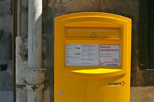
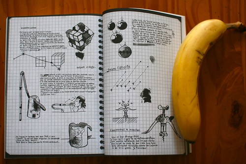
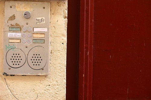
The week was short because I took few days off in the South of France to relax a bit, read some books, visit old cities and focus on reviewing projects from my students at the University of Art and Design in Geneva (HEAD-Geneva). They basically had to conduct a short field study about a topic of their own, observe people's practices and produce design implications for this. Some comments about their work:

  • The range of research questions was broad: how people behave in conferences, where people leave their cell-phones at home, how people keep track of their todos, how people choose clothes in shops, how people keep track of time. It's funny to contrast students which are more into the arty side of design and these which are into industrial design projects. While the former literally re-appropriate field study techniques to their own needs (finding ideas), the latter are following the methods to the letter and are sometimes less creative than I expected.
  • Although I have shown them various methodologies and insisted on the use of photography, the majority only relied on interviews. Speaking of which, some students still confuses an f2f interview and a questionnaire (paper-based or on-line) but I guess this is linked with my next point.
  • 1-2 students are super lazy, which is a classical %
  • The toughest part of the job is to produce original, meaningful and creative design implications. Extracting peculiar insights, constant design patterns, issues, problems and potential solution is one thing but turning them into more tangible aspects is difficult. Some proposed interesting conclusions, others carefully crafted personas or use cases while others listed few bullet points. I think I will spend even more time next year on this part to show them how to go beyond the classical formats I've shown them.

On a different note, I took plenty of pictures of intercoms (in French they're called "interphone"). I don't really know why but it became an obsession in the previous weeks. It was perhaps caused by the fact that the old town in Montpellier featured remarkable instances of these devices. The contrast between the old stone walls and these modern elements made of steel and graffitis was inspiring. The stickers used to indicate new names as well the written information (names, name origins, use of capitals, presence of surname, etc.) seems pretty informative too. At some point, I may use this material in a project about communication and architecture; i still need to find why this is interesting.

Finally, I worked on 3 research papers, trying to pursue academic work in parallel with consulting/conference business. Two of them have been accepted in a design magazine and a HCI conference. The third one has been submitted to a workshop at Ubicomp 2010.

Back to Geneva, I spent most of my time at the Lift offices working on the preparation of the upcoming Lift France 10 conference. I spent time in conference call with various speakers to discuss their speech and discuss communication matters with the local PR agency. We're almost there.

Making intentions explicit through social media

An interesting diagram by John Battelle found in the June issue of Wired UK (and pointed to me by Rémy)

Called "How the check-in extends the great database of human intentions", this categorization describe how user intents are made explicit by various platforms. It shows of social media make them explicit.

Besides, the "check-in" item corresponds to what I described in my PhD dissertation with "self-declaration of location".

Why do I blog this? this is connected to research issues I tackled in my research. The difficult thing would be to add a fourth line to describe the meaning of each of these signals: what inference can be drawn from my whereabouts or my interest. This is course addressed in human-computer interaction and there combination of each column can also be important.

Augmented Reality B&W footsteps

How Augmented Reality was portrayed back in the days. The evolution with B&W graphic landmarks:

Circa 1992 (Source: T. P. Caudell, and D. W. Mizell, “Augmented Reality: An Application of Heads-Up Display Technology to Manual Manufacturing Processes”, Proceedings of 1992 IEEE Hawaii International Conference on Systems Sciences, 1992, pp 659-669)

Milgram's continuum (Source: P. Milgram and F. Kishino, "Taxonomy of Mixed Reality Visual Displays", IEICE Transactions on Information and Systems, 1994, pp. 1321-1329.)

2D matrix code (Source: Rekimoto, J. (1996). Augmented Reality Using the 2D Matrix Code. In Proceedings of the Workshop on Interactive Systems and Software (WISS'96).)

More material (in color too!) at this insightful URL

Why do I blog this? Collecting material for an upcoming presentation. It's interesting to get back to these early representations that I studies during my MSc in HCI... and compare them to current instantiations.

Bill Buxton on "The better we do, the bigger the problem we make"

Bill Buxton's column in Business Week are rare but always intriguing. The latest dispatch offer interesting remarks:

"what to do when an idea or product gets traction and starts generating a bunch of revenue. First, show restraint on the self-congratulation front. Next, invest a significant proportion of your resulting windfall into sussing out your next great idea. Keep moving and don't count on the continued success of your original one. (...) If you make the revenue from your great idea your only food, you are going to have a problem. The longer you take to broaden your menu, the bigger that problem will be. Great ideas need to be displaced, even when they still have the allure of the cash cow. (...) Here's the sentence that should immediately set off alarm bells for those who don't want to head to the cemetery of one-category wonders: "We can't pursue that idea, because doing so will cannibalize our existing revenue stream." If you hear this phrase, stop whatever you are doing and give what lies behind these words your undivided attention. In general, here is my advice: If you can't change the minds of those uttering it, you should head for the door."

Why do I blog this? interest towards innovation process and how temporality (or people's perception of time in the short term versus the long term) influences decisions in R&D process. Besides, it reminds me of a friend who always tell me that he tends to do the opposite of what he has done before every year (in terms of design/writing/creative) process. Finally, I find interesting to wonder about "The better we do, the bigger the problem we make" because it can be a frequent trap.

Lift10 recap

Last wednesday, we did a debrief of the previous Lift10 conference in Geneva, with partners and local guests. It was an occasion to give a very quick and punchy wrap-up of what speakers presented at the event:[slideshare id=4533357&doc=lift10recap-100618032308-phpapp01]

Urban futures: from science-fiction to design fiction

Yesterday evening, I gave a talk at the Cinemathèque suisse in Lausanne. There was an event organized by the swiss radio and Les Urbanités about movies and cities and my speech was before "Brazil" by Terry Gilliam. The talk was called "Solar progeria versus renaissance of urban fictions" and it wasn't related to this film per se. Rather, I gave a talk about an interesting shift from urban representations of the future created by science-fiction writers/directors to design projects about urban phenomena created by designers: video games, visual representations, new forms of maps. All of these can be considered as "design fictions" which have something to say about cities. See the slides below, the images I used actually corresponds to several videos I commented to the attendants. [slideshare id=4488727&doc=cinematheque2010-2-100613131628-phpapp02]

In sum, new representations of the urban futures I'm interested are mostly design fictions with the following characteristics: 1. They’re not only about the urban morphology, they’re also about invisible phenomena such as radiowaves or the city metabolism (e.g. with cell-phone usage), 2. A new asthaethic emerges from the digital culture (video games, web and mobile culture) and leads to curious metaphors and representations, 3. The territory itself is augmented and new layers of information/experience is added on top of existing places.

Thanks YGM for the invitation!

A robot called Gerty

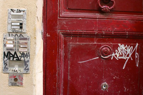
Finally had some time to watch Moon by Duncan Jones yesterday evening. Certainly a good sci-fi movie with different implications to ruminate and ponder. Slow and with a nice music. I found the props quite curious and not necessarily super showy.

One of the most intriguing feature of the movie is certainly GERTY, a robot whose voice is played by Kevin Spacey. Based on the Cog project, there is both a prop for static scenes and CG when it's moving around.

A convincing character, GERTY has a limited AI, as discussed by the director in Popular Mechanics:

"There is limited AI. GERTY is not wholly sentient. He really is a system as opposed to a being in his own right--that was one of the things I wanted to get across. The audience, and the different Sams, bring their own baggage to GERTY. They're the ones who anthropomorphize him and basically make him out to be more than he is. GERTY's system is very simple: He's there to look after Sam and make sure that he survives for 3 years. That's it. When you start watching the film, you're already making unwarranted assumptions about GERTY because of the HAL 9000 references and Kevin Spacey's slightly menacing voice. That's what the Sams do as well. The company itself, Lunar Industries, is nefarious. GERTY is not. He's doing his job. He has conversations with the company but he doesn't tell Sam because he's programmed not to. It's as simple as that. (...) The idea was to create a machine that was incorporating more than one type of sense data. So it had cameras for eyes, tactile fingertips and a moving robotic arm. It had an audio capture system. It was basically taking all of these various forms of data, giving it the eyes to see something and have the arm reach out and touch it in the right place"

See also some interesting elements about him from this interview in fxguide

Perhaps the most interesting aspect of GERTY (IMHO) is its smiley-face display to express its feelings. This little screen is meant to express the robot's emotion in a very basic ways with different permutations. Here again, it's good to read the director's intents:

"I use a lot of social networking sites. I’m on Twitter all the time. I use all these various forms of networking, including the text version of Skype. I tend to use smiley faces to make sure people know that I’m joking. That’s my own reason for using it on Gerty. I also like the idea that Gerty’s designed by this company which doesn’t have much respect for Sam and treats him in a patronizing way. So they use smiley faces to communicate with him."

I really liked the way the smiley are used, a sort of simplistic (and patronizing as he mentionned) representation of an assistant. Very much reminiscent to Clippy. This use of smileys reminded me of the Uncanny Valley and this excerpt from Scott McCloud's Understanding Comics: The Invisible Art:

Scott McCloud

For McCloud, a smiley face is the ultimate abstraction because it could potentially represent anyone. As he explained, "The more cartoony a face is…the more people it could be said to describe". Besides, it's really curious anthropomorphically because the robot design has two characteristics: the smiley face (with eyes and a mouth) and a camera. It's quite funny because in lots of sci-fi movies/comics, the camera looks as an eye and is sometimes perceived by people as having the same function. In Moon, the combination of the camera and the smiley face makes it very quirky.

Why do I blog this? trying to make some connections between this movie I saw and some interesting elements about robot design.