Various clock-like devices to express time in public space

Why do I blog this? fascinating towards the diversity of clock-related devices to indicate time in public space. The first one is definitely my favorite as it's sort of absurd.

It's been a while that i collect such examples, I don't know what to do with them. Perhaps something will emerge out of this, a typology or sth else and I'd have to think about a design research workshop with students.

Technological convergence in your toilet

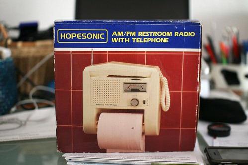
Anyone interested in robots and networked objects in multi-functions artifacts may be intrigued by this gorgeous AM/FM restroom radio with telephone that I ran across at the flea market the other day.

This device is an intriguing example of technological convergence, the tendency of certain technologies to be combined in a single device (as opposed to their existence as multiple products).

Of course, it's an example of awkward convergence as you can imagine. However, I definitely find it highly curious. So much so that the use case provided on the package if quite important to observe:

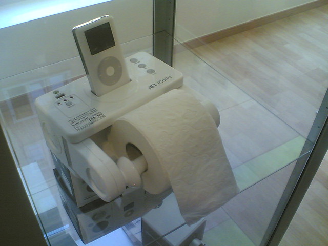
... which is reminiscent of another brilliant (and more recent) converging device found by Fabien some time ago:

Why do I blog this ? basic observation about how convergence can lead to strange solution, especially due to contextual reasons. This led me back to what Henry Jenkins wrote some time ago:

"Rather than a single machine that suits every need, technology is converging into many Black Boxes that address the needs of the consumer depending on the constraints of their situation"

Tensions between #gamification elements and location-sharing in #Foursquare

At the recent workshop on Gamification and game design elements in non-gaming contexts at CHI 2011 in Vancouver, there was an interesting paper about Foursquare entitled Gamification and location-sharing: some emerging social conflicts. The paper reports various observations on conflict that appeared between gamification elements (supposed to drive user engagement) and other usage motivations for location-sharing. The results are based on users interviews, surveys and ongoing analysis of real-time ‘check-in data’ involving 20 active foursquare users from Sweden, The Netherlands and the US.

Some examples of the conflicts described in the paper:

  • "Playing for points vs. ‘nonsense’ venues: A way to gain additional points and mayorships is creating new venues to check-into. However, venues that just have been created for ‘the game’, can also be a non-informational annoyance
  • Mayors & badges vs. privacy & identity management: Mayorships are publically visible on users’ profile, and are also shown to any user checking- in to that venue. This means that mayorships can threaten privacy (...) Some participants worried about getting mayorships or badges that would threaten their identity. Would one want to become the mayor of the cheapest eatery in town?
  • Mayorships vs. ownership: A mayorship appeared to communicate not only identity, but also public ‘ownership’ over a place, which was not always desired.
  • Anti-cheating aka ‘you’re using it wrong’: services employing gamification need to consider which messages their ‘game-rules’ send to users who might have very well appropriated the service in other ways.
  • Inappropriate can be more fun: Multiple participants described 'getting caught' and ‘doing it under the table’. Exactly this social unacceptable aspect of using the service also invoked playful behaviors"

It's interesting to see how their results show that game design elements such as mayorships, points or badges can both engage participants and restrict the use of the service.

Why do I blog this? I'm interested in this sort of frictions as they reveal relevant tensions in users' behavior. Mostly because we've been conducting a field study to understand the usage of Foursquare here in Switzerland. I'm looking forward to see the other results from this research team.

A visual taxonomy of objects by emphase.ch

An interesting project by emphase.ch encountered at the Panorama exhibit in Geneva last Saturday: ZWISCHENSAISON Knowledge Visualization is a visual taxonomy of an hotel archives (a set of artifacts). The list of artifacts is presented on the first page:

And then, each page keeps the same arrangement with pictograms to describe object traits:

Why do I blog this? Working on the game controller book project, I'm interested in different ways to depict object categories. It's interesting that design research seem to offer various exploration about how to create visual catalogues with compelling solutions like the one above.

The design of cell-phone trees

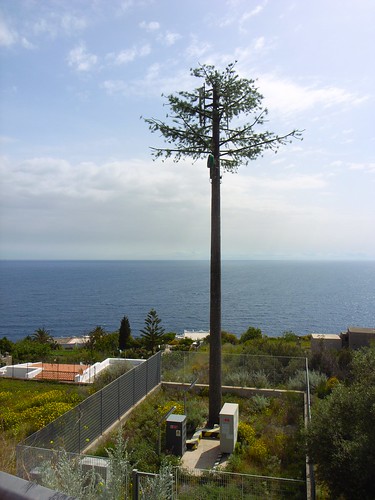
The ubiquitous presence of cell phone towers in urban and rural landscapes have led to protestation against their visual presence (the ugly mast/transmitter aesthetics) and their electromagnetic waves (which are invisible). A side-effect of people's "need" for uninterrupted connectivity, the design and building of phone towers is now influenced by various strategies. One of them consist in the use of camouflage techniques... and obviously the "natural" metaphor plays an important role here, as attested by these examples encountered in Lipari, Sicily last week.

Fake trees such as these palm transmitter species are great candidate but there are also other concealment possibilities such as fake chimneys, cross ("already a transmission tower of sorts", clock tower, water towers, etc.

As pointed out by Rick Miller and Ted Kane in their chapter on mobile phones in The Infrastructural City: Networked Ecologies in Los Angeles edited by Kazys Varnelis:

"the result is the camouflaged cell phone tower, the by-product of the only position available to communities who oppose cell phone towers, that is to demand their invisibility. Hiding its presence from public view, the ubiquitous cell phone tower camouflaged as a palm tree becomes an appropriate icon for the private infrastructural network of our day"

It would be intriguing to discover the whole design and construction process, especially how the the details have been taken care of. See for example the tower base and the antennas below... the design of the trunk, the branches and the leaves is of great quality, leading to some surreal piece of nature. Even more important here is the fact that the tree itself is (or must be) protected because it's an infrastructural installation that have inherent dangers for the genpop (electricity, etc.). The tree itself is just part of this ecosystem of components (electricity adapater, barriers, light system for night inspections, etc).

Why do I blog this? I see this sort of design as a curious sign of how certain norms lead to fascinating (absurd and perhaps depressing) solutions like transmitters concealed in fake trees:

  • Social and aesthetic norms about what should be visible or not and the type of tree/leaves that can be employed in an italian island.
  • Technological norms about how certain technologies should be protected, concealed or be accessible 24/7 (hence the presence of light).

"An internet of things that do not exist"

In a recent article about the Internet of Things for ACM interaction, Chris Speed discusses the notion of "a continuum of artifacts that are more or less valuable in their material or immaterial form". (Networked objects being designed at the HEAD-Geneva design school)

On this continuum, Speed distinguishes two poles: "things that are actually in the world, and things that are not actually in the world"... which raise interesting new question from both a design and cultural standpoint. To him, the materiality of both is influenced by their potential "information shadow", what Speed describes as "an immaterial other".

This decoupling between material things and their immaterial counterpart may lead to interesting "design futures" described in the articles... and that explain the title of the paper ("An internet of things that do not exist"). Some excerpts that caught my attention:

"we may need to design blank objects that have no other function than to become the host for memories that have lost their connection with the original physical artifact. Other times, discarded and culturally lost objects may be used because they retain some of the physical attributes that trigger associations with immaterial things (e.g., memories) that have lost their original material partner. (...) As well as becoming conduits that allow us to recall information from the past, things will help us to recover memories that have lost their physical place in the world (...) In the Internet of Things, objects may end up on your mantelpiece with associated memories of completely different artifacts. The value of these vessels and our attachment to them will likely depend on the social data stored in them, rather than on their physical form."

(Potential candidates as blank objects meant to receive memories?)

Why do I blog this? simply because I find interesting (culturally and design-wise) this distinction and the consequences that the author describes. The idea of having blank objects (and designing them) or to associate immaterial counterparts to objects which are totally different may lead to curious avenues. This is of course a shift that will be important to explore in several context and I wonder about the implications for the kind of domains we are interested in at Liftlab.

Series of articles about failures

There's suddenly a surge of interest in failures (technological, entrepreneurial, social) in the press. Curiously, I encounter various of these last week when traveling.

First, it was a piece on the Wired UK 05.11 issue which gives an account of various entrepreneurial stories and approaches. The article shows the importance of failures and the cultural lessons one could draw out of them ("Fail fast"...).

More specific and full of interesting details and analysis is the April issue of the Harvard Business Review. Although this is a journal I don't read very often, the material was kind of inspiring. The articles addressed several aspects such as the reasons to "Crash a Product Launch", the reluctance from entrepreneurs to learn from failures, the failures-that-look-like-successes, effective strategies to learn from failures, ethical issues, etc.

What struck me when comparing both the Wired issue and the HBR articles was that the entrepreneurs/innovators' testimonials were rarely interesting and pertinent... compared to external analysis (meta or not). As if there was some sort of blindness that prevented people from analyzing the problems at stake.

The Economist's Schumpeter gives a quick overview of this HBR issue with the following excerpts:

"simply “embracing” failure would be as silly as ignoring it. Companies need to learn how to manage it. Amy Edmondson of Harvard Business School argues that the first thing they must do is distinguish between productive and unproductive failures. There is nothing to be gained from tolerating defects on the production line or mistakes in the operating theatre. (...) Companies must also recognise the virtues of failing small and failing fast. (...) Placing small bets is one of several ways that companies can limit the downside of failure. Mr Sims emphasises the importance of testing ideas on consumers using rough-and-ready prototypes: they will be more willing to give honest opinions on something that is clearly an early-stage mock-up than on something that looks like the finished product (...) But there is no point in failing fast if you fail to learn from your mistakes. Companies are trying hard to get better at this. India’s Tata group awards an annual prize for the best failed idea. Intuit, in software, and Eli Lilly, in pharmaceuticals, have both taken to holding “failure parties”. P&G encourages employees to talk about their failures as well as their successes during performance reviews."

Why do I blog this? I just completed a book (in French) about recurring technological failures (title and cover are provisional, to be released at the beginning of June)... and it's interesting to see that there's a kind of momentum on these issues.

"Augmentable, Believable, Improvable and Invisible": exploring identity management services

Augmentable, Believable, Improvable and Invisible is a project by Ina Xi (Art Center College of Design) that aims at reinventing social media and identity management services. What attracted my attention is that the project is based on the research of social media users' misleading behaviors online. It basically "speculates how we can design the social network if it were to afford human conditions such as lying and hiding, even when it's offline".

Ina's research was informed by an on-going discourse about social media users' virtual identity and its security resulted from the increasingly publicized personal data, and is greatly inspired by anecdotes and stories of using technologies to selectively hide from and lie to members in one's virtual network for varied social purposes, which also has an impact on one's real-world relationships", which had led to the summary of four main typographies of dishonest behaviors and their outcomes: "The 'Augmentable Me' is driven by the motivation of a better self-image in front of the chosen audience, and based on what one wants to gain out of being the way they choose.

The 'Believable Me' is a virtual identity associated with credible, authentic informations of a real person, regardless of whether what has been said or done is exactly what has happened. The 'Believable Me' is motivated by the intention of preserving privacy through actively spreading their private information to the world.

The 'Improvable Me' is the result of a built-up online reputation on top of a bad, or a damaged one.

The 'Invisible Me' is an anonymous identity due to a missing link or a mismatch between the virtual identity and the real person. The value of the Invisible Me is rewarding especially when the identity used to be more public, exposed or discussed."

These personas were then used to translates the observational research into a series of user experiences and scenarios described on her website. See for instance this design fiction which is very compelling:

"Peter always saw Lisa on the metro train home. He wanted to approach her but, instead of coming up and say hi, he tried to find her online. Putting together the observed characteristics of Lisa and pretending to be the guy Robert who said hi to her once on the train, Peter had Lisa accept him as a friend in the virtual network.

Carefully he created a desirable picture of himself through a falsified identity seen by Lisa alone, based on the algorithmic analysis of her online profile, activity history, group discussions and contact list. A discussion between her network friends has shown Peter an opportunity to meet Lisa in real life, making her reach out naturally to him.

With everything planned out and the handy tips of talking ready, Peter went to the bookstore where Lisa works part-timely as a store assistant. Everything happened as expected, except, however, the fact that Lisa was not there to talk to him, and neither does she work at the store.."

Why do I blog this? This project is close to what a student of mine is doing at the design school in Geneva (creating bots that interact on social networking sites). The idea of using this kind of research , material and narrative to explore the complexity of identity management services is interesting. I particularly like the emphasis on various sorts of interfaces in the video.

Kevin Lynch's "Image of the City" with a graphic design treatment

"The Image of the City" by Kevin Lynch is an important contribution in urban design thinking. The perspective expressed by the author, as well as the methodology (description of mental maps drawn by residents in several cities such as Boston, Los Angeles and Jersey City), is insightful. Interesting, Gabriel Pelletier, a graphic designer added a new perspective on this book using the following treatment:

"Excerpts from Kevin Lynch's "Image of the City" were graphically treated according to their respective themes. The blue color was used throughout all the document is used to recall blueprints.

Each section's beginning was created using the graphic symbols located throughout it's pages. The cover was done in the same fashion, taking all graphic elements of the book and adding them to note the notion of unity when talking about the city's elements."

Why do I blog this? First because I like this book and enjoy this kind of graphic design. Second because it's interesting to see how the material presented in the book can be enhanced through the kind of representations proposed by Pelletier. The idea of using blue shapes is intriguing as it is sort of reminiscent of building blueprints.

Using historical research in HCI/Ubicomp

"Historical Analysis: Using the Past to Design the Future" by Wyche, Sengers and Grinter is an article about how the discipline of history similarly can contribute to research about human-computer interaction and ubiquitous computing. The authors takes the example of a specific context, domestic environments, to show that history can go beyond inspiring "new form factors and styles such as retro" by providing "strategies that, like anthropology, unpack the culture of the home and, like art-inspired design, defamiliarize the home".

The process is described as the following:

" First, we analysed historical texts to identify major themes in the development of technologies (often automation) for the activities under investigation, in our case housework. Second, we gained a broader understanding of the existing technological design space through the search of patents. Third, we developed a personal sense of the changing nature of housework through examination of primary sources from popular culture. Finally, as part of broader fieldwork we gathered oral histories from older people, using a designed, material artefact that reflected the popular history of housework to stimulate memories and reflections."

And here's how they saw a contribution:

"It was effective in helping us understand the subtle changes that have resulted with the introduction of new domestic technologies and in opening new space for design. Although the historical texts already revealed themes pertinent to ubicomp design (i.e. labor-saving debate and technology’s gendered character), by drawing on popular texts, patents, and interviews with elders as well, we learned things that could not easily be gleaned from texts alones. (...) With current interest in restoring felt experience as central to design, we believe that historical analysis is an important source for becoming aware of sensual aspects of experiences that have become lost but could be addressed in new forms of technology design. (...) In addition to revealing how felt qualities are altered with the introduction of new technologies, another benefit of our historically grounded approach is its potential to inspire radically novel design concepts. A collection of speculative design proposals resulted from our process [see 30 and 36 for details]. Like ethnography, history forces designers to become more aware of their preconceptions about a topic."

Why do I blog this? Working on the history of game controller, I am currently putting together a list of references about the role of history and historically informed approaches in (interaction) design research. This paper gives some interesting pointers about it.

The slow evolution of AI in video-games

Just read on gameplanet.co.nz:

Rather than trying to program enemy AI to think, behave and play like a human, developers simply imbue them with increased hit points, better statistics, or any number of favourable benefits whilst removing the same attributes from the players themselves. Manipulating these variables commonly forms the structure of a difficulty level.

In the quest to present the player with an action-packed experience, developers often sacrifice realism to keep the story flowing, or keep the participant at the crest of a wave. It's unlikely, after all, that precise emulation of a Special Forces raid in war-torn Afghanistan would lend itself well to the gaming public.

Why do I blog this? Artificial Intelligence is one of these Holy Grails some people are looking for. The term itself is fascinating as it encapsulates some sort of magic. Referring to something as "AI" leads to some expectations on the part of the observers and it's funny to see how people in the video-game industry describes the evolution of such tech.

"Journals of Negative Results"

A recent trend in academic sciences consist in the publication of "negative results". This is based on the idea that scientific articles published in traditional journals frequently provide insufficient evidence regarding negative data. More specifically, the point is to give a voice to negative results, experimental failures or results with low statistical significant. Some examples: Journal of Interesting Negative Results in Natural Language Processing and Machine Learning As described on their website:

"The journal will bring to the fore research in Natural Language Processing and Machine Learning that uncovers interesting negative results. (...) Insofar as both our research areas focus on theories "proven" via empirical methods, we are sure to encounter ideas that fail at the experimental stage for unexpected, and often interesting, reasons. Much can be learned by analysing why some ideas, while intuitive and plausible, do not work. The importance of counter-examples for disproving conjectures is already well known. Negative results may point to interesting and important open problems. Knowing directions that lead to dead-ends in research can help others avoid replicating paths that take them nowhere. This might accelerate progress or even break through walls!"

Journal of Negative Results in Biomedicine As described on their website:

"Journal of Negative Results in BioMedicine is an open access, peer-reviewed, online journal that promotes a discussion of unexpected, controversial, provocative and/or negative results in the context of current tenets.

The journal invites scientists and physicians to submit work that illustrates how commonly used methods and techniques are unsuitable for studying a particular phenomenon. Journal of Negative Results in BioMedicine strongly promotes and invites the publication of clinical trials that fall short of demonstrating an improvement over current treatments. The aim of the journal is to provide scientists and physicians with responsible and balanced information in order to improve experimental designs and clinical decisions."

Journal of Pharmaceutical Negative Results As described on their website:

"Journal of Pharmaceutical Negative Results is a peer reviewed journal developed to publish original, innovative and novel research articles resulting in negative results. This peer-reviewed scientific journal publishes theoretical and empirical papers that reports the negative findings and research failures in pharmaceutical field."

Journal of Negative Results in Ecology and Evolutionary Biology As described on their website:

"The primary intention of Journal of Negative Results is to provide an online-medium for the publication of peer-reviewed, sound scientific work in ecology and evolutionary biology that may otherwise remain unknown. In recent years, the trend has been to publish only studies with 'significant' results and to ignore studies that seem uneventful. This may lead to a biased, perhaps untrue, representation of what exists in nature. By counter-balancing such selective reporting, JNR aims to expand the capacity for formulating generalizations. The work to be published in JNR will include studies that 1) test novel or established hypotheses/theories that yield negative or dissenting results, or 2) replicate work published previously (in either cognate or different systems). Short notes on studies in which the data are biologically interesting but lack statistical power are also welcome."

Why do I blog this? Writing the conclusion of my book about technological failures lead me to discuss the importance of documentation. I highlighted (bold) the variety of purposes, which are sometimes different from one journal to another.

Besides, the title of the papers are utterly fascinating. See for yourself: "Failure of calcium gluconate internal gelation for prolonging drug release from alginate-chitosan-based ocular insert of atenolol", "Influence of some hydrophilic polymers on dissolution characteristics of furosemide through solid dispersion: An unsatisfied attempt for immediate release formulation", "Some commonly observed statistical errors in clinical trials published in Indian Medical Journals".

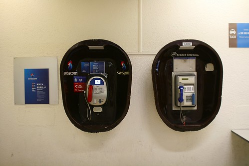
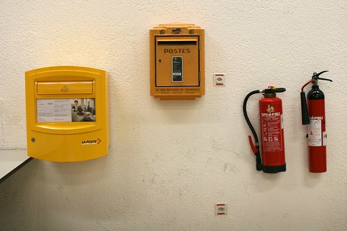
Both French and Swiss systems

There's this part of the airport in Geneva that has this fascinating setting. Several remarks:

  • You have traces of both French and Swiss systems: two separate phone booths (Swisscom and France Telecom), two separate mailboxes (French and Swiss Posts), two different fire extinguishers
  • You have both phones and mailboxes because it's a joint airport between the two countries. But this is from the French part of the airport.
  • As usual with French enclaves in foreign countries, the institutions do not seem to care much about their devices... as attested by the fact that you have an old mailbox model... and the previous logo of France Telecom.

Location-based services updates

Few examples of location-based services that I ran across recently. Bluebrain reactive music based on location As described on The Next Web:

"We had this idea of having the music progress and change based on a person’s location. We decided to release an album that’s also an app with whole melodic phrases that change based on a listener’s location. (...) The most difficult part of making this new album wasn’t the app but writing the actual music,” explains Holladay, “It’s difficult to know what all the variables will be and making sure they all work on a musical level. (...) We spent a lot of time on The Mall in different areas and created zones in parts of the mall for each particular piece. Then we’d write music based on that area in different sections."

Creepy:

"an application that allows you to gather geolocation related information about users from social networking platforms and image hosting services. The information is presented in a map inside the application where all the retrieved data is shown accompanied with relevant information (i.e. what was posted from that specific location) to provide context to the presentation."

Street Pass (Nintendo 3DS)

StreetPass is a curious feature in the new Nintendo 3DS that allows multiple devices to connect with each other when in a certain range and exchange data. As described here:

"StreetPass Quest begins with your Mii trapped in a tower. To escape, you must use Miis you have collected via StreetPass and battle increasingly powerful enemies in turn-based combat. If you haven’t collected any Miis then you’re able to purchase a cat in armour to act as a substitute. You purchase this cat with two game coins, which have been previously detailed. The cat has two attack options: sword and magic. (...) The goal of StreetPass Puzzle is to construct a 3D puzzle. But to complete this puzzle you need to collect pieces by interacting with other folks via StreetPass. The more people you interact with, the more puzzle pieces you gain until you can finally complete the puzzle."

Why do I blog this? just keeping track of recent and interesting developments in the field of location-based applications.

Teardown culture and companies' reaction

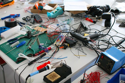
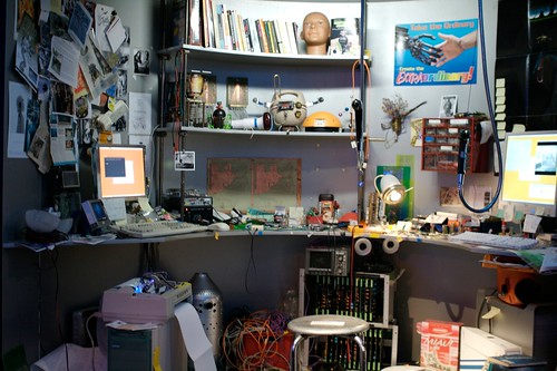
POPSCI has an article about the "history of the teardown" and what happens on websites such as ifixit.com/. (A robot tinkerer's desk at the design museum in Zürich)

The article describes the important of this kind of activity to understand how things work, child-like memories of bricolage and to generate a "culture of repair". But this is not the thing that attracted my attention, I was more curious about how companies react to this:

"A culture of repair fanatics would be rough on the tech manufacturers who rely on pumping out marginally changed gear, year after year, but would have a pretty astounding effect everywhere else. (...) The tech companies themselves aren't helping. "The manufacturers are more hostile now," says Wiens. "The Apple II came with complete schematics," but newer Apple products boast proprietary and hard-to-find screws, unlabeled components, batteries that Apple says must be replaced by the company and not the user, and no user documentation whatsoever. Apple is typically held as the worst or at least the most obvious example of this kind of repair-unfriendliness. (...) The iPhone 4, a few years later, features screws that were created by Apple expressly for this purpose. These weird, five-lobed, flower-shaped Torx screws have no practical advantage over, say, a Philips—except to keep tinkerers out. That didn't stop iFixit, of course: "We actually had to make a screwdriver—had to file a flat-head screwdriver down to fit [the Apple screw]," says Wiens (...) In Apple's case, it's probably a combination of secrecy and simple greed, but even some of the "good" companies, like Dell and HP, bury their manuals deep in their sites, difficult to find for many consumers."

Why do I blog this? This is a good example of a sort of "arm race", or a co-evolution between products and tinkerers (who need to design new tools to tear down products).

This also echoes a conversation that I had last week with some representatives of a domestic appliances company at Robolift. The notion of tinkering/repurposing/opening products is both seen as a challenge and an opportunity. But companies do not necessarily know if they should go against this. I wonder about what can be possible and what can be done with the right target group of people.

Video games that recently caught my attention

Recently, a journalist asked me what are the console games that I found interesting lately. I froze for a while, told him about 3 games: Superbrothers: Sword & Sworcery EP, Minecraft and Dwarf Fortress... and realize none of them were available on consoles... Few notes about these 3 video-games that caught my attention in the last few months. Each of them made me wonder about the possibility to go beyond standard console games through various aesthetics and forms of interactions.

Superbrothers: Sword & Sworcery EP (S:S&S)

S:S&S EP is the video game that reconciled me with storytelling, a feature that I largely ignored in the last few years. Described as a "21st century interpretation of the archetypical old school videogame adventure, designed exclusively for Apple's touchtronic machinery", it's an intriguing mix of "laid-back exploration, careful investigation & mysterious musical problem-solving occasionally punctuated by hard-hitting combat encounters". Exactly what I needed after a tough series of weeks organizing conferences.

As discussed by game’s creator/artist/animator Craig D. Adams in this interview, the game was inspired by Shigeru Miyamoto’s design sense with the original Super Mario Bros, Jordan Mechner’s original Prince of Persia and Eric Chahi’s Another World because all off these "have a cinema-influenced style, expressive human movement and a more grounded narrative concept". This combination of players' interactions with "sound, music & audiovisual style" underpinned by a basic narrative and very low-key dialogues made me tick. More specifically, I am impressed by the rhythm of the game, which is sometimes super slow/contemplative and sometimes very quick/nervous in combat.

Also, one of the curious feature of the game is the integration of social software in the game. You input your twitter login/password and you can broadcast dialog, hints, descriptions from the game to your twitter channel. It's pretty basic right now (lots of people tweet the same things) but I guess this is the beginning of something and there could be an interesting potential in also using content coming from tweets tagged with the #sworcery hashtag.

Minecraft (Markus Persson)

Minecraft has a very clear value proposition (I find this term funny), it's a (sandbox) game that engage users in placing blocks to build anything they can imagine. As described in the Wikipedia:

"The core gameplay revolves around construction. The game world is essentially made up of cubical blocks arranged in a fixed grid pattern, that represent different materials, such as, dirt, stone, various ores, water, tree trunks, etc. While the players can move freely across the world, objects and items can only be placed at fixed locations relative to the grid. The player can gather these material "blocks" and place them elsewhere, thus potentially creating various constructions."

The game was kind of a puzzle for the video game industry because of various characteristics. It doesn't follow the AAA marketing logic, graphics and are super basic, it's a simple download (no app store), you buy it with PayPal, no marketing/publicity, no publisher. But this is not what I found interesting.

Chris DeLeon has a good perspective on what makes Minecraft an important platform. He describes that it's a game about discovery:

"Discovering what’s beyond the horizon, discovering new cave systems, discovering incredible projects others have done, discovering new features snuck into updates, discovering new like-minded people, discovering architecture / electronics / sculpture / texturing / landscaping / action / photography / decorating / music / trading / storytelling / adventure / modding, and discovering that we all love to make things, provided that we have an accessible and cost-effective way to do so."

Dwarf fortress (Bay 12 Games)

Even geekier than Minecraft, Dwarf Fortress is a combination of a roguelike and city-building games in which the user interface has been limited to text. A sandboy-style simulation platform, it's a game that allows the player to build and organize a city of dwarves.

What I love in Dwarf Fortress is simply the spatial environment, its representation, how you interact with it as a player and how it's generated by the computer. As written in the Wikipedia:

"Prior to play, a world must be generated using the software or downloaded from the Internet. Each constructed world is unique; events that take place during play will affect subsequent games in the same world. World creation in Dwarf Fortress is elaborate: terrain is generated using fractals, erosion is simulated, then wildlife, towns, and other sites are placed. A specific history is attached to each site; references to these events can be found during gameplay (in artwork and conversations with non player characters (NPCs)), and development's current focus (as of April 2008) is to make world generation wars determine in-game territory distribution and NPC background stories."

Readers interested in this game can have a look at this masters thesis by Joshua Diaz about how the "space, code, and player choice (...) not only encouraged players to view the game as a world full of stories, but also gave players tools to craft their own kinds of tellable moments through the game".

Why do I blog this? Writing some quick notes about these games as a pointer in further discussion about the evolution of video games, the importance of looking at the fringes and the spatial component in virtual environments.

About gestures and mobile phone conversations

"Not crazy, just talking on the phone: Gestures and mobile phone conversations" by Carolyn Y. Wei is an intriguing paper I ran across recently. It basically focuses on a phenomena you may have certain notice: why and how mobile phone users engage in vivid nonverbal communication behaviors that do not benefit their communication partner (gesturing, smiling, and nodding their head). The most interesting part of the paper is about the design implications, such as creating mobile phones that can be sensitive to nonverbal communication behaviors (with paralinguistic social cues such as tone of voice, pitch, and volume). The "Jerk-o-Meter at MIT Medialab is based on this approach:

"The Jerk-O-Meter (or JerkoMeter) is a real-time speech feature analysis application that runs on your VOIP phone or cellphone that remedies precisely that experience. It uses speech features for activity and stress (and soon empathy) to measure if you are 'being a jerk' on the phone. The phone displays messages in case you are, and can also be setup to inform the person on the other end of the line that you're extremely busy."

(A courier in Seoul who make gestures when using his mobile phone)

But the most intriguing one is described in the original article:

"Mobile phone design can also respect existing research that suggests gestures are more meaningful to the speaker than the listener, and thus focus on innovations that aid the speaker. An example of this kind of design would be a mobile phone that senses gestures or other nonverbal behaviors and compares them with the words being spoken. If the words being spoken match the amount and nature of gesturing, then the phone might alert the user that she is performing well. Light could be used in such an interface: if the user is gesturing and speaking very animatedly, then a light on the phone might hold steady to indicate appropriate activity. If there seems to be a disconnect, for example, where the user is not saying anything but still gesturing, then the phone could alert the user with a pulsing light that she might appear odd to others. Similar feedback could be offered with paralinguistic features such as volume to notify speakers that they may be speaking overly loudly."

Why do I blog this? Observing how people gesture when talking on the phone is a situation that I have always conducted with curiosity and fascination. Especially because you can see it as an indicator how these gestures are nearly more important for the speaker than the listener. It's therefore intriguing to see how mobile phone design can benefit from this.

Keyboard hack #3

Another interesting keyboard adaptation that I ran across in one my course. This designer is working on a large graphic and needs to drag and drop lots of visual primitives here and there with Illustrator. She found it more convenient to use this quick and dirty solution by using tiny stickers with a visual representation of the graphical elements on each keys.

Why do I blog this? It's always good when you start clustering examples of user repurposing their own technologies. Along with the French-Cyrillic keyboard hack and fixed keyboard mapping, I now have a cluster of modification that show various possibilities.