A good excerpt from a text by Neal Stephenson:
"Most people who work in corporations or academia have witnessed something like the following: A number of engineers are sitting together in a room, bouncing ideas off each other. Out of the discussion emerges a new concept that seems promising. Then some laptop-wielding person in the corner, having performed a quick Google search, announces that this “new” idea is, in fact, an old one—or at least vaguely similar—and has already been tried. Either it failed, or it succeeded. If it failed, then no manager who wants to keep his or her job will approve spending money trying to revive it. If it succeeded, then it’s patented and entry to the market is presumed to be unattainable, since the first people who thought of it will have “first-mover advantage” and will have created “barriers to entry.” The number of seemingly promising ideas that have been crushed in this way must number in the millions.What if that person in the corner hadn’t been able to do a Google search? It might have required weeks of library research to uncover evidence that the idea wasn’t entirely new—and after a long and toilsome slog through many books, tracking down many references, some relevant, some not. When the precedent was finally unearthed, it might not have seemed like such a direct precedent after all. There might be reasons why it would be worth taking a second crack at the idea, perhaps hybridizing it with innovations from other fields."
Why do I blog this? This kind of situation echoes with my feeling in certain meetings and projects. Besides, I find interesting to rely on failures in order to move forward, as described in this excerpt.


 Lighweight QR code (as suggested by Paul Baron)? Game of Life (as suggested by


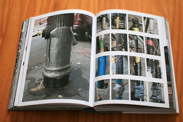
 Why do I blog this? Giving lectures here and there about user experience, it's good to have such kind of examples to show the tendency people have to repurpose standard artifacts for other needs.
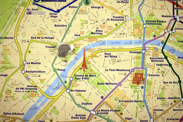 ... or you can spot where you are based on a location people made clearly visible through touching a paper-based map... seen in Paris last week-end.


 A strikingly interesting author, japanese manga author Yuichi Yokoyama has an interesting perspective on the near future:
 It took 20 years to (finally) see a
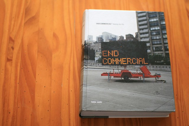
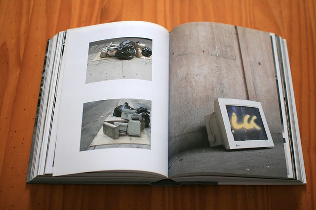
 The ambivalence of warning signs in terms of


 Why do I blog this? Collecting material about cyberpunk for an upcoming interview about the connections between science-fiction and interaction design. The creolization meme seems important but, for some reasons, I don't know (yet!) how to articulate its role. More material needed to understand the implications.
 Why do I blog this? I'm not sure "Ubiquitous computing" was supposed to mean this kind of QR code pervasive presence, but hey...