Do Robots Dream of Spring? Ken Rinaldo exhibit at the Swiss Museum of Science Fiction

Last saturday, I made a quick trip to the Swiss Museum of Science Fiction for the opening of an highly intriguing exhibition called "Do Robots Dream of Spring?". It features the work of Ken Rinaldo, an american new media artist who specializes in exploring the confluence and coevolution of organic and technological cultures.

This 6-month retrospective exhibition opening in Switzerland features a diverse set of artifacts and documents. Most of the work showed at the Maison d'Ailleurs is made of curious installations that promotes "communication between species". See below some examples that attracted my attention:
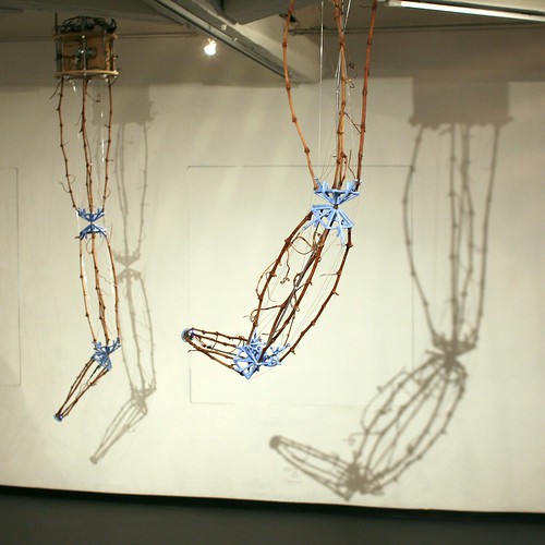
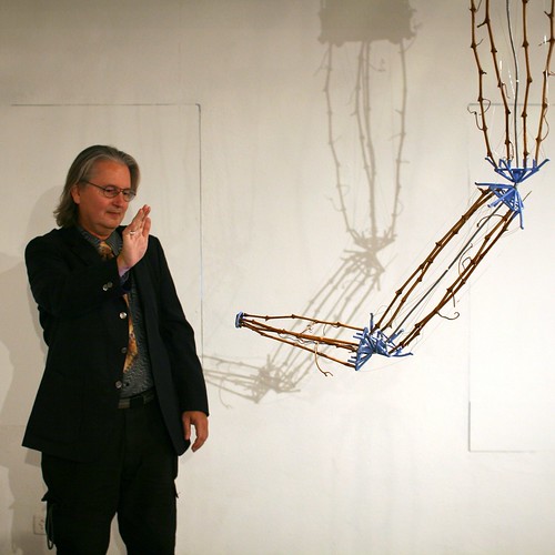
"Autopoiesis"

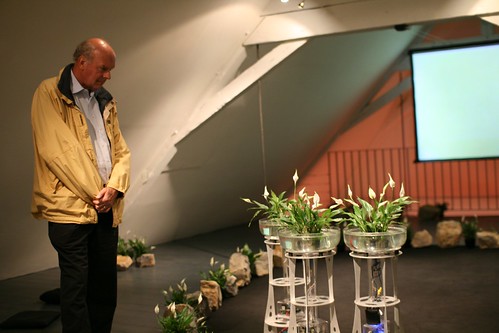
This one was my favorite in the exhibition. This installation consists of six robotic sound sculptures that interact with the public (using IR sensors) and modify their behaviors over time. These big robotic arms (made out of Cabernet-Sauvignon grapewine and steel wire) talk with each other through a computer network and audible telephone tones, which act as a musical language for the group. The group consciousness of the sculptural robots corresponds to "a cybernetic ballet of experience" with the bots and and viewer/participant involved in a grand dance of one sensing and responding to the other (the photo above depicts a science-fiction writer interacting with one of these arms).

The piece explores the idea of group consciousness and the notion of Autopoeisis coined by Francisco Varella and Humberto Maturana. As described by Rinaldo:

"Autopoiesis utilizes a number of unique approaches to create this complex and evolving environment. It uses smart sensor organization that senses the presence of the viewer/participant and allows the robotic sculpture to respond intelligently. (...) Each sculpture also generates bit strings of information as algorithms using an internal numerical randomizer. These randomizers effect overall sculptural form and the evolution of the sound environment. Additionally, the tones are a musical language that allows individual robotic sculptures to communicate and give the viewer a sense of the emotional state of the sculptural elements as they interact."

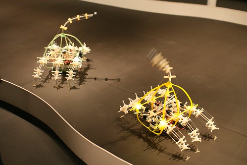
"Autotelematic Spider Bots"

This installation is a sort of playground in which spider-like bots sense and interact with the public in real-time. This artificial life piece is based on the idea that the bots can modify their behaviors based on interactions with each other (communicating like twittering birds), the public, the environment and "food source". Some can activate viewers' cell phone.

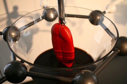
"The Augmented Fish Reality"

This interactive installation is made of 3 rolling robotic fish-bowl sculptures that is meant to explore interspecies and transpecies communication. Interestingly, this fish-driven robots are controlled by Siamese fighting fish chosen here for two reasons: (1) they have good eyes (which allow them to see for great distance), (2) they associate humans with food. The picture above shows the curious human-robot interactions at stake here. As Rinaldo described:

"This design uses 4 active infrared sensors around each bowl which allow the fish to move forward & back and turn the bowls. By swimming to the edge of the bowl the fish activate motorized wheels that move the robots in that direction. Humans will interact with the work simply by entering the environment. (...) these are robots under fish control and the fish may choose to approach and/or move away from the human participants and each other. These bowls consist of a living environment of peace lillys, which help to absorb the waist stream from the fish. The bowls and robots are designed to allow the fish to get to within 1/4 inch of each other for visual communication between the fish, both male and female."

Overall, I found that these superb artifact looks like giant and sleek exoskeleton (from the fish's viewpoint!) that are very distinct from the common armour-like devices that robotic research produces. Can we think about peculiar type of exoskeletons for human? without any reference to the shape of our bodies? Not necessarily a fish bowl for humans, but eh, you get the point.

Beyond this, what's interesting in this project is simply that observing the fish leads the viewer to wonder about its very intentionality: Does the fish really move to get closer to humans? What makes it move? How does the environment/other fishes/human beings influence the movement?

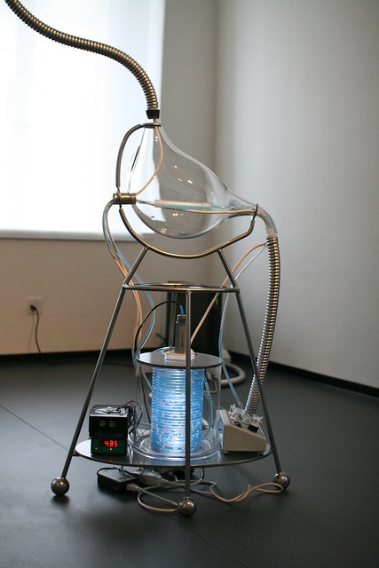
"The Enteric Consciousness"

This one is an artificial tongue activated by living bacteria that gives viewer a massage on a robotic chair (shaped into a massive tongue). This work is concerned with our "microbiome" and the symbiotic relationships humans share with bacteria. It also proposes a new form of interactive robotic installation that involves direct touch and smell.

Why do I blog this? Documenting these fascinating examples of how new media arts, science-fiction and robotics intersect led me to think about some issues raised by artificial life, robots and technology:

  • The very definition of robots and their shape. As you can see on the picture above, the devices do not really like your common R2D2/Bender/C3PO. However, they sense things in the environment, they compute this information and they react with movements and interactions... which corresponds to being a robot.
  • The self-organization of robots behavior based on what is sensed.
  • The feedback loop between robots, other robots, the environment and the viewers (which are turned into "participants" in Rinaldo's work).
  • The notion of intentionality: Are the movements of the fish/arms intentional? What influenced their movements?

Another aspect that I found relevant in Rinaldo's work corresponds to how close it is to science fiction. In his introduction to the booklet about the exhibition, Patrick J. Gyger shed some light about this aspect:

"Naturally, as a creator of systems which imitate the behaviour of living organisms, Rinaldo knows full well that the determinism of their programming prevents any evolutionary independence. But his uncanny ecologies allow a reversal of perspective. They succeed in suspending the onlooker's disbelief and incite their wonder, as perhaps only science fiction at the height of its inventiveness can. Thus Ken Rinaldo goes beyond the clichés which link robots and science fiction and sets our imagination in motion. He proves that science fiction art is not limited to the cinema, novels or illustration. He has appropriated an essential contemporary science fiction technique. He has taken ownership of the technologies that surround us, and his poetic interrogations of these technologies cause us to wonder if robots really can wait for the arrival of better days."

To which, i would point to a quote from Bruce Sterling in his speech during the opening: "Robots have been invented as performing artists [by Kapek's brothers], and they're still are performing artists".

Skateboards, golf clubs and other bodily engaging artifacts

This quick varial observed in Geneva few years ago is one of these pictures that I keep using to show how skateboard practice is interesting in the context of tangible artifacts. As a matter of fact, my argumentation about it is more based on personal intuition (and gut feelings) than serious observations. Which is why I was intrigued by this academic article I ran across recently. In Bodies, Boards, Clubs and Bugs: A study of bodily engaging artifacts, Jakob Tholander and Carolina Johansson adopt a rather interesting perspective about non-digital artifacts. They examine how the examination of golfers, skateboarders and body buggers can be relevant for design purposes. Their approach shed some light on the "qualities for design of interaction that allow for full body experiences, and engagement of a rich array of our senses and bodily capabilities for being-in and moving-in the world." The authors also compare their observations and results from interviews to a new interactive device designed for movement and bodily engagement (called the BodyBug).

Based on different artifact descriptions and experiences, the articles describes various lessons drawn from their observation and certain design implications:

"key qualities for design of interactive artifacts that connect body and world in an intriguing way:

  • make it necessary to engage with the physical environment
  • avoid perceptive modalities (in our case vision) that remove attention from body and environment
  • the response should not be discrete but open up for individual experience and interpretation
  • the artifact should allow users to continuously be socially aware."

This challenges designers of experience-oriented artifacts for body and movement to view the artifact as a medium for engaging in movement based activities, while not letting it become the sole and primary focus of the movement. This would allow the “outcome” of the activity not to be determined by the output of the system, but to be determined by the experience of the user.

Among the three examples, it's the description about skateboarders that I found the most intriguing with comments such as "The skateboard was rarely a primary element of what they talked about; instead focus was on the embodied experience or "Skateboarders talked about “surfaces” such as slopes or rails and how they were used to carry out tricks".

Why do I blog this? sorting different papers for my class about user research and interaction design. This one is relevant as it shows how the study of non-digital activities can inform the design of tangible artifacts.

In addition, this paper is relevant to my current research because it moves from observing humans to the analysis of non-humans (objects). There would be a lot to draw from analyzing both skateboards and skateboard places (street furnitures, bowl, etc.).

Evolution in rapid prototyping/3D printing

A common remark I've heard at Lift France 11 about the session focused on fab labs and rapid prototyping dealt with the lack of business opportunities in these fields. Interestingly, the NYT had an overview of the current possibilities in this article. Various companies ranging from HP to Boeing are mentioned, showing the importance of this topic. But it's not what caught my attention. (A Fab bot encountered in Paris few months ago)

Instead, I found relevant to see what has changed in the field:

"The technology has been radically transformed from its origins as a tool used by manufacturers and designers to build prototypes.

These days it is giving rise to a string of never-before-possible businesses that are selling iPhone cases, lamps, doorknobs, jewelry, handbags, perfume bottles, clothing and architectural models. And while some wonder how successfully the technology will make the transition from manufacturing applications to producing consumer goods, its use is exploding. (...) Advocates of the technology say that by doing away with manual labor, 3-D printing could revamp the economics of manufacturing and revive American industry as creativity and ingenuity replace labor costs as the main concern around a variety of goods. (...) Manufacturers and designers have used 3-D printing technology for years, experimenting on the spot rather than sending off designs to be built elsewhere, usually in Asia, and then waiting for a model to return. Boeing, for example, might use the technique to make and test air-duct shapes before committing to a final design. (...) Moving the technology beyond manufacturing does pose challenges. Customized products, for example, may be more expensive than mass-produced ones, and take longer to make. And the concept may seem out of place in a world trained to appreciate the merits of mass consumption.

But as 3-D printing machines have improved and fallen in cost along with the materials used to make products, new businesses have cropped up."

Why do I blog this? Following up on previous talks at past Lift conferences, putting things in perspectives.

Recent "you are here" encounters

London, UK: the delicate use of a pointing finger.

Istanbul, Turkey: the finger is now turned into an arrow, that indicate the location.

Faial, Portugal: a common "you are here" symbol with a bullseye signage that replaces the finger/arrow metaphor.

Lyon, France: an interesting example of a semi-bullseye signage linked to an indication of a walking path. There's a direct continuity between the two. Interestingly, this kind of representation shows a direction, where one could head to.

Paris, France. Perhaps the most intriguing as it says "vous êtes ici" printed on the sidewalk, a "you are here" indication that it not really useful as you already know that. Certainly a playful graffiti to indicate that there's something relevant in the area (one of my favorite book shop in Paris: Bimbo Tower). What is curious here is the direct inscription of the symbol in the context of the person.

Why do I blog this? sorting out the main categories of "you are here" symbols with a limited sampling (recent encounters) allows to understand the evolution over time and the design space (possibilities). Nothing digital here but I'll get to it later on.

Article about relying on failures in design (ACM interactions)

My article about technological failures has been published in the last issue of ACM interactions. It addresses the possibility to use failure as design tactic:

"failures and mistakes are important too because they are implicit signs of a need or problem that requires a solution. The examination of failures reveals what is commonly referred to in HCI as the “gulf of execution,” i.e., the difference between the user’s expected actions to achieve a goal and the actual required actions

my quirky mind-set left me wondering about the role of failure in design research: If problems and mistakes are so interesting and insightful, why not be a bit more bold and enlist them as a design tactic? I am suggesting the conscious design of “questionable” prototypes to investigate user experience. (...) In doing so, what kind of insights can be derived from leading people in the wrong direction?"

Attaching stories to objects: the return of the blogject meme

This article in the NYT made me think that there seems to be a new bubble in platforms that allows attaching stories to physical objects. The article mentions Tales of things (" Slap on a sticker with a newfangled bar code, and anybody with a properly equipped smartphone can scan the object and learn..."), Itizen ("a tell-and-tag approach") and Sticky Bits (" can also be used to link content to an existing bar code").

Some excerpts I found interesting:

"Goldstein theorizes that the motive was the same “microboredom” that inclines users of mobile check-in apps to announce that they’ve arrived at Chili’s — except that users could broadcast not just where they were but also what objects were around them. Some do use StickyBits to communicate something specific to people they know, but many essentially use it as a media platform. (...) Under that scenario, things are being linked to a story not so much in the form of narrative as of cumulative data. The continuum moves even further in the direction of raw information when you consider what tech experts call the “Internet of things” — more and more stuff produced with sensors and tags and emitting readable data (...) As more objects have more to say, the question becomes what we want to hear, and from what."

Curiously, I haven't seen any mention of Thinglink, which was one of the first platform to propose a globally unique object identifier. Developed by Social Objects Oy, a company founded by Ulla-Maaria Mutanen and Jyri Engeström, it's now a platform where the thinglink object code is linked to further references, such as photos, descriptive text, tags, maker(s), owner(s), and web links.

Why do I blog this? It's been a while that I follow this trend and it's funny so much activity along these lines. Possibly some interesting things to be discussed at Lift11. What I am curious about is how this is connected to blogjects and how things have changed in the last few years.

Lift seminar@imaginove about robots/networked objects

A quick update on the Lift@home front, we're going to have a Lift seminar with Imaginove on September 29th in Lyon. We'll talk about how networked objects and robotics can offer an interesting playground for digital entertainment. The event will be in French and we'll have two speakers. Etienne Mineur from Editions Volumiques, a publishing house focusing on the paper book as a new computer platform, as well as a research lab on book, computational paper, reading, playing and their relation to new technologies. The second speaker, Pierre Bureau from Arimaz. will discuss how robots and networked objects can be connected to virtual environments to create innovation gameplays. I'll give an introduction about this field and moderate the session. (A "beggar robot" encountered last week in Trento, created by Sašo Sedlaček)

Very related to this, we are now officially working on a new conference about robotics. The "Robolift" conference will take place on 23-25 March in Lyon, during the first edition of inno-robo, the European trade show dedicated to robotic technologies organized by the French Robotics Association Syrobo.

Designing alternative presents and speculative future

Last week I attended the European Association for the Study of Science and Technology conference in Trento, Italy. I went there presenting my work about game controllers and user appropriation of these devices. One of the most interesting session I attended was part of a track called "Speculation, Design, Public and Participatory Technoscience: Possibilities and Critical Perspectives". Focused on speculative design, the talks in this session explored how design is increasingly cast as a possible mode of intervention into technoscience. James Auger's presentation in this session was highly inspiring. Entitled "Speculative Design by Practice: robot case study", it addresses Auger's approach to design for speculation. He basically described this perspective with the following diagram:

As presented on his blog, this matrix can be read like this:

"At the origin we have the here and now; everyday life and the real products that are available on the high street. The lineage of these products can be traced back in time to where the technology became available to iterate them beyond their current form. The technology element on the left hand side represents research and development work, the higher the line the more emergent the technology and the longer and less predictable the route to everyday life (domestication). As we move to the right of the diagram and into futures we see that speculative design futures exist as a projection of the lineage; they are developed using a methodology that consciously focuses on contemporary public understanding and desires to make these speculations both tangible and desirable. Alternative presents step out of the lineage at some poignant time in the past to re-imagine our technological present. These designs challenge and question the existing systems and objects that arise from current modes of manufacture."

Such diagram is an interesting model that allows to explore product evolution in a non-standard way. One can see it as a generative tool to investigate design fictions that target potential futures or alternative presents. For instance, based on a certain technology, one can start designing original products that would challenge how we're using it. The key thing with this matrix is the context of origin (the "here and now"): where are we doing it? when are we doing it? Another interesting point IMO is also the notion of "product lineage" (see the work by Simondon). The use of past technologies and products influence potential future avenues and past failures can also be recombined to create original design.

He exemplified this with a robot case studies, which could be seen as myths/failed visions of the future. Although technologies move forward, the visions and the promises remain the same, as attested by useless humanoids devices such as Asimo. Auger shows how looking at context (what influences classical product design) leads to more meaningful and less spectacular robot design. Looking at what makes people tick (such as a video of lizard that catch fly on a restaurant table) enables to speculate and design about a potential robot that would do the same.

This part reminded me of Sara Ljungblad's work about how the observation of marginal practices can provide a new perspective on the use of the technology, raising design ideas that are based on alternative viewpoints and ways of doing things. In her work, she showed how the observation of people who collect unusual pets, such as snakes and spiders) can be relevant to understand underlying human interests and qualities of interaction, relevant for designing robots.

This corresponds to the Carnivorous Domestic Entertainment Robots we shown at Lift10. See for example the coffee table mousetrap robot:

What's important here, as claimed by Auger, is that the term "speculative" is flawed. It gives the sensation that the artifacts does not exist. By existing for real, the public treat them as more seriously because it resonates with their everyday life.

Auger also discussed several principles that guided his work:

  • Ignore the stereotypical representation of robots and acknowledge existing contextual artifacts (tables, lamps...)
  • Produce "objets of desire" that people would be happy to have in their home,
  • Get to a new kind of relationship with objects.
  • Using this to question technology

Why do I blog this? the interest here is triple: (1) My personal interest in design fiction (and an upcoming talk about it as the Swiss Design Network conference!), (2) The design tactics used in this context and how they can be transferred to design research/field research, (3) The robot case, which resonates with current Lift Lab projects about networks objects and robots.

Foursquare data analysis about users activities

Bitsybot has an interesting set of visualizations about Foursquare usage. Called Foursquare Trends, it shows users' behavior over time by visualizing a week’s worth of Foursquare checkins. Bitsybot is interested in using this to "develop a suite of similar tools to help small brick and mortar businesses understand their micro market landscapes":

Why do I blog this? another type of material that is relevant for our study of Foursquare usage. This type of graph is relevant as a way to show rythms and usage patterns. The example above is based on activity analysis (each activity actually corresponds to a certain set of places).

For us at Liftlab, it's also interesting to compare this to our current musings about spatial occupancy analysis. See for instance Fabien's work about:

"We retrieved a couple of months of records produced by 5 Bluetooth scanners, deployed by the Mobility Service of the city of Barcelona on light poles and traffic poles in the Barcelona city center in the Plaza Catalunya – Puerta del Angel – Rambla – Cathedral area. BitCarrier’s solution aggregated over 4 millions non-unique devices (about 1 million unique devices) into periods of 15 minutes, and we discarded the periods with less than 100 detected devices. The database provided a first understanding of the cyclical nature of passing Bluetooth traffic at the nodes and routes forming a connected graph of sensors."

Motivations for "off the grid check-in" on Foursquare

TechCrunch is generally not a website I follow that much, but there's an interesting article by a Guest Author about "Off the Grid" check-ins on Foursquare. Following up on the blogpost about automatic location capture I wrote last week, I think it's worth having a look at this survey mentioned in the TC article. The survey was about the purpose of using the "OTG" feature, i.e. the possibility on Foursquare to avoid disclosing the location where you checked-in to your contacts. Being "off the grid" however enable to gain points, badges and compete for mayorship. Although the methodology may be a bit rough in terms of sampling (I wonder less about the quantity of peeps who participated than the stratification), here are the conclusions I found interesting:

  • "The single largest reason for OTG was hiding from friends [46%]. People gave a variety of motivations [examples: buying a gift for girlfriend, on a date, avoiding someone in particular, hiding one’s poor eating habits from friends, and seeing a doctor.]
  • 60% of respondents cited the desire to keep track of where they’ve been for their own future reference. (...) your Foursquare History is a flat set of your check ins but the user interest here points to the opportunity for a much more robust feature. (...) loyalty programs and offers; customer acquisition and retention instruments.
  • 34% of respondents used OTG to check into a location that could have been considered confidential or sensitive to their job.
  • Mayor stalking was the surprise motivation for many OTG check ins since they count towards mayorships but don’t display your name associated with the venue.
  • Only 15% of users report using OTG to signal a “check out” — leaving a venue and not wanting to publish location out of concern friends will arrive to find you departed.
  • 26% of people utilize OTG for repeat check ins at a location over the course of a few days (such as a hotel). These could easily be public but collapsed into a single line. Or subsequent check ins might be public, but not published as alerts."

Why do I blog this? Simply because we (Lift Lab) are currently conducting a short user study of Foursquare with both lead users and people who abandoned using it after a while. Our approach is much more open-ended and based on visualization of spatial data (such as the one generated with where do you go). The TC data will allow to triangulate our qualitative data with this quantitative insights.

What can we learn from the analysis of disorientation?

An excerpt from this presentation by Ruedi Baur:

"We simply allow ourselves to be guided by the system, led by the hand, almost to the point of losing any notion of orientation in the process. So we can fairly easily imagine this future world in which everyone would be systematically guided by his device, connected to the synchronized global network, and gradually lose any sense of natural orientation. It is a matter of everyday observation that being guided considerable reduces our capacity to know where we are and have any spontaneous sense of the route towards our chosen destination. Neither is this phenomenon only connected with satellite navigation technology; more generally, any guidance by a reliable artificial system tends to reduce our capacity to orientate ourselves naturally, that is to interpret what is in front of us in the environment and independently take decisions that would truly enable us to find our way. (...) What can we learn from disorientation? How can a design project leave room for individual choice? How can we orientate without guiding?"

Why do I blog this? Although the tone here is slightly over-deterministic, I like the design issue that is at stake when creating urban signage (supported by digital and non-digital means). There's plenty of study about how people orientation but it would be good to grasp the user experience of disorientation... and use it as a starting point to create meaningful systems.

About sailor messages, café and Lift11 in Geneva

I ran across these post-its notes at Café Sport in Horta, Azores. They feature various questions and messages about sailing crew. You want to go to Marseilles? Bermudas? You have certain kinds of skills, help yourself.

These inscriptions are interesting as they show the social importance of certain places where people could access this kind of messages. Sailors know that if they show up at this café, they might meet like-minded people to help them. Life being what it is, social interactions are generally asynchronous, which is nicely supported by the yellow inventions of 3M: post-its notes (printed and folded A4 papers too).

The place enable a sort of filtering: in terms of people who come over here, and in terms of messages that can be exchanged. One of the dream of location-based platform designers (and the social media crowd) is to enable this kind of touchpoint with digital tools. This is by the way a topic we will address at Lift11 in Geneva.

The importance of futility in innovation

Convinced that innovative artifacts always seem futile at first, I am a long-time observer of weird patents or odd pet gear.

A curious article in the IEEE Spectrum entitled "Whimsy and Invention: Why ridiculous inventions are a good thing", highlights the importance of weird peculiar objects such as "A laser pointer to divert a cat? A plastic sphere of silence, for tête-à-têtes in noisy bars? A rocket belt, for escaping boring tête-à-têtes? An atomic-powered airplane? A life-expectancy watch? An electric spaghetti-twirling fork? A tiny generator of random noise, to secrete in a friend's office to drive him crazy? An air-bag bodysuit for motorcyclists?".

The IEEE Spectrum column gives some interesting lessons about all these odd artifacts:

"The more closely you scrutinize the process of invention, the less confident you will be of understanding it. We are told, for instance, that invention typically begins in one person's exasperation over a defect in the standard way of doing things. Oh, really? Then there must be a great deal of exasperation concerning the care and feeding of pets. (...) Again and again this pattern recurs: What begins as a lark develops into a major invention. Remember back when big-iron jockeys dismissed the early personal computers as mere toys? They had a point: The first PCs really were toys. Now, though, PCs and their handheld descendants rule the world. Facebook, begun as a way to keep up with members of the opposite sex on the Harvard campus, is now also poised for world domination. (...) We see the reverse pattern as well, when what begins with serious intent devolves into a form of whimsy. Take the antimissile laser: After decades of work and tens of billions of dollars of government funding, the technology has yet to prove itself on the field of battle. Yet substantial aspects of that technology have found application in protecting backyard barbecues from mosquitoes"

SOmething encountered in Lyon few years ago, I have not clue about its use.

Why do I blog this? I sometimes feel a bit lonely when I discuss with clients about the importance of futility in environmental scanning/user research. This kind of arguments (and examples) are very good to show them why it's relevant to take into account weird innovations.

This discussion echoes with the notion of "needs" and the desperate quest lead by big companies to find "new needs". Looking for these so-called new needs is not a matter of asking people what they want or asking them what they would crave for. Instead, observing how products and services that may seem futile at first can be adopted, domesticated, appropriated and tweaked for other purposes is a better strategy.

Location-Based Social Media and the automation bias

Reading this blogpost left me wondering about some companies/people that do not understand the notion of "active check-in" on Foursquare (or now Facebook Places). See for yourself: "The active checkin requirement is one thing holding back location-based social networks (also called “geosocial” networks) from widespread adoption. (According to Forrester, only 4% of Internet users have ever used them.)". It reminds of the opinion about Foursquare stated by this analyst: "It seems like the marketplace has taken a step back 5 years. All of a sudden people seem to be convinced that this kind of technology -- where you have to actually remember to tell people where you are -- is the best thing since sliced bread. (...) The crucial flaw with FourSquare et al., is that it's based around manual push notifications." For this kind of analyst, an explicit interaction (doing a check-in) is perceived as backward and lame. In engineering circles, this sort of argument is highly common and I would refer to it as the "automation bias", i.e. the firm belief in automating whatever human activity that can be transferred to computers/machines (which is grounded in strong positivist ideas about progress obviously). The comments I quoted above do not acknowledge the reason why interaction designers have chosen this solution over, say... CellID triangulation or a nearly magical GPS signal detection. Readers here have certainly read my opinion about this topic here, there (or in French). But I think it's worth repeating the claims here:

  1. Of course, decreasing users' burden is an important adoption factor, I fully acknowledge it. However, automating this can be perceived as a threat by people who feel that they will loose control of their personal data. It can also be problematic for some individuals because this automatic feature will make explicit situations they don't want to make public. Technologies should be "conservative of face" as described by Adam Greenfield some time ago: wherever possible they not unnecessarily embarrass, humiliate, or shame their users. See for example this comment in the original Mashable blogpost: "I go places that I am not always proud of (think Waffle House at 2:30am) and at that point (think less than sober) I can see myself forgetting to turn the auto check-in off. (...) there has to be a better way for it not to be obtrusive, but still controlled.". Letting people doing manual check-in is more respectful of people's habits and, above all, it enable people to lie (which has always been a good adoption factor). This is why the proposition to have an intermediary solution is interesting: " the app would have some sort of pop up/notification that lets you know you are in a check-in-able location"
  2. What is showed in my research: self-reporting one's location has a value in itself. Declaring your whereabouts is not just a piece of information, there is also an intention attached to it. Say I'm in a Bar and the name of this place is sent to my colleague, it's both a statement about where I am and an act of communication that tells others that they can act upon this information (to draw inferences about my availability or my willingness to interact socially for example).

Having said that, the problem is not about the manual check-in but instead, it's about the extent to which people use this feature. I know "checkin fatigue" is important... but doing it manually means that the place where people check-in are more meaningful to others... since Foursquare removed the leaderboards (and hence the incentive to gain as many points as you can), users I have interviewed said that they stopped checking-in everywhere (supermarkets...) and only made their position available when they wanted to meet others or access to certain information. I am curious about this and we are currently launching a user study of Foursquare to understand this kind of issue.

Lessons learned from studying Nintendo DS appropriation

A Nintendo DS attached to a luggage encountered in Marseille the other day.

Some excerpts I found interesting from a user study about the Nintendo DS appropriation by kids written by J. Alison Bryant, Anna Akerman, Jordana Drell:

"handheld gaming systems, and particularly the Nintendo DS, are coveted entertainment devices. As older children in the household “graduate” to newer versions, the younger members of the household inherit their old systems. This opens up the opportunity to create games for the younger audiences, particularly preschoolers. (...) Preschoolers cannot read, which means that all instructions need to be in voiceover and include visual representations. (...) Text instructions take up minimal memory, so they are preferable from a technological perspective. Figuring out ways to maximize the sound and graphics files we have while retaining the clear visual and verbal cues that we know are critical for our youngest players is a constant give and take. (...) Preschoolers may use the DS stylus or may use their fingers, or both! (Although they are not very accurate with either. (...) Although preschoolers do not have trouble holding the small stylus, they do have difficulty making small movements that require fine motor skills. This means that the “hotspots” for interaction within the game must be forgiving for them (i.e., larger). (...) While rhythm games seem ideal for the DS, and are very successful with older demographics, preschoolers find it difficult and frustrating to tap in a rhythm or on a beat. (...) The microphone is a big hit with preschoolers! They love to yell or blow into it and see the game respond. (...) Combining directional pad mechanics with stylus movements is a problem for young children. (...) Two-step processes (i.e., drag the item over here and then tap on it) are not as successful with preschoolers. (...) Preschoolers love immediate (and positive) responses to their actions (...) Replayablity is key with both parents and preschoolers. (...) Being able to re-use graphics or sound for new variations on a game is a good way to make the game feel “new” to the child."

Why do I blog this? Certainly useful material to be shown in my course about user research in interaction design. The findings echoes a lot with similar ethnographical exploration I conducted for a video game studio in the past. This sort of insights also have implications beyond gaming, there's a lot to draw from the paper about the research paper: methodology, implications for design as well as ideas for mobile computing services.

Why mobile phone users engage in vivid nonverbal communication that do not benefit their communication partner

An interesting read for a Friday afternoon: “Not crazy, just talking on the mobile phone: Gestures and mobile phone conversations” by Carolyn Y. Wei from Google research.

The paper addresses why mobile phone users engage in vivid nonverbal communication behaviors that do not benefit their communication partner, e.g., gesturing, smiling, and nodding their heads. The insights presented here are not coming from a user study. Instead, they are derived from a literature review about nonverbal aspects of mobile phone use and on the communicative functions of nonverbal behavior (such as the use of gesture in speaking when the partner is not visually present and how it can influence conversations).

Some excerpts I found interesting:

"Much of the literature about gesture in conversation suggests that it has cognitive benefits for the speaker. (...) The gestures can help speakers think through a complicated task, explain complex relationships, and find substitutes for missing vocabulary. Gesture has a definite purpose in communication and is not performed merely for color. It is easy to see why mobile phone users engage in these nonverbal behaviors to aid themselves as they speak even without an audience in sight – it is instinctual and probably spontaneous. (...) speakers intend gestures to help their listeners better understand communication. They use gesture in concert with words and to convey semantic meaning. Further, they tailor gestures relative to the listeners. Gestures are purposefully designed for the listener – with fewer and different gestures used with people who are not face-to-face. Thus, the gestures employed by mobile phone users are probably more muted than they would normally be in face-to-face conversation. (...) Despite all these studies that suggest speakers gesture to help themselves think and to help their listeners, there seems to be inconclusive evidence about whether the gestures actually help listeners."

And about all of this can influence mobile phone design:

"Mobile phone design can be sensitive to nonverbal communication behaviors. (...) Gesture could be taken advantage of in a similar way to create innovations in mobile phone design, especially to improve the “user experience” for surrounding people. A simple design could be a phone that alerts nearby listeners that the user is speaking on a mobile phone, perhaps by turning on a signal whenever the phone is engaged. One example of this might be a phone that is linked to a wristband, and the wristband visibly glows whenever the phone is in use. (...) Mobile phone design can also respect existing research that suggests gestures are more meaningful to the speaker than the listener, and thus focus on innovations that aid the speaker. An example of this kind of design would be a mobile phone that senses gestures or other nonverbal behaviors and compares them with the words being spoken. If the words being spoken match the amount and nature of gesturing, then the phone might alert the user that she is performing well."

Why do I blog this? because the paper highlights interesting insights about the role of non-verbal communication in cell-phone usage... which is something that has always fascinated me when observing people on the street.

Field research for interaction design: slides from my course

This year, at the Geneva University of Arts and Design (HEAD-Geneva), I gave a course about field research in interaction design. It was a combination of lectures, readings and applied projects. The point was to engage student from this Masters in Media Design in understanding and applying field research for design purposes. Moreover, I tried to push them as much as possible in turning the results from their exploration into material that can be relevant for design (beyond mere "results"). See the slides below, it's the version that I will update/expand/modify for next year's courses for the same program and in different design school who asked me to do it. There is certainly room for improvement but it was good to spend some time with all these students and see how they can appropriate these elements. My role here was not to turn them into ethnographers. Instead I wanted to see them taking these techniques and using them for their own projects/purposes.

[slideshare id=2232469&doc=1-cours-intro-091015111228-phpapp02]

[slideshare id=2376480&doc=2-cours-methodo-091029111036-phpapp01]

[slideshare id=2650467&doc=3-cours-photo-091204111132-phpapp01]

[slideshare id=2915537&doc=4-cours-itw-100114120531-phpapp02]

[slideshare id=3551690&doc=5-cours-analysis-100325110149-phpapp01]

Into the night with Jason Rohrer + Chris Crawford

Yesterday, I watched the latest episode of the documentary series called "into the night" on Arte (the French/German television). The point of this series is to have two intriguing people and get them to talk to each other. In this episode, the conversation happens between the Indie game designer Jason Rohrer and legendary game designer Chris Crawford over the course of a day during the GDC 2009 in San Francisco.

The 52-minutes documentary shows Crawford and Rohrer playing and discussing different indie titles, show their approaches to one another, and wonder about the evolution of game design. There are some funny moments where the "old fart game designer" (as Crawford defines himself) complains that he has seen "everything under the sun" and that all the games today are "derivative or some old variation of hand-eye coordination"... but he admits that Rohrer's stuff is new and original. However, the overall impression is that both of them seems to be trapped... as shown by the uncertainty expressed by Crawford's difficulties with interaction storytelling or Rohrer's cluelessness about what to do in the future. Quite sincere indeed but a bit sad for the game industry.

Two aspects in the discussion struck me as important, with regards to my interest in game design. They're very short and maybe not that conclusive, but at least they surface interesting issues.

First, the brief conversation about space and game design is insightful. Crawford is interested in how Rohrer sees spatial metaphors. Rohrer shows an excerpt of Passage in which the player can choose to join a companion who appears in the game. Once you do that, you realize you can't get into certain spaces of the maze where two people won’t fit. Rohrer defines it as a spatial trade-off. Crawford then wonders: "What is most important about your approach... you're taking out the spatial navigation, which is always done too literally and you turn it into a metaphor and explore what kind of metaphor can be created. How far do you think it can be pushed?". Rohrer then describes why he is so much interested in 2D games (as opposed to 3D) showing how the level of Pacman enables to see the whole environment (in contrast to FPS in which you only see what is around you).

Second, I find important that these two game designers are interested in interaction rather than glossy graphics ("graphical sugar"). As claimed by Crawford: "the entertainment lies in the interaction, not the presentation... you have to make the interaction entertaining, it should influence your experience (...) I am very dismissive of the techie approach to game design (...) Do not be prescriptive, be descriptive".

Why do I blog this? quick summary of what I felt when watching this documentary about game design... from a standpoint that can be seen as an alternative to mainstream video games. The uncertainty expressed by the two designers here is stunning and left us wondering about the possibilities for the future.