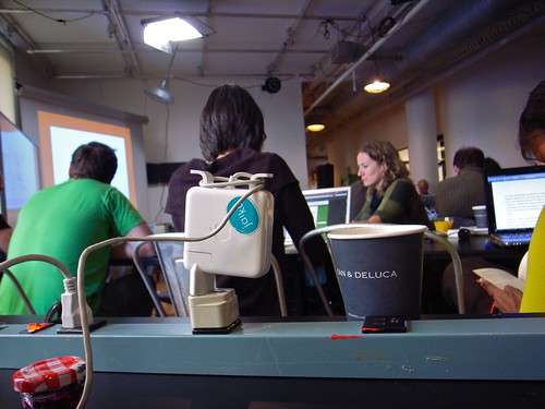
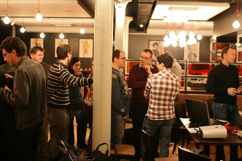
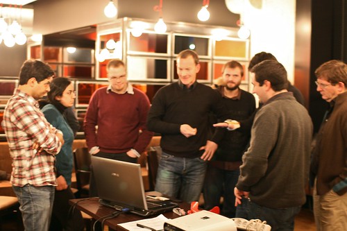
 Last week, I was at the Social Computing Symposium at the ITP in New York; a small event sponsored by Microsoft Research’s Creative Systems Group that "brings together academic and industry researchers, developers, writers, and influential commentators in order to open new lines of communication among previously disconnected groups".
The theme of this symposium this year was “The city as platform”, which revolved around various sub-topic such as urban informatics, the city as a social technology, pervasive games and government infrastructure/data. My notes are definitely messy and incomplete but I tried to cobble some excerpts below as a reminder of what I learnt there. Sorry this is a blog and I have less and less time to make my notes very coherent.
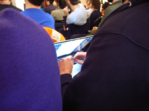
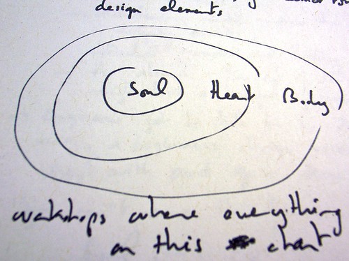
Kevin Slavin gave an insightful presentation that connected lots of various fields that I found refreshing to hear about, I've taken (badly) handwritten notes (see below) so readers may want to access Liz Lawley's more legible write-up.

In the afternoon, Adam Greenfield gave a short presentation about "what cities are for?":
"what functions and activities they have evolved to support? plausible deniability (but with technologies such as social software... life become explicit and declarative), anonymity (but tech can determine whereabouts, activities and intentions), reinvention (but tech re-laminates our "separate masks"), forgetting (but tech leads to a global mnemonic), becoming urbane/confront the others (but networked tech can undercut the logic of networked sociality)."
In her ignite talk Alice Marwick dealt with the following issue: "Why kids do care about privacy?":
"there is this misconception that kids don't care about privacy
but this is not the case
there's a range of privacy concern; 3 categories of people: privacy pragmatists (open-minded liberals), privacy fundamentalists (cynical concealers) and privacy unconcerns
overlapping spaces: public/private/semi-public...
opting out of social media is a great disadvantage for kids
AT&T family map = invasive privacy invasion!
kids deeply care about their privacy whatever they define it"
Which was nicely complemented by Alice Taylor's presentation about the fact that teenagers don't change much ("teens don't have ADD, they're just bored) and Genevieve Bell's discussion about how the notion of "digital native" is a wrong paradigm... "because in general natives lost (at least where I come from [australia]
should we talk about refugees? squatters? there a new nomenclature. On a different note, she also cited some interesting statistics (26% of americans who don't use the internet) and the fact that for some user groups "the internet is just for TV or for phone call".

On Day 2, the morning was devoted to "The City as Social Technology". As proposed by the session organiser (Mr. Tom Coates, thanks for the invitation!):
"It's an attempt to bring together the various levels of the built environment (the home/office, the city etc) with the "Social computing" in the name of the event. The basic premise is that the city is an invented thing, designed to support, extend and derive value from human socialising, collaboration and labour - and that new pervasive technologies (sensors, programmable environments etc) are going to take all of that stuff to a completely new level.
Tom reminded us how the city emerged and different implications of the city as a social platform:
"the city only appeared VERY recently, about 12,000 years ago
urbanization has increased dramatically
but why? what functions did it fulfill?
numbers of theories: agricultural societies that fostered more resilience, static population are more robust/protected, better for trades
once cities have appeared, they gave massive advantages to the collective, making it more efficient
+ doing more together than was possible to do apart
not only the city is a social technology but other tech came from the city: money, alphabet & writing, law & government
le corbusier: a machine for living in
but the city has also costs: infectious diseases spread more in cities... hygiene, sewage, crime, pollution...
there is another leap forward right now. the city will be upgraded
sensors will transform the idea of the city as a social technology"
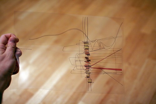
As a follow-up, Molly Steenson gave us an historical perspective on the way that architecture and computers were imagined as a symbiosis in the late 60s and early 70s. She started by quoting various quotes from the 60s by JC Licklider ("The hope is that, in not too many years, human brains and computing machines will be coupled together very tightly" or "your computer will know who is prestigious in your eyes and buffer you from a demanding world") to show that the ideas we are discussing nowadays have been around for quite sometime. Then she exemplified the 3 ways these ideas affect the city (or were supposed to affect it):
- Representing and visualizing: computer graphics... which comes from wing/cockpit design and mechanical engineering. Ivan Sutherland's sketchpad (1962)
- Defining the right problems to solve: c. alexander, was interested in defining problem to solve and apply analysis (1963: "design today has reached the stage where sheer inventiveness can no longer sustain it")
- Generating symbiotic systems: "someday machines will go to libraries to read and learn and laugh and will drive about cities to experience and to observe the world." Negroponte, 1995 in his booked called "The Architecture Machine: Toward a More Human Environment.
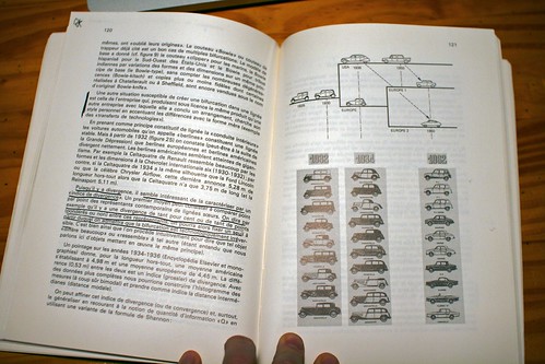
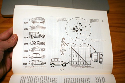
Her presentation was very visual based on seminal texts by the authors mentioned above. See some example from my Flickr stream:


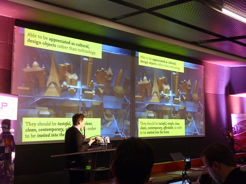
Then Duncan Wilson + Dan Hill from Arup showed some projects going on right now in the architecture community. They called it "digital built fabric":
"Sustainable dev:
- making the invisible visible (barangaroo in Sidney) via real-time data on neighbourhood activity projected throughout site, acting as a civic-scale collective smart meter.
- infographic sketches for responsive street furniture throughout site, inspired by vernacular symbols traditionally found at docks
- smart-meter style dashboard schematic indicating zones of responsibility and contribution as well as consumption
- Forcefield (London, Arup): LED-based lighthing structure responds to proximity and movement of visitors
- unfolding resource use: fitzroy street, london (arup)... hard to read for people: who knows what is the baseline (what number is wrong or good?)
- EST (environment sustainable...) low2no (helsinki)... with web-based and phone-based services, carbon-shadow (yours in comparison with others)
- Kurilpa bridge, Brisbane: LED-based lighting structure capable of responding to environment... we tend to avoid the "big screens" (non-screen, LED instead)... to show collective wifi
"Encrusting the building with sensors"
Aaptive ambient information:
HINTeractions, Green screens (Chiswick park)
Wireless civic spaces: state library of queensland (use of wifi, transformation of public space, library used 23 hours per day, safer, more active)... what can we learn these activities? what sort of patterns can we reveal?
tag cloud of internet connections within public wi-fi space: what countries?
tag cloud of term extraction of public wifi: nouns or people's names currently being browsed in this space?
what if we could put these viz back into the pace? interactive installations
Responsive architecture: mediamesh (UTS broadway competition entry): reveals character of production within building by tapping into the wifi
Mazdar: parasol star... plaza that plays back pattern of activities collated through the day; city centre acts as dashboard/central processing unit for wider city
Persuasive public transit: post-hoc analysis of large data-sets (real time rome), "smart light fields" (Jason mcdermott: traces of BT enable phone), "Mobile sensing" (can we trace where people are, how space is used in real-time...), active wayfinding"
In this talk, Usman Haque started by 10 things he doesn't believe in" and turn them into insights about what he is interested in:
"
make data public ...which becomes... public make data
more data is more useful ...which becomes... more context is more useful
freedom from constraints is the end goal ...which becomes... constraints provide hints
local = proximal ...which becomes... local = shared (we have neighbor but they are asymmetrical) stanislaw lem's about robots fucking other robots (inorganic evolution)
architecture is about organizing ...which becomes... architecture is about disorganizing (h. von foerster: there are no such things as self-organizing system), it's about putting something out there that reconfigure/re-adapt
people need simplicity ...which becomes... we are complexity processors (granularity is essential), people learn to understand the tokyo map! we should not dumb down representations; it's not about simplifying but creating multiple levels of granularity
individualism is the key to behavior change ...which becomes... neighbours just as important! (natural fuse project)"
After that, we had different break-out groups. Mine was called "From instrumentation to social technology" and here is a summary of what we dealt with:
" The digitization of the contemporary cities with technologies embedded into its streets and buildings and carried by people and vehicles has appended an informational membrane over the urban fabrics. Location-based services, interactive architecture, real-time visualizations of cities activity provide new means to make decisions and navigate city space. However, by being more operationally efficient, there is a risk that the urban environment becomes limited to an utilitarian perspective: going from A to B as quick as possible, receiving geolocated-café coupons or getting updates about contacts' whereabouts can be seen as the new cliché of this model.
Questions to be addressed:
1) Yesterday: What have we learnt from the past 10 years in the field (beyond the usual clichés I listed above)? Where did this system fail?
2) Tomorrow: How to go beyond these issues? What kind of problems will emerge? Is there a balance between utilitarian and more desirable systems? What's the stupidest idea one can we think about?
3) Summary: Can we discuss a roadmap of possibilities/problems for the near future?"
In the afternoon of the second day, the topic was "Cities and Play". Kati London started off by showing an interesting set of projects such as "avatar machine" by mark owens, and the surge in location-based games (or Mobile social software that uses game mechanics): Parallel Kingdom (a mobile location-based MMO), Mytown, or Monopoly city street. Dennis Crowley from Foursquare also showed some interesting lessons they drawn from the platform evolution and how it's differentiated from other friend-finder systems.
Why do I blog this? It was an interesting event, very diverse in terms of the topics that people presented and perspectives. What I found relevant was that "social computing" was not taken to the letter, which is good. Surely, some elements to be directly re-used in current projects.
 Yesterday in Lyon, Emmanuel Rondeau and myself organized a Lift@Home about gestural interfaces. We (Lift) indeed partnered with Imaginove, a French cluster of companies, research institutions and universities focused on video games, audio-visual, cinema, animation and multimedia. Several other Lift seminars will be organized around various topics such as the Social Web, 3D virtual environment, networked objects and locative media. We'll focus on the uses and practices of each of these technologies, to reflect upon how they are appropriated by users and how this information can be fed back into the design process.
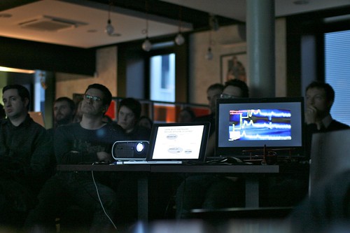


 (Fabien's picture of Matt Jones at Technoark)


 The annotated slides from my talk "
 "
"


 The famous drawing extracted from "Theory of the Dérive" (Théorie de la Dérive) by Guy Debord. As explained by the author: